Mexican chain Wahaca sports playful, new look
In the saturated market of casual dining, standing out is hard, especially when there are new brands popping up every day.
For the UK’s Mexican street food restaurant chain Wahaca, the need to stand out on the high street and differentiate itself from a saturated market was acute. Founded in 2007 by Mark Selby and Masterchef winner Thomasina Miers, the chain now counts 25 branches across the UK but needed to update its brand to appeal to a wider audience.
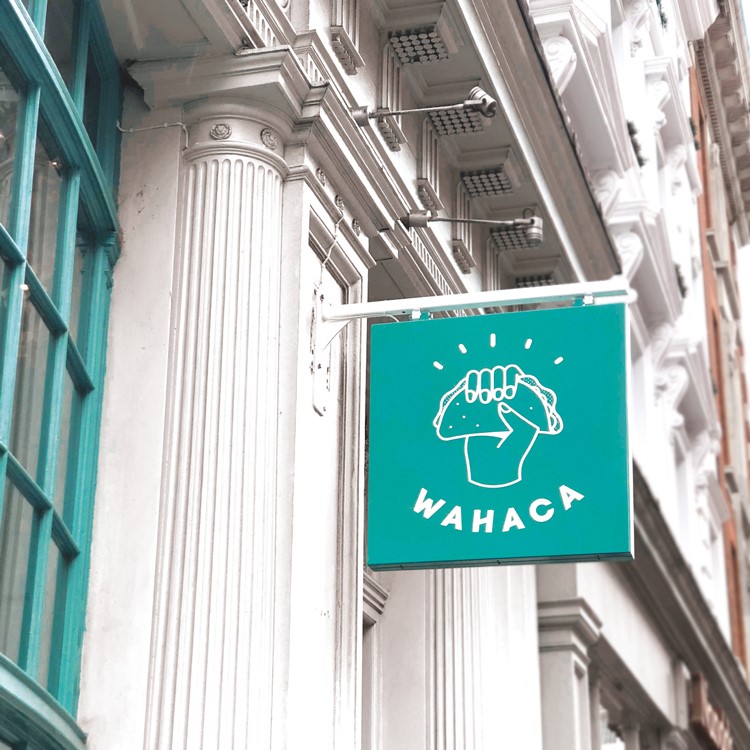
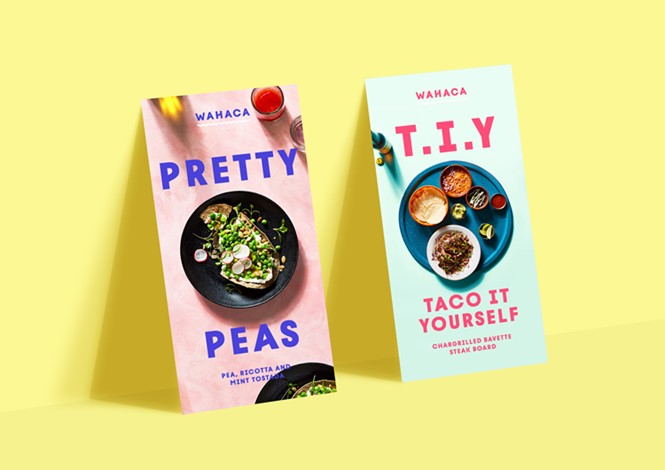
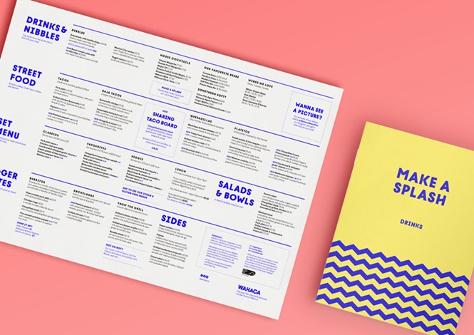
That’s why Wahaca has rolled out a new brand identity designed by brand design studio Without. The rebrand focuses on illustration, with its playful and colourful new look conveying the ‘independent spirit’ its founders want it to have.
Wahaca has collaborated with Without since its establishment in 2007, adopting a colourful almost amateur look for its visual identity. The rebrand however, is an update of the initial brand that has kept its cheerful elements, while adding a more clean, modern and simple aesthetic to it.
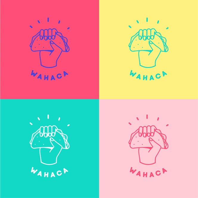
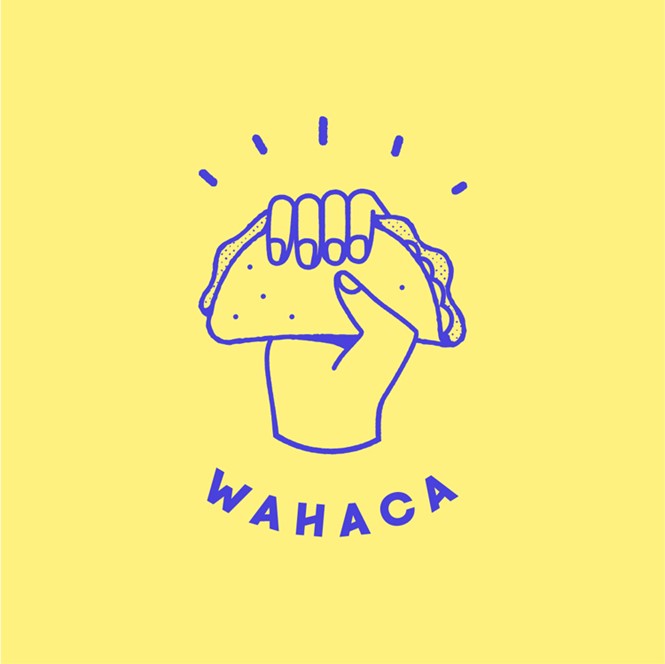
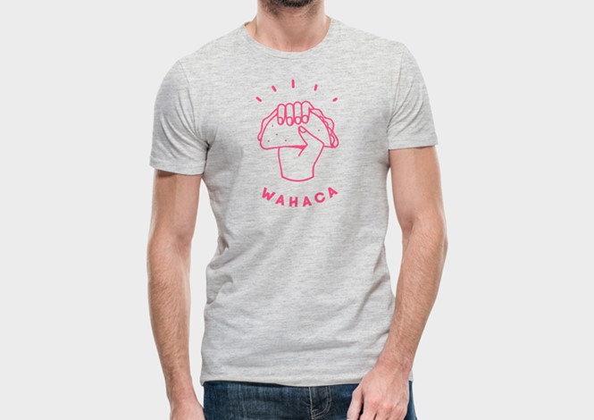
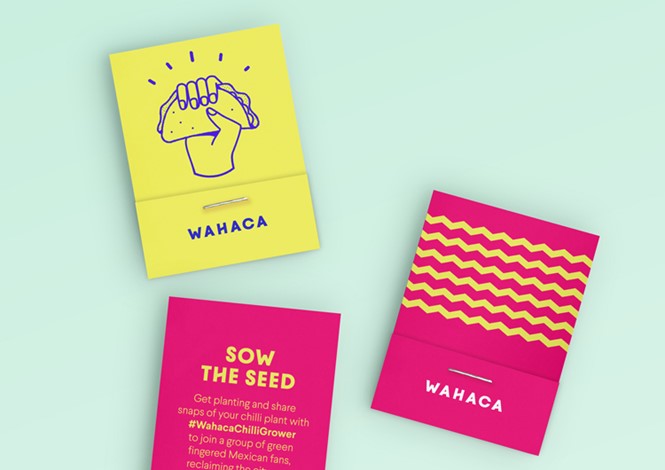
The new logo is an illustration of a hand holding a taco. Under the drawing, the wordmark is written in a small, bold and all caps sans serif typeface in the shape of a semi-circle. The typeface is bespoke, also designed by Without, called Wahaca Bold and helps enhance the brand’s prominence.
For the new branding, the colour palette consists of shades of pastel pink, bright pink, turquoise, navy and yellow, with the logo being flexible in its colour combinations. The result is a contemporary and cheerful brand that looks both effortless and endearing, while it manages to catch people’s attention due to its stand-out colours.
Form more from Transform magazine, follow us on Twitter @Transformsays