#TransformTuesday: 11 December
Every week, Transform examines recent rebrands and updated visual identities. This week's picks are below. For more from #TransformTuesday, follow @Transformsays
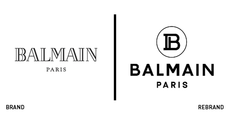
Balmain
Following the steps of established fashion houses, such as Burberry and Celine, Balmain has revealed a revamped brand identity consisting of a new logo, led by its creative director, Olivier Rousteing. The new logo uses a more minimal typeface for the wordmark, crafted by design studio Adulte Adulte, along with the new monogram, a capital ‘B’ that sports an additional brush stoke to resemble the letter ‘P,’ referencing the brand’s founder, Pierre Balmain. "Having been the creative director of this house for eight years, I'm not about to tear down traditions or break rules simply for the sake of breaking them. But times do change. Balmain is now a fast-growing brand relying on new media to communicate to a global audience. To best meet the challenges and opportunities of today, we unveil a newly updated logo for Balmain Paris,” says Rousteing.
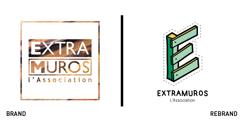
Extramuros
The Extramuros association operates with the objective of raising awareness on the value of discarded materials, such as wood waste, through a recreative transformation of waste products into durable and useful furniture and accessories. The company has now updated its brand identity, leaving behind an old, outdated logo and rolling out a new one that focuses on the texture of wood in a more contemporary way. At the centre of the new visual identity, Ectramuros has put a monogram of the letter ‘E’ that is illustrated as if constructed from a wooden pallet, a direct reference to the brand’s recycling ways. The visual identity is vibrant and eye-catching, featuring shades of bright yellow and green, which connects the brand with its purpose of environmental conscience. The dotted lines pictured all over the new brand refer to the process of constructing both the furniture and the accessories from the recycled materials.
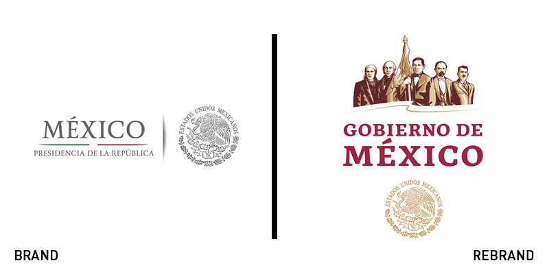
Government of Mexico
Following Mexico’s change of presidency at the beginning of the month, the Mexican government has unveiled a new logo to be found across all of its touchpoints, marking a fresh start for the country. The new logo for the Government of Mexico features an illustration of five national heroes holding a waving flag. The wordmark, along with the national coat of arms, a symbol which denotes an independent state in the form of a heraldic achievement were also redeveloped. In an effort to achieve consistency in the government’s communications, a bespoke typeface was crafted, called ‘GMX.’ The colour palette, surprisingly, doesn’t consist of the country’s flag colours of green, white and red, and instead features shades of gold and a dark, muted red. The new visual identity for the Government of Mexico manages to find the balance between heritage and modernity, while offering a look for the government’s brand that is distinctive and unique.
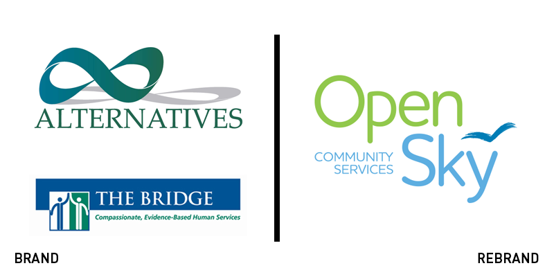
Open Sky Community Services
Two providers of human services in central Massachusetts have merged under one name and brand. Alternatives Unlimited, Inc. and the Bridge of Central Massachusetts have rebranded to Open Sky Community Services in a collective effort to create a new entity that is innovating in its approach of the community’s behavioural health and human service needs. The new logo uses a curved typeface for the brand wordmark in the shades of pale green and blue, with an abstract illustration of a bird above the letter ‘Y.’ “The dedicated and mission-driven staff of Open Sky Community Services are committed to helping people see beyond and live beyond the expectations that society and individuals place upon themselves,” says Ken Bates, president and CEO of Open Sky Community Services. “Our new brand exemplifies the passion and creativity of our employees and our dedication to do whatever it takes to support individuals and families as they strive toward growth; ultimately strengthening our communities.”
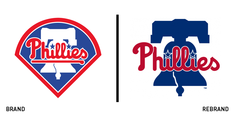
The Phillies
To prepare for the 2019 season, American Major League Baseball team based in Philadelphia, Pennsylvania, the Phillies, have revamped their visual identity, revealing a new look through the Majestic Clubhouse Store’s Twitter account, with a post that revealed the new uniforms. The new logo is not dramatically different from the previous one – which was used for the last 26 years – with two key elements remaining the same: the ‘Phillies’ and the Liberty Bell illustration. However, the colour palette has been updated, now consisting of a significantly darker shade of blue, while the illustration of the baseball diamond around the logo has been dropped altogether.
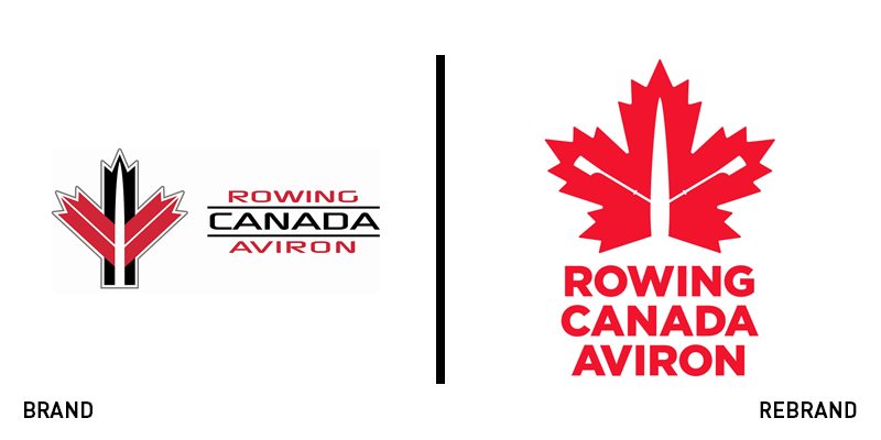
Rowing Canada Aviron
The national governing body for the sport of rowing in Canada, Rowing Canada Aviron (RCA), has revealed a brand new logo that connects with the brand’s heritage, while enhancing its transition to the new age. Designed by design agency They Integrated, RCA’s new visual identity aims at bringing the sport closer to the people, making it more relatable and relevant. “This foundational work is critical to grow and sustain our sport through the creation of marketing campaigns and the development of new partnerships and corporate sponsorships,” says Jennifer Fitzpatrick, RCA’s director of partnerships and sport development. The heritage leaf logo was designed to pay homage to the history of the sport while also looking towards the future with a more consumer-friendly brand mark. The logo has a single, powerful colour that is readily identifiable as a standalone element. A strong, timeless, heavily weighted typeface was created to balance and complement the icon.


