#TransformTuesday: best of 2017
Every week, Transform examines recent rebrands and updated visual identities. This week, we’re looking back at the most popular #TransformTuesday columns from 2017, featuring rebrand stories from around the world. For more from #TransformTuesday, follow @Transformsays.
#TransformTuesday: 17 January
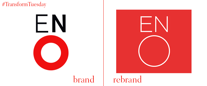
From Dominican Republic banks to Swiss chocolate via the English National Opera, one of 2017’s earliest #TransformTuesday columns was also one of the year's most popular. The new visual identity for US-based history channel HISTORY by DixonBaxi continued the trend for television programme and channel rebranding which reached its peak in mid-2016. There was also an interesting twist on a retro classic with The Allotment’s new design for Radical Sportscars, as well as a new identity for salary sacrifice scheme TechBenefits. An increasingly popular model adopted by companies for employees, branding agency Mr B & Friends delivered a fresh, contemporary update for a fresh, contemporary idea.
#TransformTuesday: 25 April
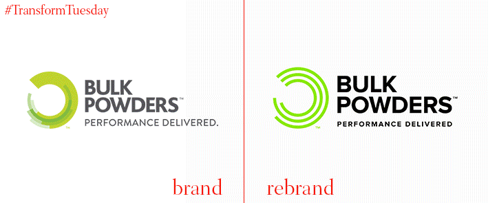
A plethora of UK-based rebrand projects shone through in this #TransformTuesday from April 25, including three packaging redesigns and a delve into the insurance and performance industries. In a food and drink industry increasingly characterised by ‘wellness,’ Leeds-based agency Robot Food updated protein brand Bulk Powders to a more progressive aesthetic. Elsewhere, brand clarity was also at the forefront of new offerings from aerospace solutions provider Unilode and insurance broker Ryan’s, rebranded by London agency Spinach Design and digital marketing agency Jacob Bailey respectively.
#TransformTuesday: 13 June
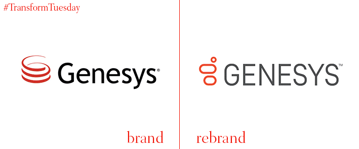
The offering from 13 June included the design and strategy behind two new brands, as well as the usual rebrand stories. The Nordic region unveiled a place brand collaborative in both its outlook and its creation, with the aim of highlighting its unity to the world; the other brand, the Blueprint Partnership, was developed by Designhouse to aid transparency in the travel retail sector. This #TransformTuesday also welcomed a rejuvenated brand experience for Irish customer experience software provider, Genesys, as well as packaging stories for Brazilian milk drink Mupy and nutritional bar 9Nine. Johnson Banks provided the visual identity for UK charity, Action for Children, which changed its brand approach to be more storytelling-focused.
#TransformTuesday: 15 August
Transform paid a visit to Canada, Italy, Greece and the University of Illinois in the second most popular #TransformTuesday roundup of 2017. Taxi app Beat began life in Athens; its founders’ vision of expansion to South America led to a rebrand, carried out by DesignStudio, which included a name change and vast change in colour palette. The Canadian Red Cross, or Croix-Rouge canadienne, had a subtle yet necessary brand update courtesy of Toronto, Canada-based design agency Concrete, one of two charity rebrands to feature in this week’s roundup. The other, Italian humanitarian charity Helpcode, departed entirely from its old identity to reflect its optimistic future vision.

#TransformTuesday: 5 September
From global digital corporations such as YouTube and eHarmony to Norfolk, UK-based local brewery Woodforde’s, #TransformTuesday on 5 September spanned every scale. Similar to Woodforde’s low key and historic new brand, London-based advertising agency the Gate created a bespoke business card offering to highlight its team’s unique personality. Then, almost 6,000 miles away in Sao Paulo, Brazil, high street grocery chain Natural de Terra streamlined its brand offering with the help of Futurebrand. JJ Media Group announced a new identity to coincide with its restructure, while BrandPie created a new name and accompanying identity for independent charity, lifeArc. Global dating site eHarmony also made its mark, updating its visual brand to become a more competitive force in the modern dating landscape.

#TransformTuesday: 10 October
Blue and red were the stand out colours in #TransformTuesday on 10 October, the most-read column of 2017. This was as well as a focus on lettering and typeface, whose drastic changes lead much of the identities. Dropbox was perhaps the most controversial rebrand, with its new design following an inhouse decision to update the Dropbox brand proving divisive among creatives. Meanwhile, Dutch lettering artist Paul von Excite carried out an update for London-based app Marvel, with a redeveloped typeface representing the app’s energetic character. Similarly, Ontario International Airport and BAC Credomatic received much-needed updates to their logos while UK-based creative agency Catalyst delivered a contemporary twist for business funding solutions company, Shire Leasing. Vodafone also made the cut, with its iconic 33-year old logo updated following the position the brand towards ‘future optimism.’


