#TransformTuesday: 3 January
Every week, Transform examines recent rebrands and updated visual identities. This week's selections are below. For more from #TransformTuesday, follow @Transformsays.
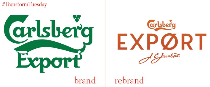
Carlsberg
In recent years, artisan beer and craft ale has become one of the most successful trends in drinking – particularly among the 18-30s. Tapping into this trend is Carlsberg, which is launching an updated Carlsberg Export in February 2017. Its logo and packaging has been designed by UK-based brand agency, Taxi Studio. Despite already being a well-known lager, the brand has updated its visual identity and marketing materials to appeal to a younger and more dynamic audience. Its new design aims, according to the company, to go back to the lager’s Danish roots. Carlsberg will also include the signature of its founder J.C. Jacobsen, as well as a Danish ‘O’ (Ø) in ‘Export’. Liam Newton, vice president of marketing at Carlsberg UK, says, “By reminding people of where Carlsberg comes from and adopting some of the positive attributes from the people of Denmark, we believe we will have a powerful platform from which to connect with millennials in a meaningful way.”
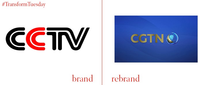
China Global Television Network
In order to consolidate its global reach, China’s state broadcaster, Central China Television (CCTV), has rebranded its international networks and digital presence. China Global Television Network (CGTN) is the channel’s new iteration, with several new apps being rolled out to coincide with the launch. The channel also aims to communicate the diverse array of cultures and colours China has to offer. Cementing its international reach, CGTN now broadcasts in English, Spanish, French, Russian and Arabic.
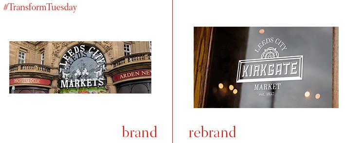
Kirkgate Market
Purported to be one of the UK’s oldest indoor markets, and the largest in Europe, the Leeds-based Kirkgate Market has had its historic identity updated to coincide with the launch of a new campaign to attract visitors to its stalls and offerings. Courtesy of the Leeds office of UK-based branding agency, Ilk, and a £14mn investment, Kirkgate Market has been branded as an ‘iconic Yorkshire landmark’ in line with wider development received by Leeds city centre. Shaun Beaumont, creative director at Ilk, says, “It was important that we incorporated the history of the market into our creative. We wanted it to be fully reflective of the significant impact the market has had on Leeds and even the region over many years.”
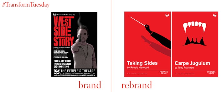
People's Theatre
Based in the northern UK city of Newcastle, People’s Theatre is an entirely volunteer-led organisation which funds its projects and performances mainly through box office revenue. One of the oldest amateur theatre companies in the UK, it rebranded during 2016 to continue attracting a diverse array of audience members and cement its importance as a community arts hub. Newcastle-based design agency, Jump, led the update to the People’s Theatre visual identity, creating bold and distinct posters to resonate with the public and theatre-goers alike. Through its simple yet striking designs, Jump has created a visual narrative to truly distinguish the individuality of each play shown in the theatre. The agency has also updated the theatre’s logo, the same it has held for over a century.
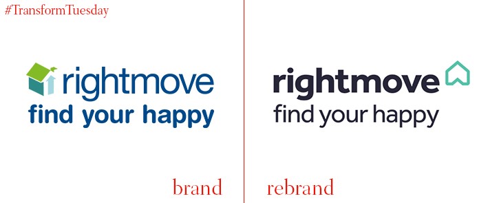
Rightmove
London-based brand and communications agency, The Team, led the update to property search giant, Rightmove’s, online presence and visual identity. With a focus on ‘Find your happy,’ the rebrand aims to lend a more human face to a sector often accused of being lacking empathy, with its emphasis on dynamism reflected via a rotating house symbol. The logo has also been optimised for B2B relations and printed materials, despite Rightmove being largely online-based. Dan Dufour, brand strategy director at The Team, says, “We wanted to enhance the emotive human quality of the brand. Inspired by the sentiment of home of where the heart is, we realised the new logo could tell the story of helping people find their happy with a simple rotation. While the identity has to work in 2D its simplest form, that doesn’t mean it can’t also come to life.”
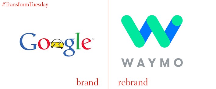
Waymo
Self-driven cars, a Google-led project seven years in the making, has attracted an extraordinary amount of media attention, even before being rolled out to the public. In a bid to lend an independent identity to the project, it has been rebranded as ‘Waymo’ under Alphabet, the Google parent company which oversees projects outside of its core online business. The product is set to be the world’s first autonomous car, needing no human intervention to function at all. According to Google, the name Waymo stands for ‘Way forward in mobility’. The branding has been completed in-house.


