#TransformTuesday: 24 October
Every week, Transform examines recent rebrands and updated visual identities. This week's picks are below. For more from #TransformTuesday, follow @Transformsays.
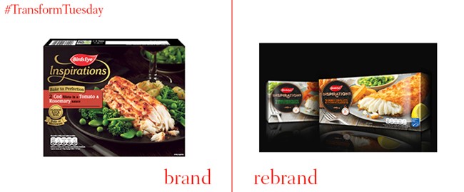
Birds Eye Inspirations
Beloved family favourite Birds Eye turned to design consultancy Brandon to reexamine the packaging across its Inspirations range. Inspired by an editorial style of photography, the agency made the food the star of the show. Packaging remains the quintessential black, but a prominent Inspirations wordmark and bright imagery help it stand out in the freezer. Steve Conchie, creative director at Brandon, says, “Packaging design within the premium frozen fish category was all beginning to look like wallpaper, with every brand opting for full-on black packaging to create a premium feel. As a result, no one brand was standing out." Birds Eye's marketing manager says the new approach imbues the range with a more premium feel and allows it to better communicate about the food's quality.
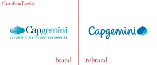
Capgemini
Consulting and outsourcing expert Capgemini has celebrated its 50th anniversary in a special way – by rebranding. Working with London-based agency BrandPie, the company has unveiled a friendly new rebrand with a logo typeface inspired by the handwriting of its founder, Serge Kampf. The iconic spade logo will continue to be present in the visual identity, but in a more modern, fluid way. Dynamic photography and a new colour palette complete the visual identity overhaul.

CharityJob
For over 17 years, CharityJob has helped people build their careers in the third sector. But, the brand needed a stronger focus on its human stories and those it has helped, to build a stronger identity. It worked with IE Brand, a Birmingham-based agency, to reexamine the organisation’s web platform, tone of voice and visual identity. The result puts more emphasis on real-life stories and allows for easier navigation.
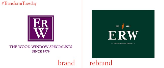
ERW Joinery
The 38 year-old joinery located in Middlesborough in the north of England, is a family run company that has always put craft at the forefront of its brand. In order to support its growth, though, it turned to local agency the Creative Alchemist to join its heritage with its goals for the future. The result is a new brand featuring a responsive website, clear navigation and a new logo that embodies heritage, quality and expertise.

foodpanda
German company foodpanda has unveiled a rebrand following its acquisition by Delivery Hero last December. The company, active in 23 countries across Africa, Asia, eastern Europe and the Americas, has eschewed its omnipresent orange for a neon pink main colour and a slightly slimmer panda logo. With thousands of restaurant partners, delivery people and other brand assets worldwide, the rollout is no small feat. Laura Kantor, head of marketing at foodpanda says, “Pink will be a strong differentiator for foodpanda to stand out in markets in which orange is used extensively throughout the cities´ landscapes.” The rebrand will be complemented by unique restaurant collaborations and a content campaign to support the change.
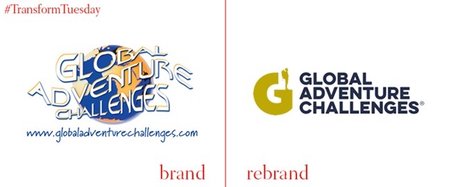
Global Adventure Challenges
With a previous logo that would look most at home stitched onto a polar fleece pullover, trekking and exploration travel brand Global Adventure Challenges needed a fresh approach. It worked with Truth, a Manchester-based agency, to relaunch the brand in its entirety. Peter Robinson, director of GAC says, "Since our conception we had successfully operated with a tired, unreadable and incredibly difficult to reproduce logo which, as the years went by, didn’t reflect the services and quality events we delivered. We had no structure to our external image, we had no brand story to tell. Working with Truth has literally transformed our business into something we never thought imaginable. We have a brand! We have a story!”

Ugly Drinks
It may be called ugly, but its new packaging certainly is not. The Ugly Drinks brand is an unsweetened, natural flavoured spring water purveyor that has worked with Jones Knowles Ritchie to redevelop its brand and packaging. The result is a free spirited visual identity that uses blocky cloud-like text, cute emoji-like icons and a straight forward tone of voice. Hugh Thomas, co-founder of Ugly Drinks says, “We already had a really powerful name and product, but we needed a brand that we could take to the masses to really get our message out there. We wanted to truly define our purpose and create a brand that people would be happy to be seen with - rather than a healthy badge of honour. The new identity we created with JKR does just that, perfectly positioning us to spread the Ugly Truth on a global level."


