#TransformTuesday: 15 August
Every week, Transform examines recent rebrands and updated visual identities. This week's picks are below. For more from #TransformTuesday, follow @Transformsays
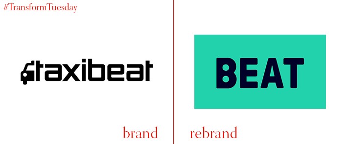
Beat
Launched in Athens in 2010, Beat is a transport-based app which allows users to select taxis based on certain criteria, such as wifi or driver rating. With plans to challenge Uber and expand across South American markets, Beat has presented its new visual identity, developed by London–based branding and digital creative agency, DesignStudio. Most strikingly, the rebrand includes a name change from Taxibeat to Beat and a series of icons named ‘city code.’ Navy, turquoise and orange are the leading brand colours, a departure from the classic yellow and black palette often associated with taxis, and forming the basis of Taxibeat’s previous identity.
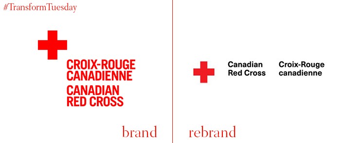
Canadian Red Cross/Croix-Rouge canadienne
Functionality leads in this update to the Canadian Red Cross (CRC) logotype, with everything from signage to packaging to digital application developed by Toronto, Canada-based design agency Concrete. The eponymous symbol is paired with a revamped yet understated sans serif font, Neue Haas Unica, which denotes the charity name in both English and French (Croix-Rouge canadienne). In application the red cross becomes the lead signifier, its height and weight dependent on the product. Use of imagery connects the visual identity to the organisation’s global mission. Concrete says, “The CRC engaged Concrete to review its current identity system and develop a comprehensive set of guidelines that addresses the identity’s general usability, public perception, and accessibility, all while representing the organization’s core values of humanitarianism, leadership, trust, expertise, safety, protection, hope, neutrality, and unity.”
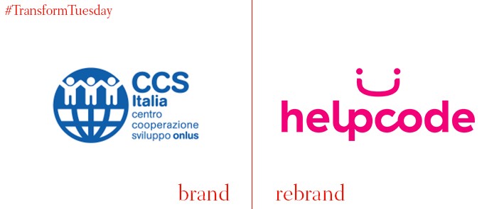
Helpcode
In a project led by the Italian office of global brand agency FutureBrand, Italian-based humanitarian charity Helpcode – which mainly focuses on the wellbeing of children – has released a new visual identity. Previously known as the Onlus Development Cooperation Centre (or Centro Cooperazione Sviluppo Onlus, in Italian), Helpcode has completely revamped its logotype and digital applications. A smile, formed from two people, forms its logo, a reflection of Helpcode’s commitment to bettering the lives of children around the world. FutureBrand Italia has also forgone the previously corporate blue, grid concept logo which look more akin to a governmental organisation. Instead, a maroon and orange colour palette and sans serif font portrays Helpcode’s objectives in a positive and optimistic light.
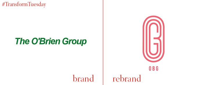
The O’Brien Group
Liverpool-based the O’Brien Group is primarily concerned with enabling sustainable enterprise in science-led markets. However, with a disparate brand architecture comprising member companies from the pharmaceutical, and plastics and industrial additives industries, a unifying identity was needed to strengthen its employer brand proposition and make clear the O’Brien Group’s creative credentials. Creative consultancy USP Creative, also based in Liverpool, was tasked with developing a unique identity for the O’Brien Group. A colour palette unique to the traditionally fairly conservative science world is a main website feature, its pink-red tones fostering an atmosphere of trust. This is as well as emphasising the creativity and collaboration for which the O’Brien Group strives.
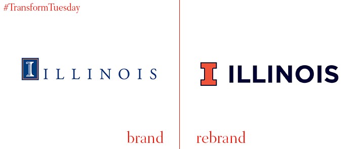
University of Illinois
The University of Illinois, located at the Urbana-Champaign campus in the state of Illinois, has announced its return to a single logo by its in-house team. This a response to confusion created by the university’s use of multiple logotypes across marketing materials, digital applications and sports teams. The previous logo, a column-inspired ‘I,’ has been used to denote the University of Illinois’ administrative and academic units since 1997. However this will be retired, in favour of the simple orange ‘I’ associated with the University of Illinois identity as far back as 1892. University of Illinois chancellor, Robert J Jones, says, “Ultimately, this is just the first step in our effort to harness the power of the Illinois brand, work that will have tangible implications for our fundraising efforts, faculty and student recruitment, corporate support, research funding and our overall reputation.”
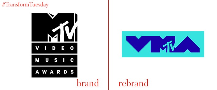
MTV Video Music Awards
New York-based brand design agency, Original Champions of Design (OCD), has created a new identity for the world-famous MTV Video Music Awards (VMAs). While previous logos have been fairly transient, changing annually, the 2017 approach strives towards a greater permanence for the event’s visual identity. It incorporates the two distinct, yet intrinsically connected and self-dependent, brand identities of MTV and the VMAs. Using imagery of famous artists, OCD unites some of the VMA’s most iconic performers such as previous awards host Katy Perry, under a glittery, galactical identity. A pink and blue-led colour palette allow for easy application across all mediums, while enhancing the chosen imagery and typeface.


