Aromatic appeal in Patak's new sub-brand
Britain has long been in the throes of a love affair with curry. Since the first restaurant serving Indian food, the Hindoostane Coffee House, opened in London in 1810 in Marylebone, curry dishes and its accompaniments were popularised through recipe books and commercial cookery. One of the best-known Indian food brands in Britain, Patak’s, was founded in 1956 off the boom in curry house popularity and continues to make its jars of curry pastes and sauces widely available. While its latest sub-brand offering, a set of paste pots flavoured for classically popular curry dishes, is developed with an inventive British audience in mind, its branding also aims to appeal to kitchens with a love of flavour.
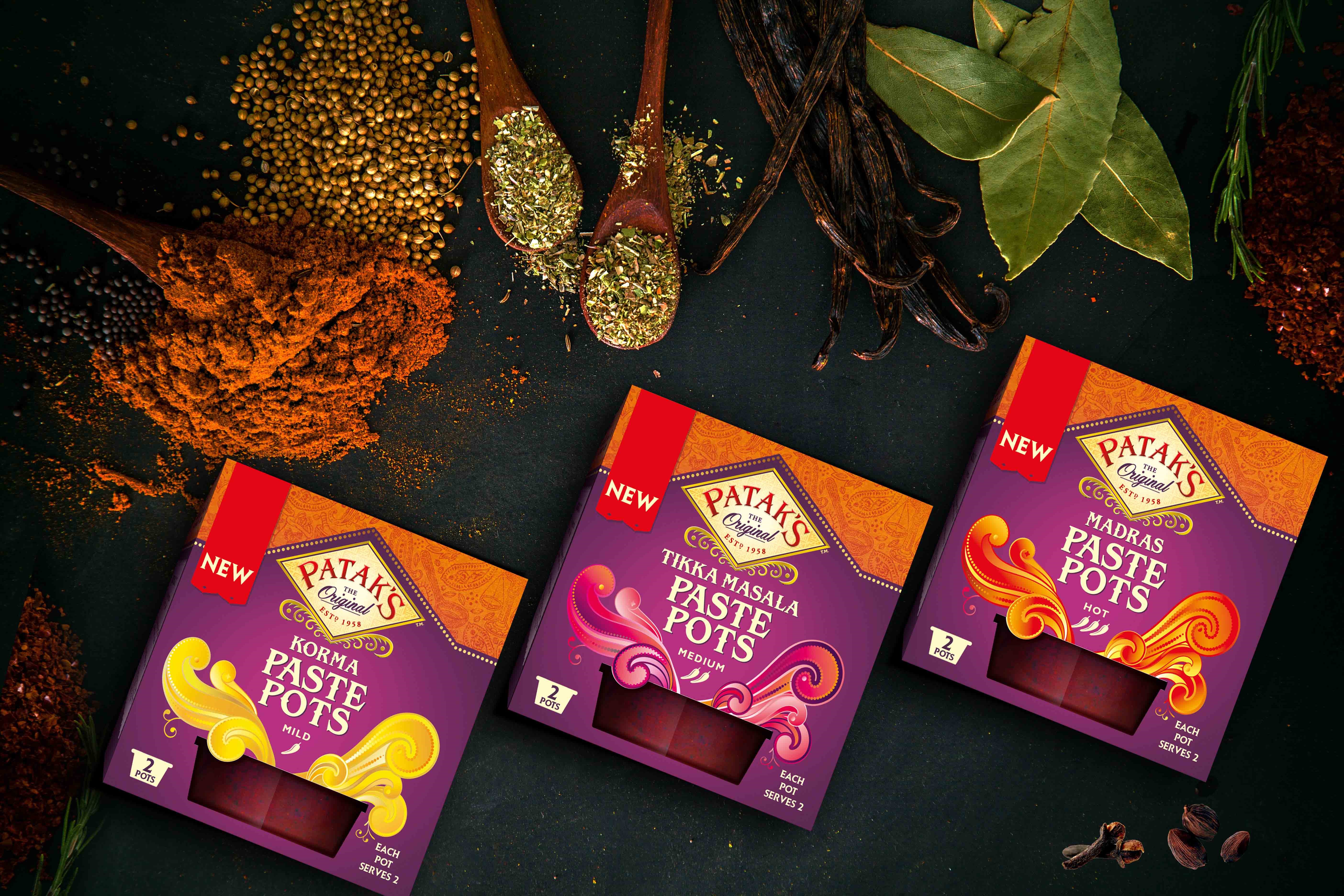
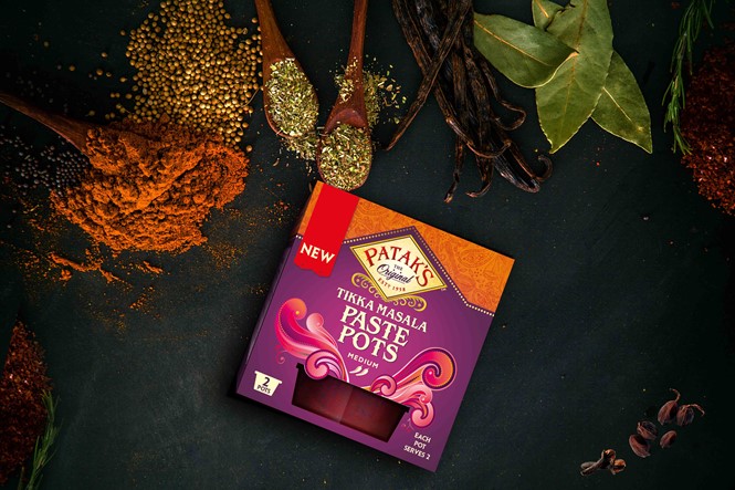
Developed by the London office of global design agency Hornall Anderson, the design of Patak’s Paste Pots aims to communicate the ease with which authentic Indian-inspired dishes can be formulated in home surroundings. The packaging, which retains the lead colour as purple to correspond to the classic original Patak’s brand, is small. Yet, its size is effectively manipulated by Hornall Anderson to include intricate designs which appeal to everyone from curry novices to more adventurous, experimental chefs.
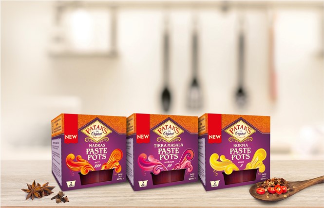
Currently available in korma, tikka masala and madras flavours, Patak’s new sub-brand also retains its connection to dishes loved by the British. The addition of purple, orange and cream abstract swirls corresponds to each flavour. Framing the product window, these patterns reflect the aromatic nature of each product while ensuring cut-through in a supermarket section often crowded with competing brands.
Kim Van Elkan, managing director at Hornall Anderson, says, “We had very limited space to work but the use of a graphic illustration on the front of pack overcame this challenge and communicated the sensory experience which will attract consumers looking for an easier and more convenient way to blend spices. Graphic illustrations feel so modern and will be a big trend going forward.”
Paul Watmore, UK marketing director at AB World Foods, says, "The launch of Patak's Paste Pots is one of our biggest and most important innovation projects and will introduce many new consumers to the wonders of Patak's Paste Pots. Getting the design right was a vital part of ensuring success and I feel Hornall Anderson managed to do a great job.”
“Patak’s has a very strong design hierarchy across its range, designed to create maximum brand stand-out in store and help consumers navigate to the right product,” Watmore continues. “However, with the paste pots we needed to generate extra stand-out for a new range, on an innovation project that was designed to be very shelf-efficient for retailers. The graphical expression of an explosion of flavours coming out of the pot will entice consumers to try the new Patak’s Paste Pots.”
Hornall Anderson has added vibrancy and vitality to the Patak’s range through its focus on developing product packaging reflective of the product’s country of origin. By emphasising Patak’s Indian background with colours and patterns inspired by the country’s many holy festivals, Hornall Anderson ensures the product’s brand positioning remains focused on Patak’s as one of Britain’s best-loved curry brands.
Patak’s Paste Pots are currently available in Morrisons. The product will be available in most major retailers, including Asda, Sainsbury’s and Tesco, in the coming weeks.