"Zee" new face of healthcare
Zocdoc, an online medical care scheduling service, has rebranded to further its vision of giving power to the patient.
In collaboration with international creative agency, Wolff Olins, it has worked on developing a user experience that is more dynamic and relatable, straying away from the typically scrutinized hardness of the healthcare industry.
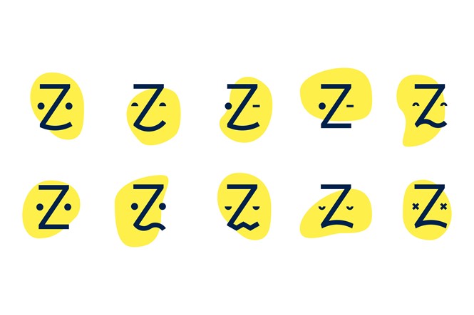
The new design is simple with more interactive capabilities; a clear horizontal homepage bar and professional head-shots on search results pages. Additionally, the revamped logo has become the new 'face of healthcare' - the friendly Zee face is made up of the letter Z and two eyes that represent the many expressions of a patient’s face. The bright yellow colouring also adds a vivid twist in contrast to the the healthcare industry’s uninviting and corporate demeanour, contributing to the brand’s key attributes of simple, smart and caring. Zocdoc represents a new generation of healthcare companies putting technology at the centre of their patient’s experience with access onzocdoc.com or through iPhone and Android apps.
“The new face of Zocdoc looks the way healthcare should – friendly, simple and, most of all, reflective of patients and real life,” says Zocdoc vice president of marketing, Richard Fine. “With this redesign, we are finally matching our design philosophy with the ethos of our brand.”
“We couldn’t be prouder to have collaborated with the team to bring its vision of healthcare to the world. Zocdoc is revolutionizing a stale industry to connect with patients in the most simple, relevant and human way. Zocdoc impacts how patients interact with healthcare, and its revamped brand and digital experience is only the beginning of what’s to come,” says Lisa Smith, creative director at Wolff Olins.


