#TransformTuesday: 6 December
Every week, Transform examines recent rebrands and updated visual identities. This week's selections are below. For more from #TransformTuesday, follow @Transformsays.
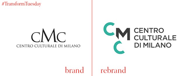
Centro Culturale di Milano
The city of Milan is in the midst of a reinvention following the success of its year hosting the 2015 Expo – a kind of neo-World’s Fair. Milan and London-based design firm CBA has created the brand for the Centro Culturale di Milano, the cultural centre for the city. The brand uses the Cs as viewing devices and overlays them with images from around the city. The new brand replaces a formal, rigid and bureaucratic visual identity.
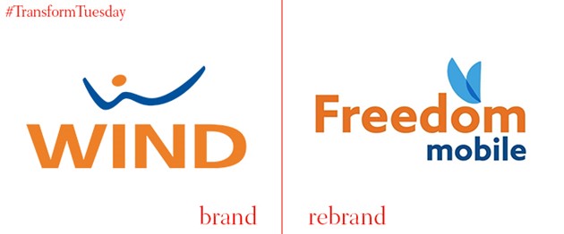
Freedom Mobile
Canada’s fourth-largest mobile provider, Wind Mobile, has rebranded to Freedom Mobile under its new ownership by Shaw Communications. The company will complement this change with the introduction of 4G (or LTE) services across its network, beginning in Toronto and Vancouver. With poor perceptions of its service rampant after a series of ownership changes, CEO and founder of the discount brand, Alek Krstajic says a new brand, new service outlook and new name were the way to move forward.
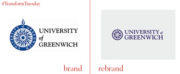
University of Greenwich
British brand agency rbl transformed a historic institution into a modern one with a fresh new look for the University of Greenwich. The compass device in the old wordmark is replaced with a cleaner rendering, allowing Greenwich to move forward while still harking back to its maritime roots. The brand system is complemented with ‘change lines’ – perhaps influenced by the university’s location on the prime meridian – that allow for flexible use across the school’s brand touchpoints. The new brand also focuses on the concept of change to galvanise students and staff to achieve their ambitions.
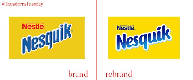
Nesquik
Italy is soon to see a new face of Nesquik gracing its supermarket shelves. The ubiquitous chocolate milk powder produced by Nestlé was given a rebrand by the Milan office of Futurebrand. The logo is still blue and white on a yellow field, but the typeface is rounder a bit more friendly. Even the brand’s bunny mascot has been retouched with a rounder, fuzzier look. The packaging is slightly shifted in terms of design and shape, but still retains the most familiar of Nesquik’s brand identifiers – its sunny yellow.
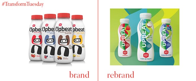
Upbeat
London’s Conran Design Group has redesigned the packaging for Upbeat, a brand of milk-based protein drinks owned by the Good Whey Company. As the category has expanded, Upbeat was no longer differentiated against newer competitors. The new look consists of a white background with a blue and green cyclone travelling up the bottle, a design that is carried throughout the brand system. This replaces a more stationary packaging consisting of cow-like illustrations and an udder-like ‘U’ in the Upbeat wordmark.
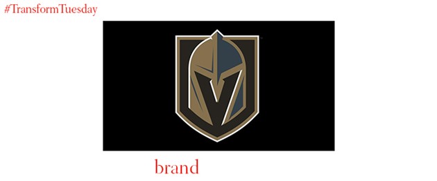
Vegas Golden Knights
It’s been a long time coming, but Las Vegas, Nevada finally has a professional sports team to call its own. The NHL’s expansion into western cities has made it possible for the Vegas Golden Knights to come into being. The new team will be represented by a ‘steel’ and brassy gold colour palette, complemented by red and black. The gold reflects the state’s history as a gold miner’s paradise and the red represents the Vegas skyline and the red rock canyons of its Mojave desert location. The Golden Knight himself has a Spartan helmet rendered in gold and black and placed on a shield.

