#TransformTuesday: 29 November
Every week, Transform examines recent rebrands and updated visual identities. This week's picks are below. For more from #TransformTuesday, follow @Transformsays
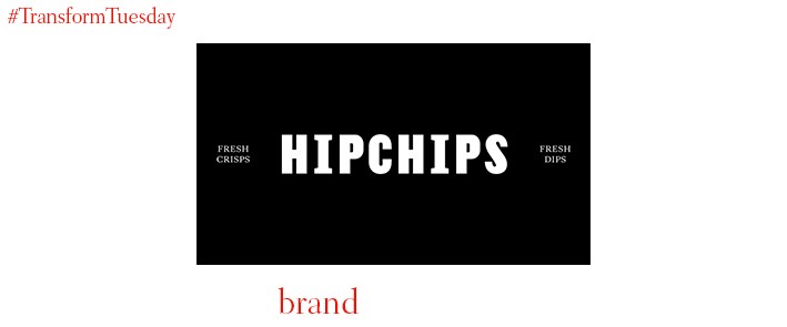
In the latest addition to unique retail ventures popping up across London, Hipchips is a shop and café offering a choice of gourmet crisps with sweet or savoury dips. London-based branding agency, Ragged Edge, led the development of Hipchips’ visual identity. Using the concept of ‘Fresh traditions’, Ragged Edge focused on making the everyday staple food of crisps into a gourmet food offering. In utilising classic British patterns such as deep red and pinstripe in its design cues alongside British phrasing across the restaurant’s serviettes and other collateral, the agency hopes Hipchips will appeal to a ‘Millennial audience.’ Max Ottignon, co-founder of Ragged Edge, says “We believed that by building an experience into every element of the brand, we could give Hipchips real cut through. The end result is a disruptive, premium brand with substance derived from its powerful quality story.”

Danish designer Bo Linneman, executive design director and founding partner of Danish communications agency Kontrapunkt, has updated the ideogram used to depict international co-operation movement, the Nordic Council. Founded in 1952 to promote togetherness between the Nordic countries, it retained its previous logo design from 1984 until present. While the historic swan depiction remains, its update renders it more appropriate for the digital age. The primary colour, blue, remains in place across the logo variations, but new design flexibility ensures the new iterations can take on any one of the five colours used across the flags of the Nordic countries.
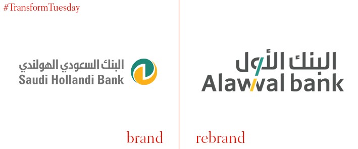
Saudi Arabia-based bank, Saudi Hollandi Bank, was first established in 1926 and has changed its name to Alawwal Bank. In English, this translates to ‘First Bank’. The rebrand is a bid to reflect the changing technological landscape of the United Arab Emirates, as well as highlight the community work done by Alawwal as part of wider global initiatives. The bank offers its services through a variety of channels, with its mobile-based banking platform also rolled out across Saudi Arabia. Chairman of Alawwal Bank, Mubarak Abdullah Al-Khafrah, says, “Our new identity is more than just a name change. Not only is it representative of our efforts to continue delivering a wide range of services to our clients, but it is also a statement of how we view the way the banking sector should operate going forward as the Kingdom realises its ambitions.”
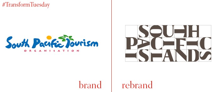
Creative brand consultancy, Futurebrand, has updated the place brand identity for the South Pacific Tourism Organisation. Although made up of 18 government members, it is headquartered in Fiji; a main consideration of Futurebrand was developing an identity to appeal across each different culture. Thus, the consultancy has integrated human imagery, island culture and traditional patterns and colours into the brand application. Through this, the organisation’s new identity aims to represent each government while focusing on how the South Pacific Islands Organisation can approach tourism and island conservation. Futurebrand says, “To add further meaning and differentiation, we created a tagline far removed from the stereotypes of sun, sea and sand that shifted the sentiment much closer towards the soulful spirit and welcoming nature of the region – “Ours is Yours.””
A collaboration between Netherlands-based font foundry, Bold Monday, and the in-house design team at We Transfer has seen the file sharing site update its logo and visual identity. It launched in 2009 and has enjoyed unprecedented success since. Its new iteration places more emphasis on the ‘We’ part of the brand name, dropping the ‘transfer’ part altogether on much of its brand and marketing materials. A redesigned website sees easier navigation, along with the implementation of a ‘peachy’ colour scheme which takes inspiration from more historic design cues. Vice president of design at WeTransfer, Thijs Remie, says, “Starting with an empty canvas, our mission was to create a symbol that captures just the right personality, one that is technically well-executed, and can clearly be read as ‘we’.”


