#TransformTuesday: 13 December

Every week, Transform examines recent rebrands and updated visual identities. This week's selections are below. For more from #TransformTuesday, follow @Transformsays.
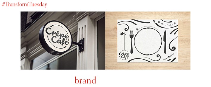
To further introduce Kazakhstan to the intricacies of modern European dining, international brand concept agency Mystery has developed a new French-style café in the heart of the Kazakh capital, Astana. The Crepe Café, a modern creperie with a classic twist, is designed to appeal to the many families which visit Astana for a dining experience. Mystery, along with client, entrepreneur Adilet Zakiyevgeared, ensured the interior design was geared towards the difficulties Kazakh weather brings. This is while focusing largely on the idea of a personality which aims to ‘Seek adventure in the everyday.’
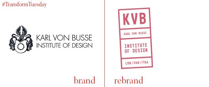
The Sydney-based Karl von Buss Institute of Design, which offers a range of creative courses to students interested in fashion, media and design, has updated its visual identity to a logo more befitting of its young audience. In a brand strategy developed by local design firm, Born and Raised, the college’s identity is more succinctly based on the international background of both its students and their wide-reaching global opportunities. The college’s catalogues and adverts embody the design cues developed by Born and Raised, creating a unique identity easily identifiable among the noise of other college promotional materials.
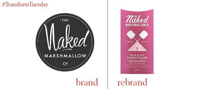
Independent packaging and branding design agency, Design Happy, has updated the identity for naturally handmade product company, the Naked Marshmallow Co. Through developing a brand mark based on toasting marshmallows by the campfire, Design Happy has emphasised the natural elements of the Naked Marshmallow Co. brand positioning. The agency’s simplified yet fairly artisan approach sees the product marketable across a range of luxury outlets, including Liberty’s. The Naked Marshmallow Co. has also extended its own range of products to include marshmallow flavoured gin and vodka.
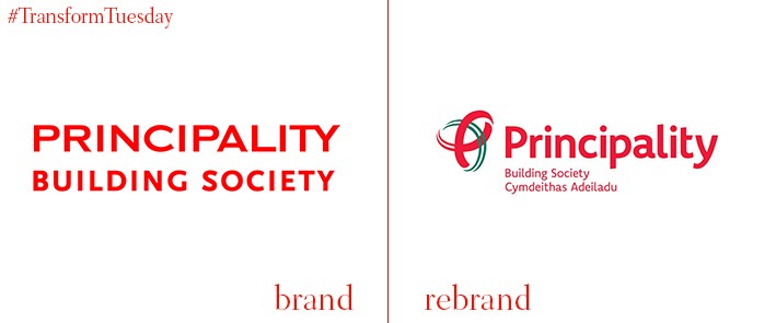
Principality, founded in 1860, is now the largest mutual building society in Wales. Bath-based creative agency, Mr B & Friends, has updated its visual identity in a bid to emphasise the customer focus of Principality and its new brand positioning of helping people prosper in their home. Its red font and inclusion of the Welsh language on its new signage reinforces the geographical positioning of the society. Its new marque also incorporates aspects of the Celtic knot. Simon Barbato, founder and CEO of Mr B & Friends, says, “Principality recognised that it needed to evolve to remain relevant and the new brand positioning signifies their commitment to that. The whole branding exercise, underpinned by the statement ’Where home matters’, enables Principality to own a territory which will be of growing importance to the whole sector over coming years.”
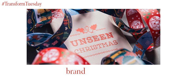
Creative storytelling agency, Aesop, has developed a Christmas campaign in collaboration with Bristol-based charity, Unseen. The charity aims to bring attention to and end modern slave conditions and to highlight its work, Aesop depicts slave conditions on a series of bespoke illustrated paper chains. “From a distance the paper chain designs appear traditionally festive,” explains Stephen Lynch, creative director at Aesop Agency. “But on closer inspection the ‘unseen’ stories reveal themselves. We all have memories of making paper chains as kids – we felt it was the perfect analogy for focusing attention on the unseen victims of modern slavery.” All money raised from paper chain sale goes to charity. Follow the #endmodernslavery hashtag for more information.
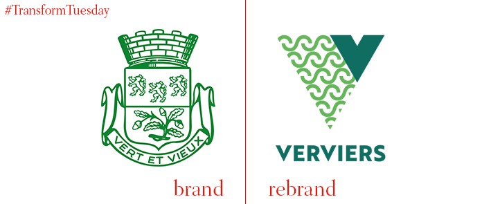
The French-speaking town of Verviers, located in the east of Belgium, has updated its place brand identity with help from Liege-based design firm, Synthèse. Its main town symbol and typeface is finished in green, yet the logo’s flexibility allows different colours to be added according to the district. This includes its shopping area, the central area and its train station. Verviers’ new graphic system aims to bring the town’s brand into a modern age while highlighting the plethora of activities available for both locals and tourists alike.


