Swimming upstream

Burges Salmon, a law firm with origins dating back to the Victorian era, has updated its visual identity to better reflect its positioning in the contemporary era.
Burges Salmon started life in 1841 under the directorship of Edward Burges. Various changes in ownership saw the name Burges Salmon become permanent after its move to Narrow Quay House, Bristol, in 1982 – almost a century and a half after its initial conception.
A move to One Glass Wharf, Bristol, and New Street Square, London, in 2010 and 2012 respectively, cemented the need for the firm to redefine its visual identity.
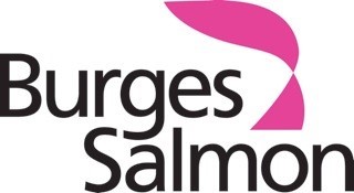
Since the 1990s, the Burges Salmon logo had been a diamond composed of light pink and black triangles. Considered to no longer accurately represent the firm, in its new iteration the diamond has been replaced by a more abstract shape. Resembling a fish, the new logo is certainly memorable. It also plays on the uniqueness of the Burges Salmon brand name.
While the distinctive colour scheme is retained, a shade of magenta replaces the dusty pink of its original logo. Unique to law firm design, this brighter colour accentuates the visibility of Burges Salmon in a market dominated by dark blues, reds and grey.
Use of the magenta logo across its marketing materials affirms consistency, a main consideration of the rebrand. Yet Burges Salmon has been careful to retain the values upon which it is built.
Elspeth Wales, head of PR and communications, says, “Our brand refresh is not about changing our values, our strategy or our approach to client service. We hope that our refreshed brand will help to make us more visible in a crowded market and underline why clients should choose to work with us.”
It is not only the firm’s imagery that has been refreshed, however. A new slogan for Burges Salmon, ‘The independent UK law firm which delivers the best mix of advice, service and value’ has been specially chosen to ensure each word reflects the company’s existing principles.
For law firms, with a distinct visual identity difficult to achieve, clarifying the Burges Salmon attributes through specific wording gives Burges Salmon a distinct advantage over competitors.
Simon Marshall, executive head markets, at Burges Salmon, “In addition to updating our visual identity, we have also honed our brand messages so that they more accurately reflect our promise to clients and to people thinking of joining us. Which is why we believe Burges Salmon to be ‘The independent UK law firm which delivers the best mix of advice, service and value.’"
He continues, "There’s no wasted word in that sentence – every word has a rationale and a benefit to our clients.”


