#TransformTuesday: 12 July

Every week, Transform examines recent rebrands and updated visual identities. This week's picks are below. For more from #TransformTuesday, follow @Transformsays
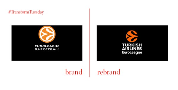
With an ongoing conflict between Euroleague and its parent company FIBA Europe, the league has launched a new brand – including typography and icon changes. The league will roll out further assets during its upcoming autumn events.
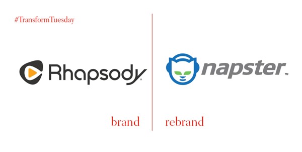
Long ago, Napster was born as a means of (illegally) downloading music. After being shut down in the U.S. in 2001, it reimagind itself as a paid-for streaming service. The Napster brand was used for the service outside the U.S. and Rhapsody, the U.S. front. After 45% subscriber growth in 2015, the brands are now united as one under the Napster name and visual identity, consigning Rhapsody to the history books.
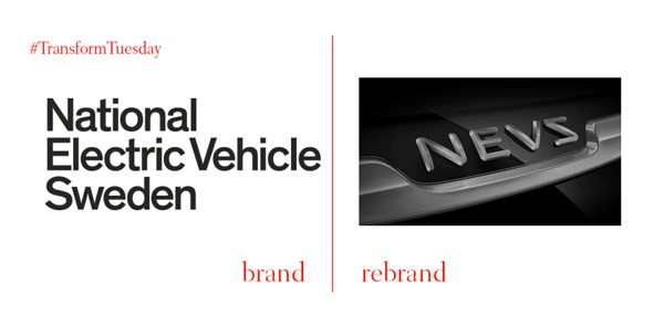
Once National Electric Vehicle Sweden, the newly-rebrand NEVS rescued the beleaguered SAAB brand from oblivion in 2012. However, with the latest rebrand – including a snazzy new typeface – the company will no longer use the SAAB brand. The company will focus on China to grow and expand its production of electric vehicles.
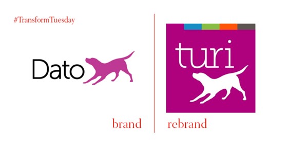
Machine learning startup Dato has changed its name and rebranded due to a trademark infringement suit with Datto, another tech startup. The new name, Turi, is a nod to computing genius Alan Turing and, "T
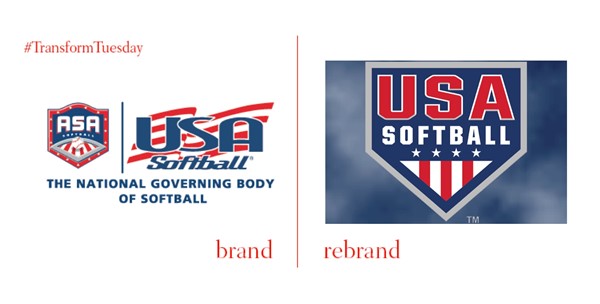
The 80 year-old governing body of American softball, ASA/USA Softball has rebranded and dropped the longtime designation 'ASA.' “The evolution of our brand to USA Softball showcases our organization to its fullest potential,” says USA Softball's executive director Craig Cress. “Rebranding shows our members, teams, umpires, players and fans that we are continually evolving and furthering the softball community while connecting and unifying them under the USA Softball brand." Clarity seems to be the name of the game in terms of the repositioning. The visual identity itself is cleaner and references home plate and typical American sporting tropes like outlined lettering and the stars and stripes. Yet the new look should pave the way for a stronger, more unified future for the organisation.


