Everland designs identity for new French plant-based food start-up
Scandinavian consumer brand agency, Everland, designed the new brand identity for plant-based food company, La Vie. The design aims to change the perception of meat alternatives and unite vegans and meat lovers alike.

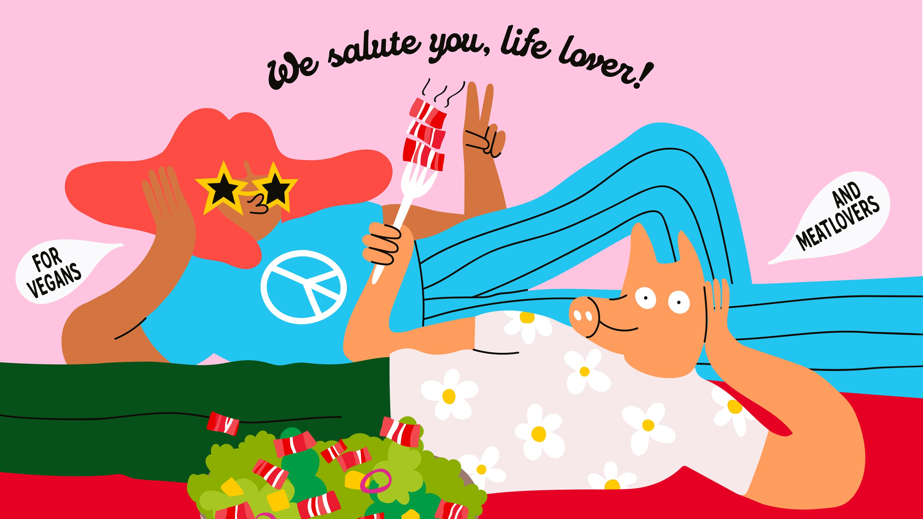
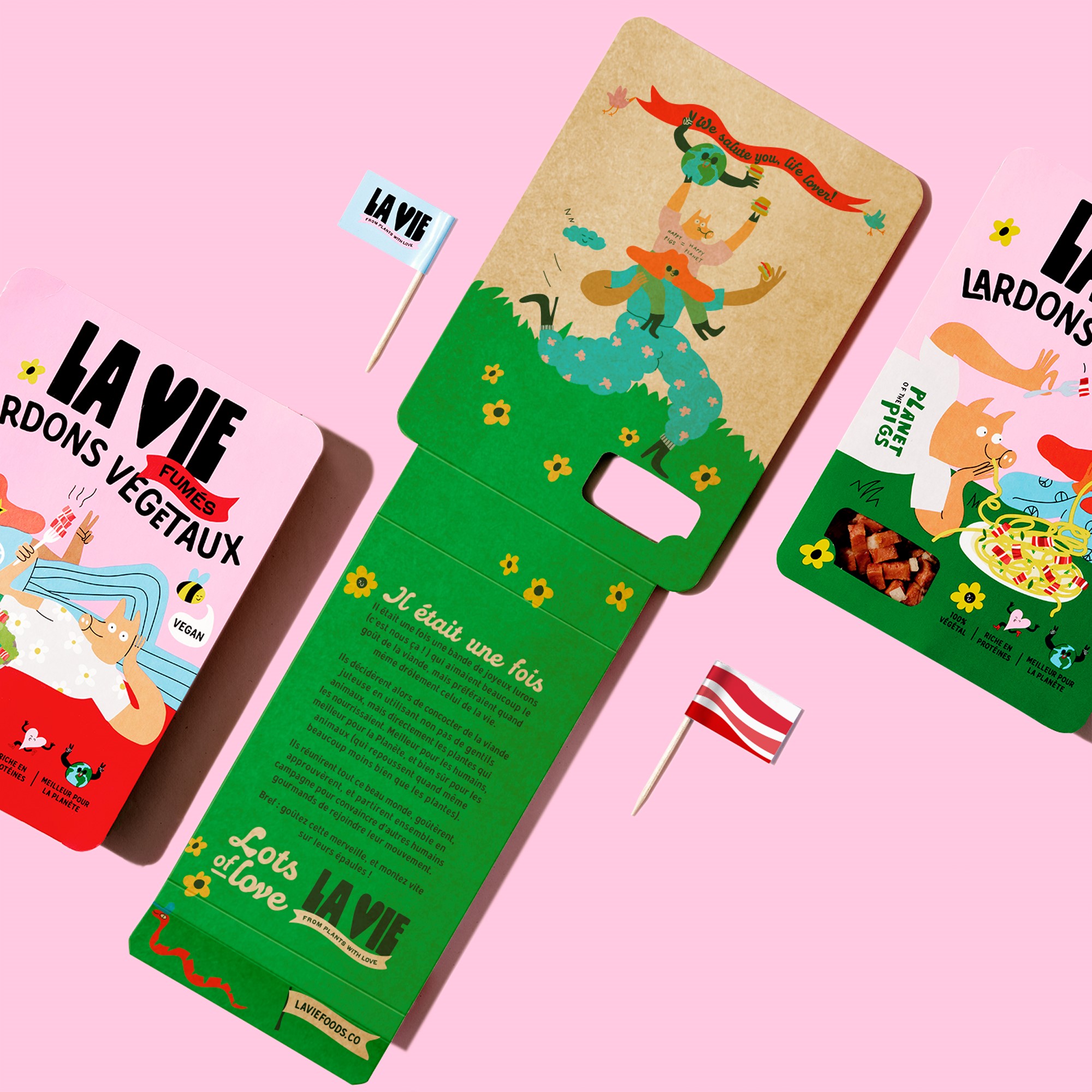
La Vie needed an illustrative style to reflect its warm but edgy tonality. The brand worked with Everland and Lithuanian artist and illustrator, Egle Zvirblytye to create bright and punchy yet humorous designs that would stand out amongst competition.
“Meat alternatives are an ocean of sameness, building on traditional FMCG packaging conventions. It’s mostly pale meat patties, happy, yet boring, colours, generic plant icons and then some equally unnoticeable brand name involving butcher, plant, alternative, or meat,” Carl Johan Larsson, creative director and partner at Everland.
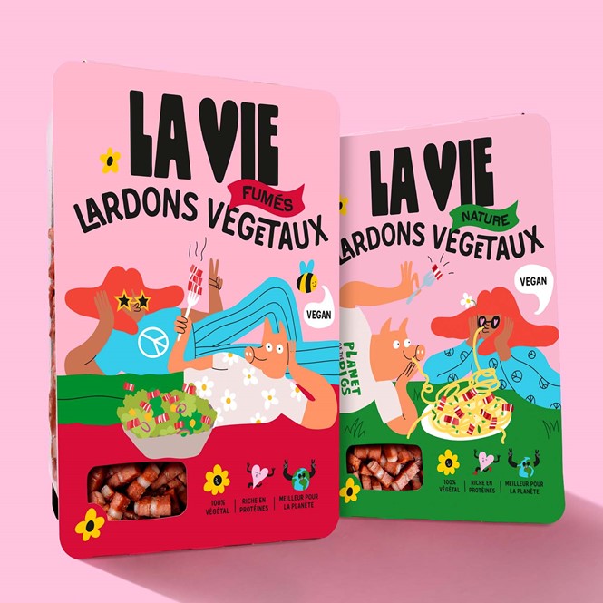
They also created a universe with animal characters and representatives for each type of meat. The first package introduces Mr Piggy and the ever-present Hooman, who lies over a bacon pasta dish.
The colourful illustrations, the typeface and the colour palette all add to La Vie’s mission of celebrating life. The use of two typefaces highlights different aspects of the brand personality. The bold and expressive script typeface aligns with the illustration style, complements the rounded sans serif typeface, reflecting La Vie’s positive attitude.
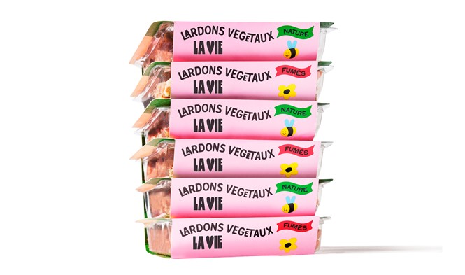
“We chose a colour palette that celebrates life. Pink is positive and powerful and the dominant colour, flirting with the bacon colour. Then we add some green and red to support the main colour and differentiate the products. Finally, some black for contrast and boldness. All in all, it makes a cohesive look that makes you smile and feel energised, just like the food itself,” says Larsson.


