Saboteur develops ‘gravity-free design’ for fintech company rebrand
UK brand studio Saboteur unveiled a new rebrand for London-based financial data company Quant Insight (Qi), which uses mathematical models from the Science of astrophysics to decode the torrents of macro data that come through the financial markets.
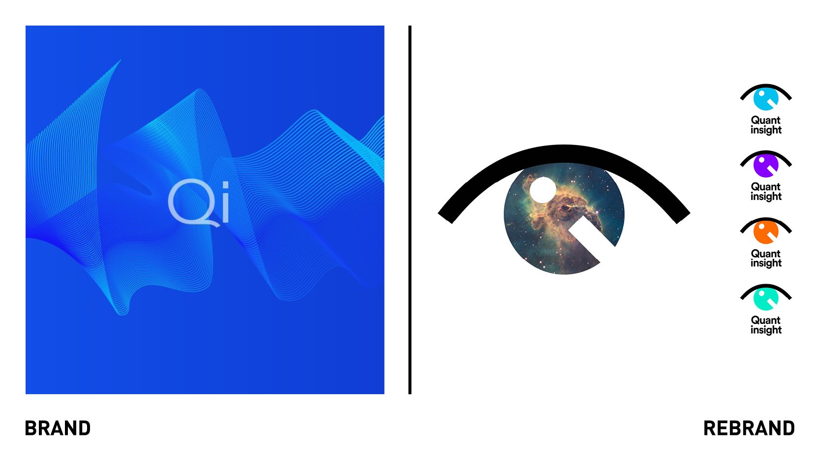
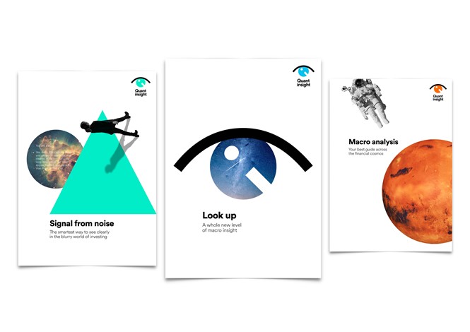
Saboteur started by identifying Quant Insight’s core brand idea and narrative. It quickly became obvious that the new idea should be expressed in a brand that didn’t look or sound like anyone else. They developed ‘Look Up’ as the brand’s strategic heart. The style Saboteur developed for the visual identity is described as ‘gravity-free design,’ where none of the normal rules apply. The aim was to develop something, iconoclastic, and at the same time, clear and simple.
"We needed a brand redesign that could capture and reflect the way we are pushing boundaries in the financial data world. Saboteur was able to see our vision and have translated our complex world into something eye-catching, brave and elegant. A brand redesign which is out of this world,” says Mahmood Noorani, CEO of Quant Insight,
“Websites can look like they were designed in Excel – Quant Insight were clear from the beginning that they wanted their brand to be as different as the pioneering technology they’ve created. Elements float and drift in a seemingly random fashion. But, of course, there is pattern here. All you have to do is look up,” says Alex Clegg, co-founder of Saboteur.
The redesign has the flexibility to be used to pivot the brand to a B2C proposition.


