ROOK/NYC designs new packaging for 88 Acres
Creative agency, ROOK/NYC, worked with 88 Acres, a seed-based, allergy-friendly snack company, to evolve and elevate the brand’s identity and packaging design. The aim was to adapt 88 Acres to the rapidly changing culture and consumer behavior.

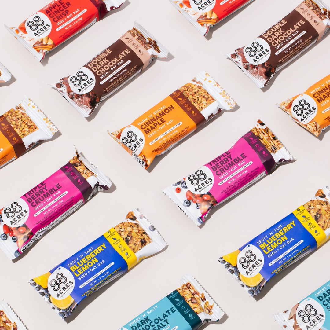
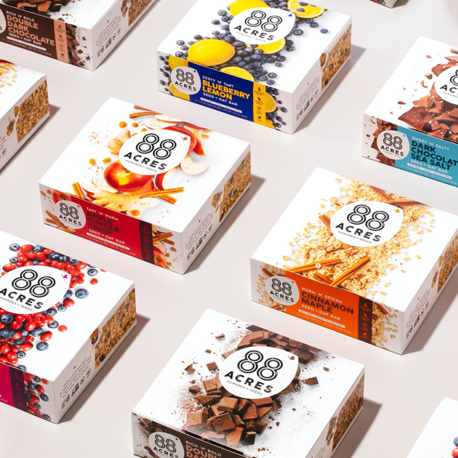
The goal of the project was fourfold: drive taste appeal, set product expectations, educate and drive trial. To drive taste appeal and set product expectations, ROOK/NYC incorporated new ingredients and product photography, with the aim of helping consumers to quickly understand what the product is made of.
The evolved color palette speaks directly to category flavor cues, while the logo was placed in a seed-shaped holding icon. The new logo design aims to emphasise that seeds are the foundational ingredients with which all of 88 Acres’ products are made. The language and product descriptors on the packaging is simpler, with a stronger, more playful brand voice that seeks to reflects familiar, tasty, home-cooked terminology.
88 Acres chose to retain both their existing logo and the leading colour of each stock keeping unit to maintain brand and flavour recognition for their current, loyal consumer set.
“Through our long-term relationship, the brand has seen enormous growth, despite the economic challenges of 2020, and this redesign will be a big step in helping 88 Acres to grow beyond the natural channel into more of an iconic mainstay in the conventional snacking category,” says Mark Christou, founder and creative partner at ROOK/NYC.