Renault refreshes timeless diamond logo
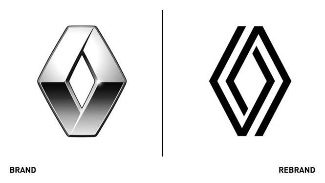
The geometric diamond-shaped logo has embodied French automaker Renault since 1925, making the brand instantly recognisable around the world. However, the latest version of the Renault emblem was beginning to date. Renault developed a new version of the timeless logo to meet the challenges of a modern international brand, but also embrace its different touch-points, including the digital one.
The new, vibrant and modern logo was created to both pay homage to the brand’s heritage and look towards the future, towards a new area, making Renault a more open brand that creates human values.
“It’s a simple geometric shape, with a strong, powerful identity; the challenge was to renew this shape by giving it meaning, new, contemporary values to project the brand into the future,” says Gilles Vidal, Renault design director.
First unveiled during the presentation of the 'Renaulution' strategic plan and integrated on the grille of the Renault 5 Prototype., the universal geometric shape is a ‘true timeless signature’ and an essential part of the brand’s ’graphic heritage.’
“With the line [of the diamond] it is a question of telling a story, that of a symbiosis, a cycle, a path between two lozenges which are intertwined by an optical effect, creating a complementarity and the impression of continuous movement,” says Vidal.
Uncluttered, with no signature or typography, this new logo has been designed to live in movement. The flat treatment facilitates its animation, for example on video or digital media, but also on vehicles, for their welcome sequence.


