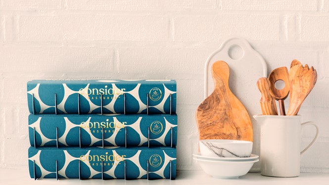
Pearlfisher brand identity for Consider Pastures gives product ‘pride of place’

Creative agency Pearlfisher New York partnered with sustainable eggs company Consider Pastures to develop a brand strategy and design that matches the brand’s mission to provide the best nature has to offer. The overall look aims to give the product pride of place, whether it’s on the farms or in the kitchen.

The revival of the classic carton is for Pearlfisher a commitment to doing things elegantly and choicefully. The geometric egg pattern that is introduced on the top of the pack and carried through on the side panels celebrates the naturally large and imperfect shape of the egg. The pattern also creates a ‘wallpaper-like’ appearance when the cartons are stacked on-shelf or in ones kitchen.
The brand’s monogram is inspired by the Greek alphabet’s Phi symbol and the golden ratio, which suggests that the brilliance and infinite detail that naturally occurs in nature is the ideal standard for beauty. The monogram, ‘hand-gathered’ seal and embossed messaging parallel the hand-crafted approach to raising and sourcing eggs through the packaging design
The warm colour palette of golds, blues and whites and other discoverable details found within the packaging enable the design to go deeper than the surface.


