Hcma rebrands to reflect evolving role of buildings in society
Vancouver-based design and architecture firm hcma, has rebranded to reflect the changing role of buildings, brands and shared experiences in society. Through the new visual identity, hcma seeks to reinforce its commitment to strengthening community bonds through design, and working with people to create positive, measurable change.
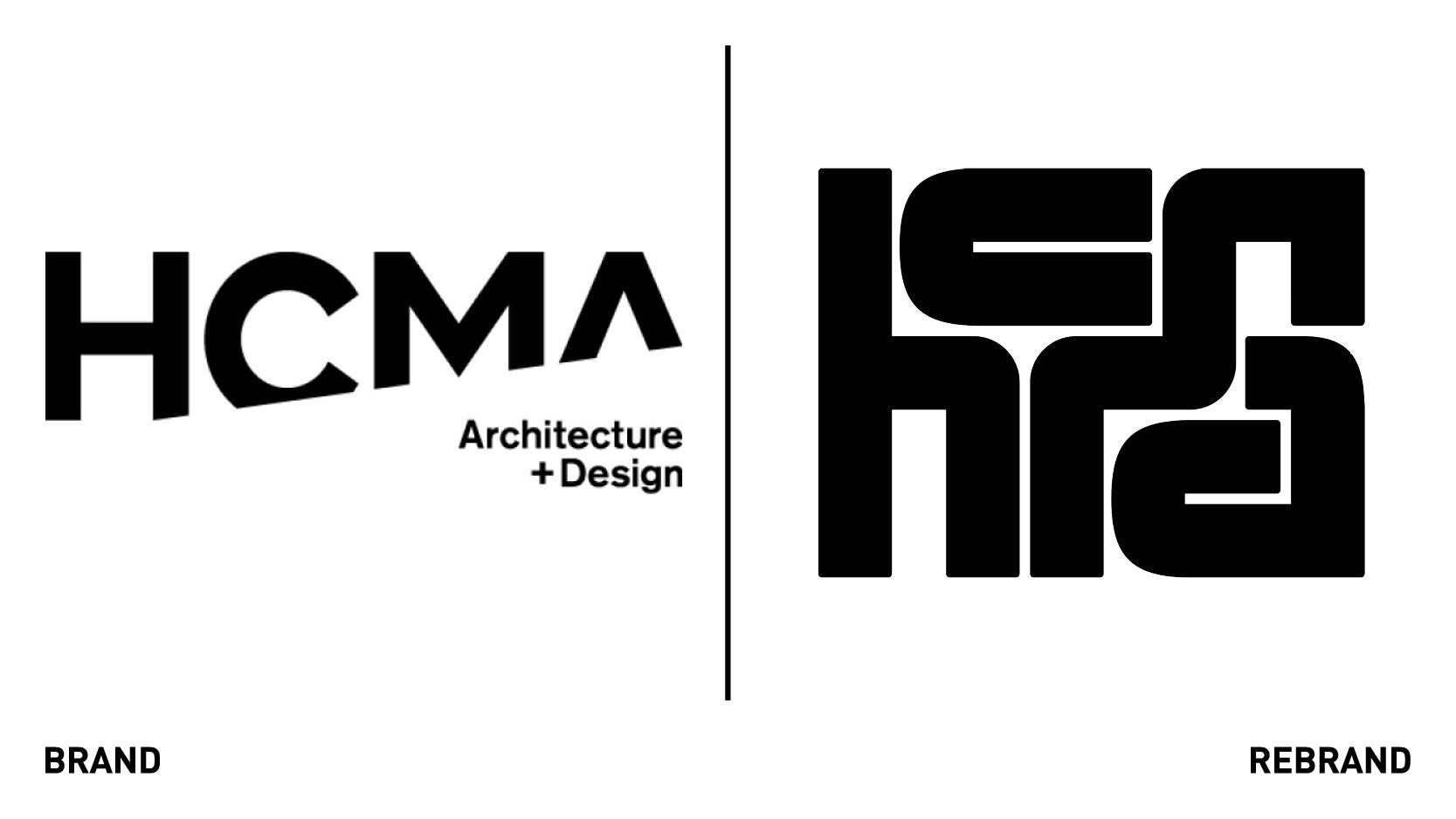
Hcma has dropped the ‘architecture + design’ from its wordmark to break from the conventions of its architecture roots and reflect the development of its interdisciplinary design capabilities.
“The hcma rebrand and evolution of our communication design offer reflect the need for architecture to look beyond itself for answers to the rapidly changing needs of people and spaces. We are making the design process as accessible as the spaces we create, inviting people into the process so together, we can create lasting change,” says Darryl Condon, managing partner at hcma.
The new identity moves away from the stark visual conventions of the architectural world in favour of warmer, more approachable look and feels that is rooted in the moments of connection between people from different backgrounds working together.
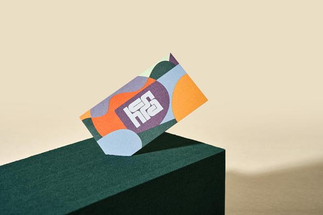
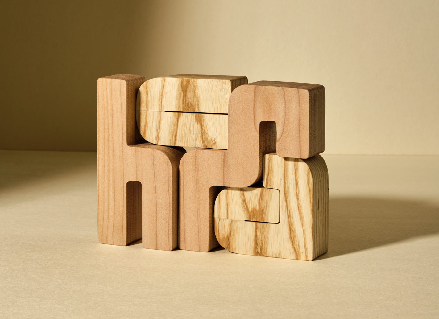
The dominant strong outer rectangle of the wordmark is formed through disparate, unique letterforms, each playing its own key role in establishing balance and flow. Together, they form an analogy of hcma: a collective of unique individuals, with their own strengths and curiosities, that create a total greater than the sum of its parts.
A core neutral colour palette pairs harmonious hues, tints and shades, with highlight colours, while a composition pattern of silhouettes , humans, objects, and nature, symbolises the overlaps between projects, learning cycles, and disciplines. A photojournalistic photography style makes people the focus, showing the moments of real life that happen in and around the spaces hcma creates.


