#NewBrandMonday: 29 March
Here are this week's selection of newly launched brands from around the world. For more from #NewBrandMonday, follow @Transformsays on Twitter.
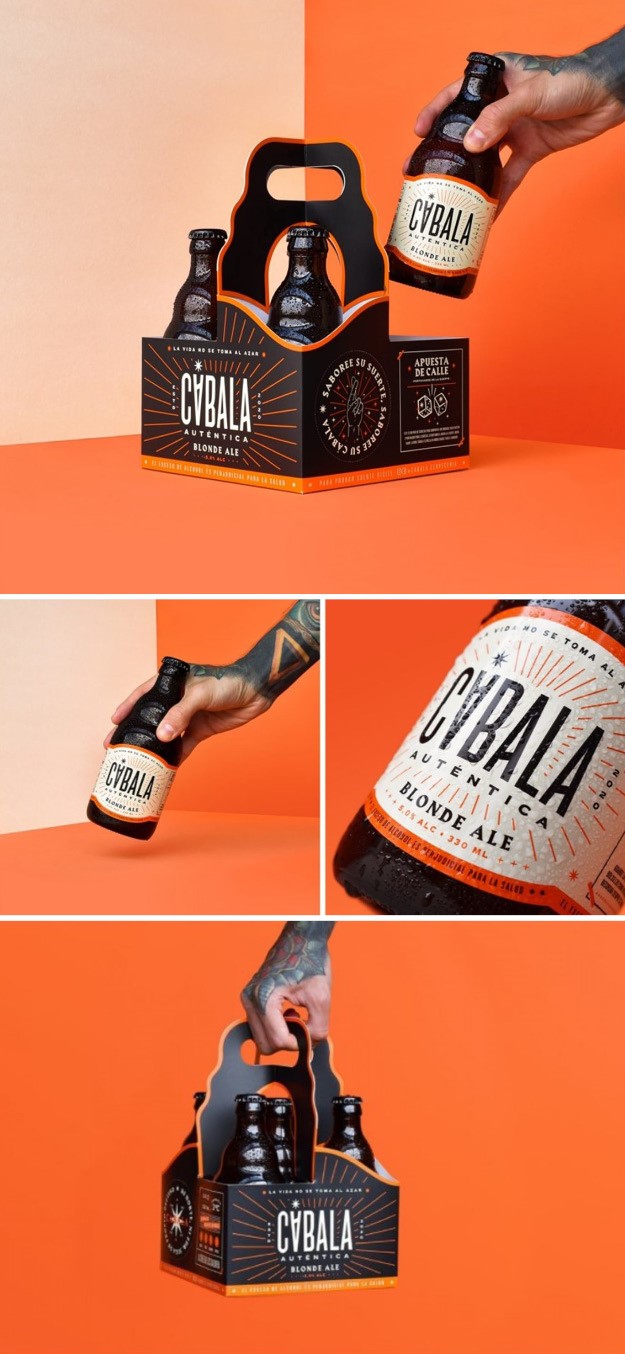
Cabala
Design agency Hobby designed a new beer brand, Cabala. Hobby took inspiration from the popular ritual of sharing a beer in the street, at the table, at home or in front of a church. The challenge was to create an identity removed from the traditional brewing world, while giving a deep and suggestive personality to an old and universal drink. The goal was to create a distinctive packaging, from the bottle to the pack of beers. The starting point to the beer were the popular myths and amulets (cabala) that are expressed through people, places, objects and anecdotes. The brand aims for the drink’s story to be rooted to what happens on the street, in the neighbourhoods, the urban tribes, the underground and in the ‘unknown’ world.
The five-pack was chosen to intentionally stand out, accentuating the fact of wanting to break paradigms and schemes within the category. The colour palette is centred around a vibrant orange, which contrasts with the black text and the brown bottle. The construction of the logo proposes a hidden message: the upside down ‘A’ refers to a change of destiny and a glass of beer.
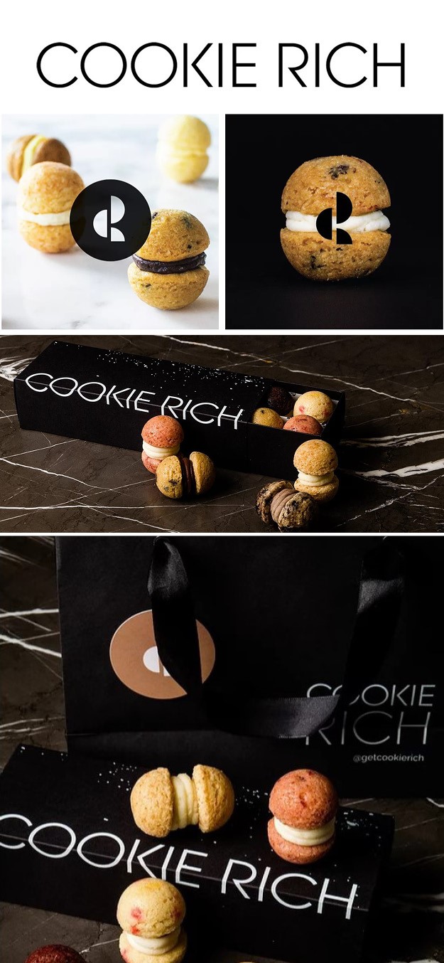
Cookie Rich
San Francisco based design agency Hope Meng Design developed a brand identity and packaging for Cookie Rich, a new brand that reimagines the classic cookie. The cookies are luxurious and slightly whimsical and a nod to macarons but stick to natural colours in their dough. The packaging is black and white, communicating the brand’s modern new way of offering a cookie. The custom wordmark emanates sleek minimalism and the CR monogram is a play on the shape of the cookie. A splatter of flour adds a touch of whimsy, while alluding to marble, giving the packaging an edge.
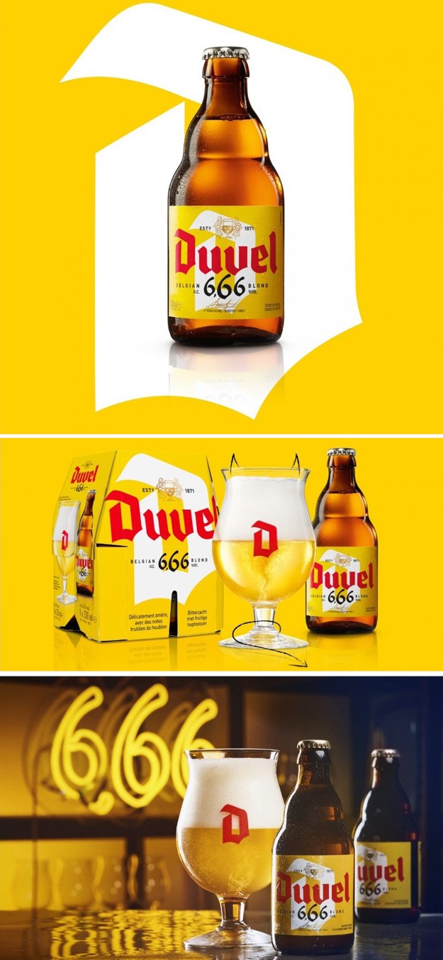
Duvel
Brand and packaging design agency Quatre Mains designs Duvel’s new beer brand Duvel 666, a lower percent alcohol beer of 6.66%. The decision to add a new beer to the Duvel portfolio came from increasing pressure to diversify and attract new customers. This more diverse and easy-going product is tailor-made for a broader and younger customer group.
The design challenge was to respect and build on the Duvel design while creating a newness that expresses the unique characteristics of 666. Celebrating the brand’s rebellious side, the background was changed from white to a bright warm yellow and the ‘D’ in Duvel went from red to a crisp white. Balanced with the Duvel red logotype, the brand achieves standout while always retaining the recognisable elements of the master brand.
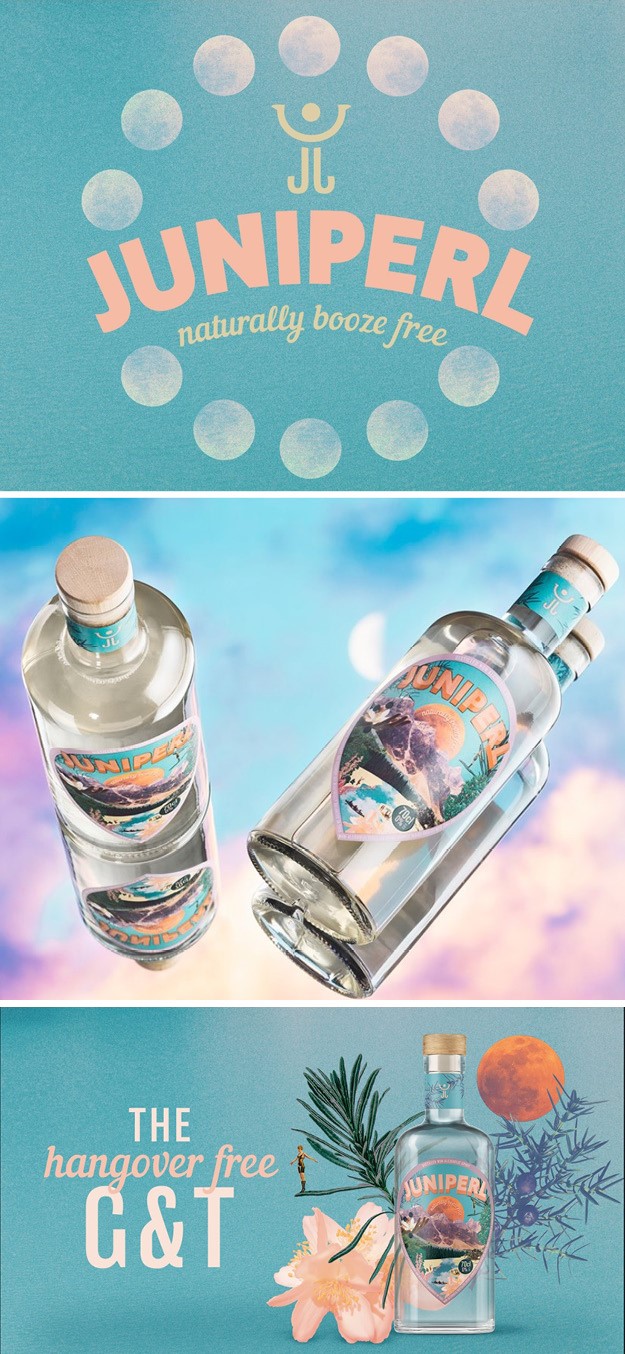
Juniperl
Design agency Kingdom & Sparrow partnered with non-alcoholic gin brand Juniperl to help them stand out in the fast-growing low and no ABV spirits category. The goal for the brand was to communicate a sense of joy and activity with a contemporary feel-good identity. Kingdom & Sparrow combined light-hearted messaging and a modern colour palette consisting of turquoise and orange with playful collage elements depicting flavour cues and people outside enjoying themselves in nature. Tactile finishing elevates the premium, reinforcing the market position while keeping it accessible. The result is a fresh look and feel that equally has a place on millennial drinkers’ Instagram feeds as it does on their shelves at home.
“The team at Kingdom & Sparrow completely got our brief. Their ideas were so creative and different and they’ve really made our brand stand out against others,” says Rebecca Strange, founder and director at Juniperl.
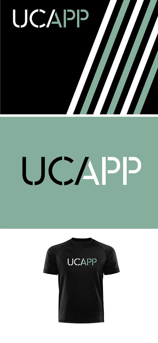
UCAPP
Design agency Offthetopofmyhead developed a new visual identity for the University of Cambridge Athlete Performance Programme. The challenge was to create a logo that represents a high-quality programme and also focuses on the merging of academia and sport. As part of UCAPP’s graphic identity, Offthetopofmyhead developed the A stroke into multipurpose graphics to support the logo and bring energy to an assortment of collateral, such as stationery and sports clothing. The colour palette is a striking combination of black and the famous Cambridge blue.
“Stencilled letterforms are traditionally associated with sport. Our stencil-inspired logo, with its two-tone letter A, captures the coming together of academic and athletic careers. The A is also used as an independent icon in social media, and on merchandise and promotional items,” says John Spencer, founder and creative director of Offthetopofmyhead.