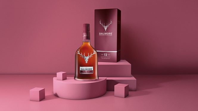
Butterfly Cannon redesigned The Dalmore’s Principal Collection
Single malt Scotch whisky brand The Dalmore wanted to build on the success of its core Principal Collection and inject modern luxury cues to set it up for its next phase of growth. The Dalmore worked with London-based creative agency Butterfly Cannon to redesign the collection in a way that would capture all the distinctions of each individual expression within the collection while establishing consistency across the range.
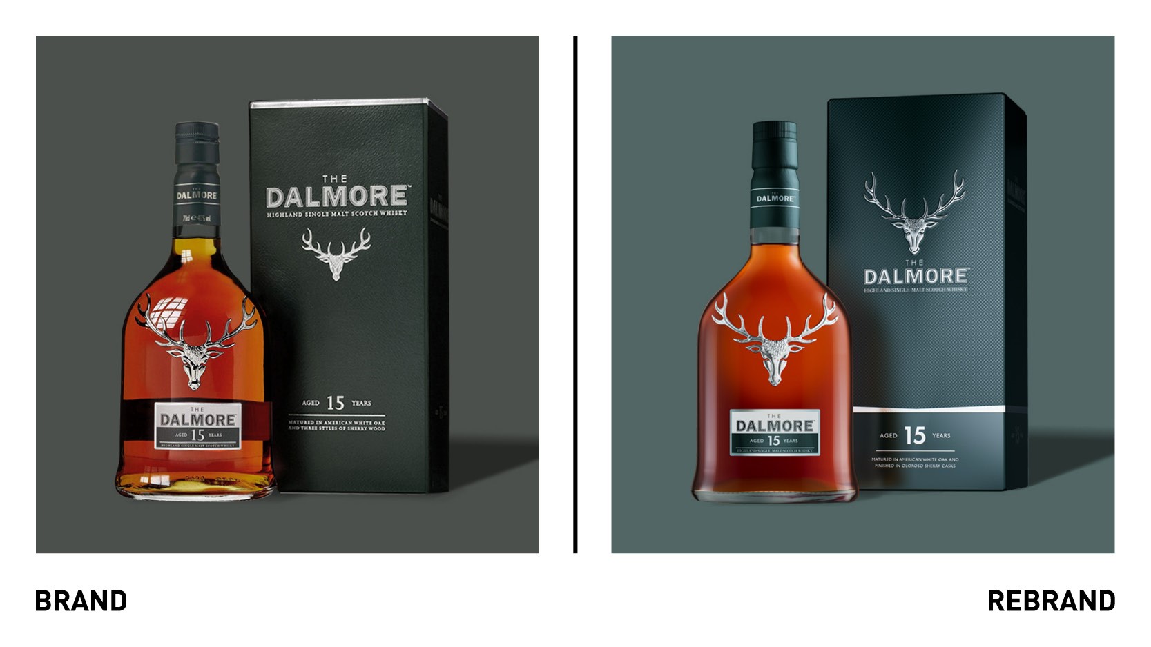
Butterfly Cannon’s approach was to take contemporary design cues from outside of the single malt category and interpret the finesse of the products in an distinctive way. The redesign is centered around the royal stag, a symbol of noble origins and a key brand asset. With embossed detailing, the stag is now positioned high on the pack above the word mark, achieving a standout that capture customers’ attention.
The lines of the silver band in the lower half of the box echo the shape of the stag, framing it and delineating the space for brand and product information. The matte texture of the box and motif within the stain silver brand aim to bring a contemporary tactility to the packaging.
Across the range, the original colours have been subtly enhanced through the use of micr-embossed texture and satin finished, modernising a traditional palette. On the label, the use of bespoke fonts emphasizes the age statements.


