#TransformTuesday: 19 May

Here's this week's selection of rebrands from around the world, from housing companies to online games. For more from #TransformTuesday, follow @Transformsays on Twitter.
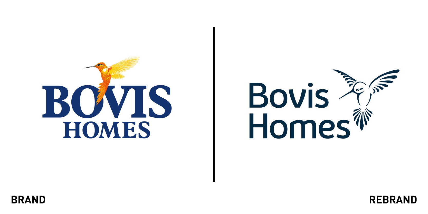
Bovis Homes
Bovis Homes, one of the UK’s leading home builders, worked with design agency The Team to redesigned its brand identity, including its iconic Hummingbird logo, to reflect a traditional house builder with a modern look that can embrace new digital channels. To do so the Team began with redesigning the iconic Hummingbird logo to be more open, meeting the demands of digital platforms, while also working well in print, and on merchandise. The new logo includes a modern wordmark and a palette centred around bright yellows, azures and neutral colours. The Team also introduced a customised typeface, Bovis Sans, which is easily legible in both digital and print formats. “Reflecting our heritage and presenting the business progressively is a critical requirement of our brand. The work we did with The Team is a ‘once in 20 years’ exercise’ and not only does the work look great, the responses to it have been extremely positive whilst we transition the full roll-out and activation of the new look,” says Kevin Wilkins, group marketing director at Bovis Homes Limited.
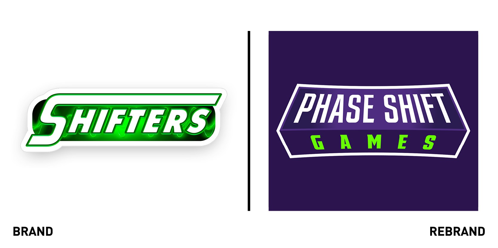
Phase Shift Games
Tabletop game publisher Phase Shift Games worked with US design agency, Walk Design, to launch a new logo design that better represented their growing brand in the tabletop games world. While the old logo was a play of words, the new one is more clearly identifiable with the brand, regardless of which individual game it’s seen on. It is also three dimensional, eluding to the infinite dimensions and possibilities there are in the Phase Shift games. “We had many versions that were pretty busy and literal, but ultimately we decided to go with a cleaner approach that allowed for more flexibility when shown with the individual games themselves. I am very proud of the end result. It’s a really clean, sharp logo that is very understated but also shows strong technique and tells a story,” says Matthew Walker, senior product designer at Walk Design.
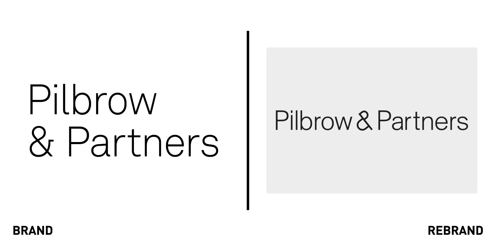
Pilbrow & Partners
London architects Pilbrow & Partners worked with design consultancy Greenspace to launch a new brand identity that captures the spirit and strengths of its founder and partners. To encapsulate the passion and energy of its founder Fred Pilbrow and the technical excellence of its partners and team, Greenspace created the concept of ‘The power of &.’ Rther than focusing on ‘either,or’ the ‘and’ showcases all the aspects of design Pilbrow & Partners focuses on when working on a project.This provided the creative platform for a new, more confident tone of voice for the practice alongside a more distinctive visual identity for its communications. “We were all inspired by the strategic idea “The power of &” and from this created a simple, ampersand-inspired symbol comprised of two conjoined letter P’s, distilled from the practice’s name, Pilbrow & Partners. This led us to a develop a rigorous type-driven approach to communication that combines complementary design principles like; sophistication and playfulness, tradition and modernity, surprising and grounded," says Greenspace's founder Adrian Caddy. The new Identity has been developd across a number of creative applications, in both digital and print.
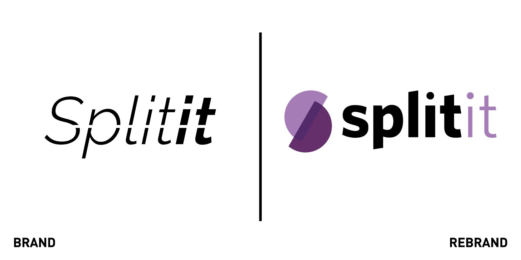
Splitit
Splitit, the only global payment platform that enables shoppers to pay instalments via their credit cards, worked with New-York based marketing firm Ricciardi Group to unveil a new brand identity that is more reflective of the current marketplace, as Splitit works to take on competitor brands like Affirm and Klarna. To do so, Ricciardi Group focused on Splitit’s unique feature that allows hoppers to use their current credit cards to pay over-time with no interests or fees. This enables smarter use of customers’ existing credit, allowing them more control over cash flow, which led to the creation of a new brand identity that centres around the straplines ‘Split payments in Split seconds’ and ‘We have no interest in interests.’ The new brand mark, in addition to the purple colour-theme, acts as a visual portal to focus shopper’s eye on the items they might choose to pay over-time using Splitit.
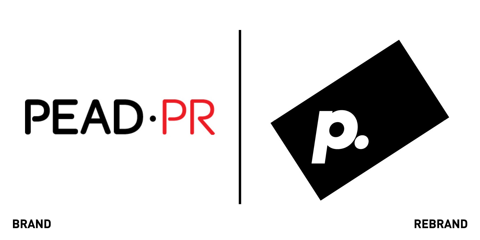
We Are Pead
New Zealand PR agency Pead has rebranded to We Are Pead, in hope it would reflect what people working in PR do as communicators, which is much more than just media relations. The new visual identity, which includes a bright colour palette, is dynamic and fresh and challenges the traditional agency landscape and marketing framework. This is especially true now during the Covid-19 pandemic, where the working landscape is changing completely.“For too long, we’ve allowed PR to be boxed in narrow terms that suit our competition. It’s time for that to change; today a PR agency is the best placed to fully develop and activate campaigns that push boundaries and embrace the flux of the world,” says Deborah Pead, founder & CEO of Pead PR.
This new position is further emphasised by the new strapline ‘provoke action’ through with compelling ideas that cuts through the chaos, demonstrating cultural relevance, intelligence and creativity – across media, content, digital, social, stakeholder engagement, events and activations. The new identity includes substantial investment in video content, an internal communication programme, and a brand-new website.


