Typographic expression inspired by London's sounds for DixonBaxi and Fontsmith
The goal was to come up with a typeface that would go against clichés and would produce an unexpected result, showcasing a modern application of a traditional design. Fontsmith's idea of London, with its diverse cultures and contrasting energy, results in a symphony of noise. The ‘Sounds of London’ was a concept born out of this idea.
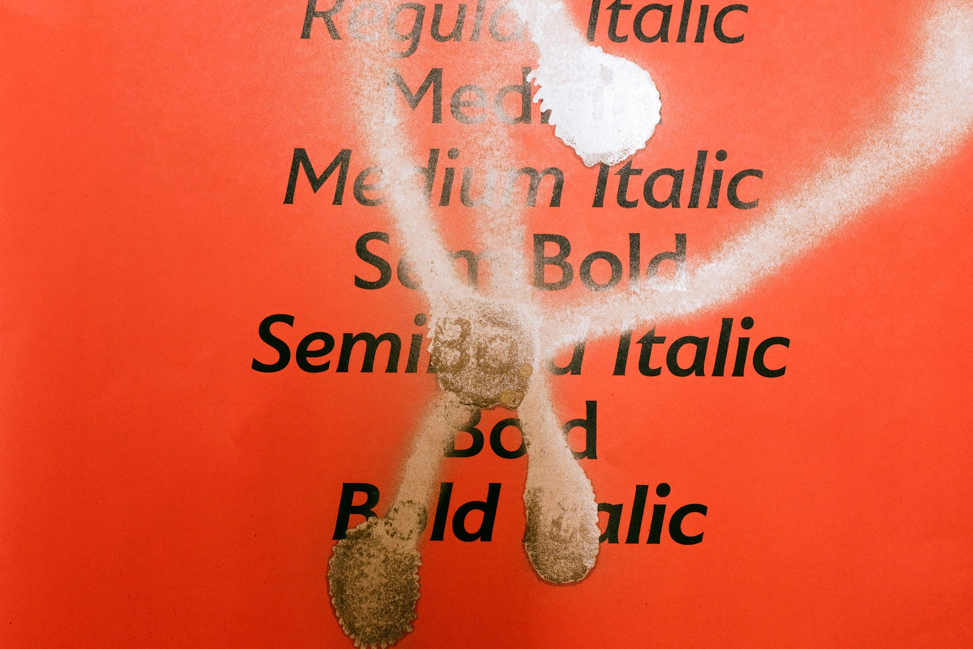
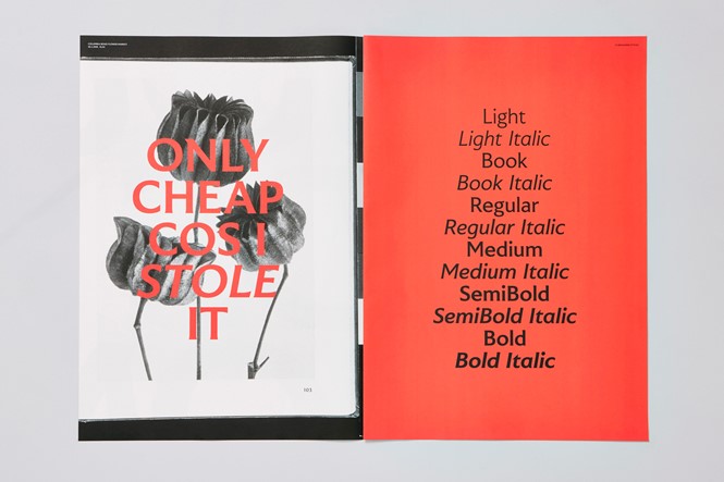
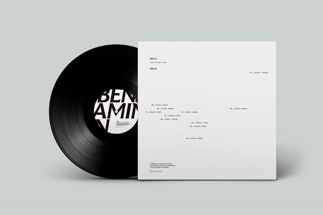
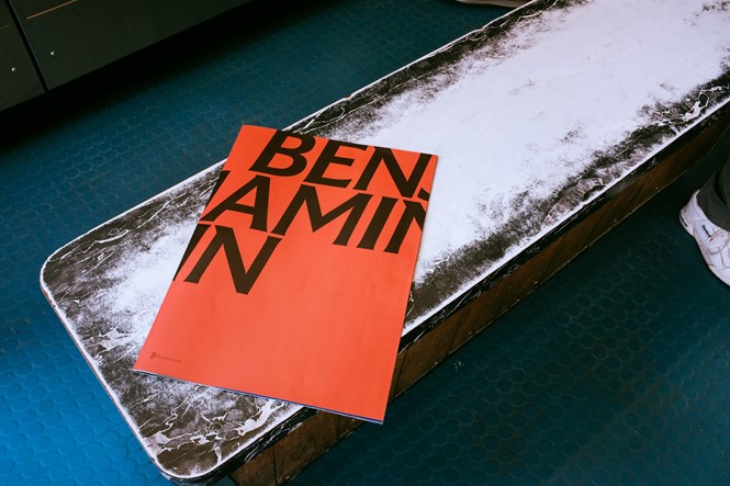
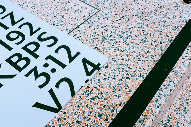
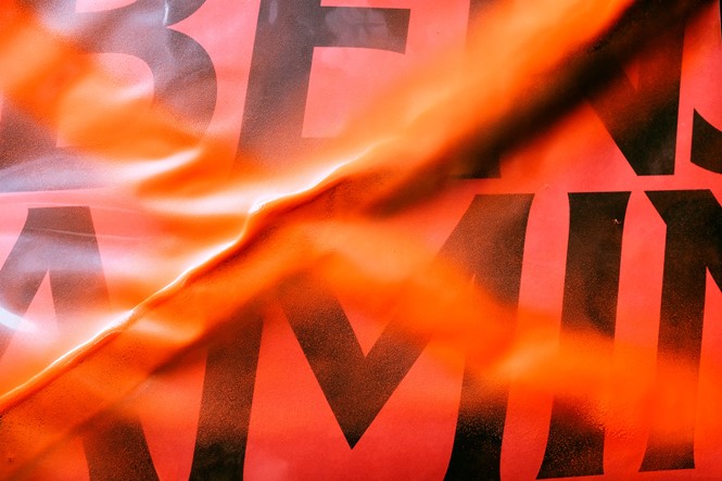
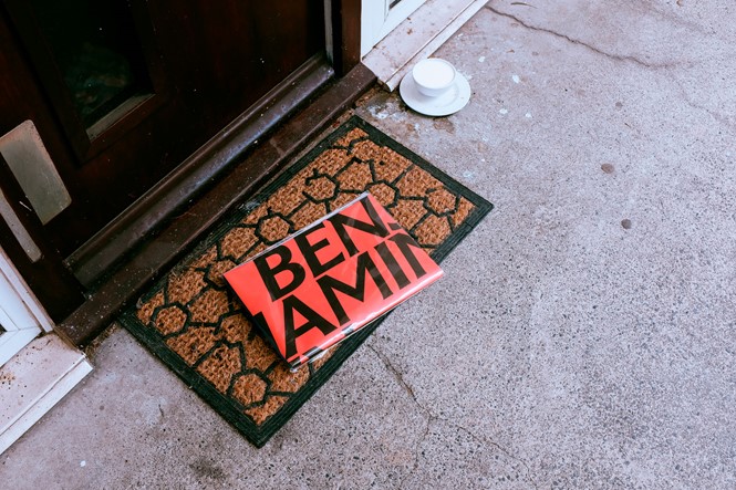
Drawing inspiration from the beautiful city of London, Fontsmith has designed a new flares serif typeface under the name of FS Benjamin that incorporates 12 styles, including light, book, regular, medium, semi-bold and bold with italics.
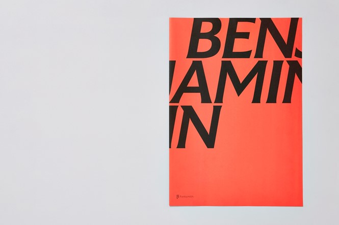
The typeface’s name references Big Ben, while the font itself is a reflection of the contrasts of London. FS Benjamin was designed by senior type designer Stuart de Rozario with creative direction from Fontsmith founder and creative director Jason Smith.
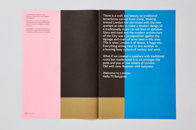
Smith says, “Much of the typography we see today is so similar. I thought what if we created a typeface with traditional roots but modernised it to sit amongst the punk and noise of the streets of London. Old with new. Business with busyness. This is what London is all about. A huge mix. Everything sitting next to one another in a buzzing busy culture of society and work.”
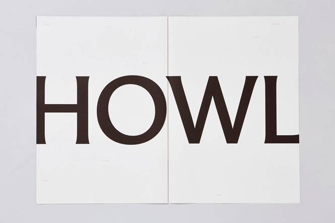
The typeface features simple, thin fonts with sharp angles giving a startling futuristic feel. This way, a quite traditional typeface takes a contemporary turn, allowing the typeface to work well in a digital setting.
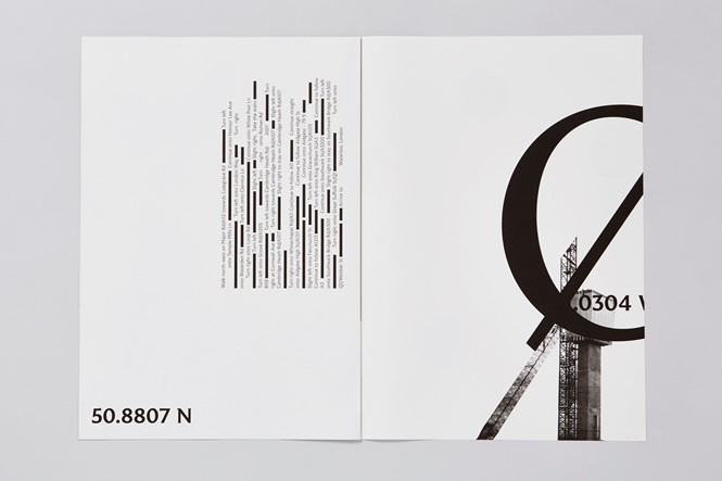
In preparation of the typeface design DixonBaxi’s team went to the streets of London to capture its unique sounds for a few weeks, managing to capture a blend of sounds, noises and scraps of everyday conversations at different times of day.
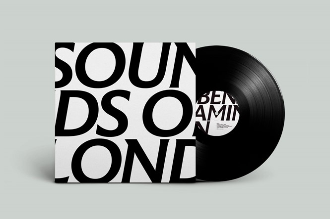
The mixture of sound DixonBaxi’s team managed to capture was made into a track that was then pressed into a limited-edition vinyl, in collaboration with creative music and sound company, Zelig Sound. The cover artwork has the words ‘Sounds of London’ written on it in FS Benjamin, while the reverse shows where the exact spot where recording took place laid out on a London map.
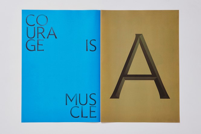
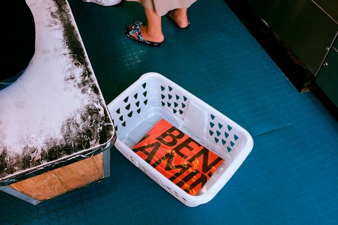
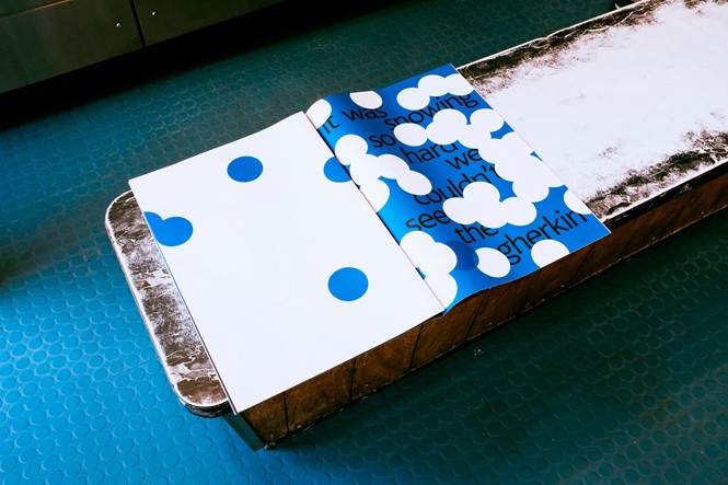
A wide-ranging colour palette was chosen in an effort to combine tradition with a modern outlook, while the layouts are intentionally free of structure to signify the rustic side of the London. DixonBraxi also partnered with London-based print company Push Print, to produce packaging that would offer their audience a satisfying experience, both visually and tactilely.
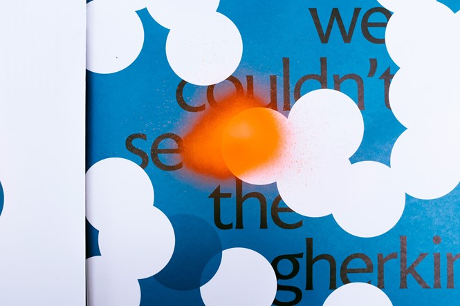
The vinyl includes a large-format unbound booklet, in which the sounds, and the conversations have been transcribed and printed in FS Benjamin, testing its flexibility and limits through a variety of expressions, from quiet to loud and from ambient to conversational.
For more from Transform magazine, follow us on Twitter @Transformsays.