#TransformTuesday: 6 February
Every week, Transform examines recent rebrands and updated visual identities. This week’s picks are below. For more from #TransformTuesday, follow @Transformsays.
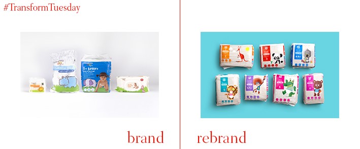
Co-op baby care
Leeds, UK-based branding agency Robot Food has partnered with children’s illustrator Jim Field to create a new brand and packaging design for Co-op’s baby care range. Employing its signature ‘challenger brand’ aesthetic, Robot Food uses Field’s illustrations to create a narrative across the baby products range, staying clear of the cliched tropes of smiling babies inherent to many nappy brands. Julia Allan, senior sesigner at Robot Food, says, “We wanted to be on the same side as mum or dad. A lot of us our new parents as well and have all felt the pressures that come with the role. The last thing we wanted to do was project this unrealistic expectation of ‘perfect parenting’ – the category needed a wake-up call.”
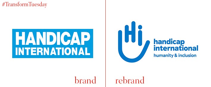
Handicap International (Humanity & Inclusion)
Joint recipient of the 1997 Nobel Peace Prize for its work in clearing landmines, international charity Handicap International specialises in landmine clearance and peace advocacy. This is as well as helping vulnerable populations in developing countries. The launch of its new name and logo, designed by Canadian marketing communications agency Cossette, aims to better reflect the charity’s aims and move away from the word ‘handicap,’ which can carry negative connotations in the English-speaking world. HI’s updated logotype, which includes a splayed palm in a ‘hello’ greeting, implies the organisation’s friendliness and ability to help. Jeff Meer, executive director of Humanity & Inclusion in the US, says, “’Inclusion’ reflects one of the core ambitions that has driven our actions for 35 years – the inclusion of people with disabilities and vulnerable people who are so often overlooked. We value difference and fight exclusion. This name helps to show that.”
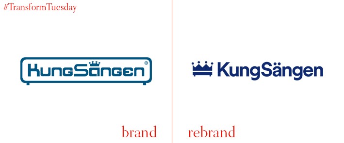
KungSängen
Bed and mattress warehouses are traditionally fairly bleak places, the preserve of boring Sunday afternoons out. So, with ‘KungSängen’ translating to literally ‘the King’s bed’ in Swedish, it was fitting that Stockholm-based mattress manufacturer KungSängen rebranded to reflect its premium offering – and ensure its visual identity matched the brand promise. In a project led by Stockholm-based brand design agency Ström & Jag, the new brand for KungSängen uses a deep blue, highlighting its allusions to royalty. The agency has combined a crown and bed to create a new icon for the brand, putting quality at the forefront of KungSängen’s offering.
Mornflake
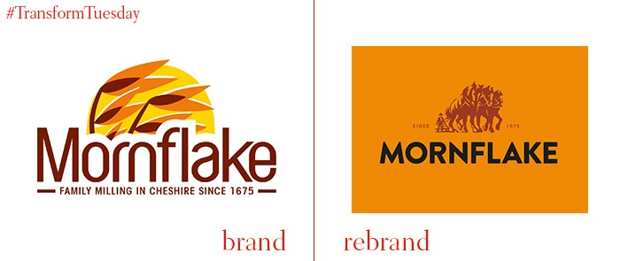
Launched in 1941 in Cheshire, UK and still going strong, Mornflake is a subsidiary of large UK company Morning Foods. A bold new rebrand of Mornflake, recently launched by London-based design agency B&B Studio, celebrates both the cereal’s unique longevity and its commitment to providing high-quality, healthy oats. Strength and character is reflected in its updated logo which, copied from an original illustration, depicts Flossie, Bonnie and Metal – the horses that milled the company’s oats over a century ago. Shaun Bowen, creative partner at B&B studio, says, “As one of Britain’s oldest brands, Mornflake has a rich history and a great story to tell. We worked closely with the team to communicate this through a hugely meaningful logo, strong brand equities and clear, consistent brand architecture.”
Ovarian Cancer Australia
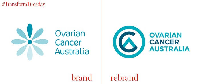
The eighth most common type of cancer in Australia, and the sixth leading cause of death for women in the country, ovarian cancer has seen a push for awareness and funding in recent years. One of the countries leading cancer charities, Ovarian Cancer Australia, has launched a new brand. designed by Australian branding agency Principals, the fresh design draws attention to the charity’s purpose and updates g its icon for a contemporary age of fundraising. Josy Shaw, director of marketing and communications at Ovarian Cancer Australia, says, “Principals has gone above and beyond on this project completing a part of the work pro-bono. We’re thrilled with our new look which conveys we all need to stand up to ovarian cancer, and this is our year to take action.”
Nano
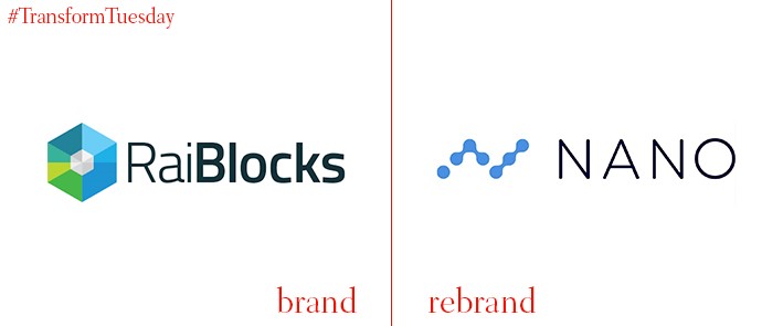
The leading transaction and low-latency platform formerly known as RaiBlocks has rebranded, including a name change, to better reflect its mission and prevent confusion caused by its name. spreading across all its marketing assets, including its digital platform, the new Nano brand comes following an unprecedented growth in the crypto market at the end of 2017. “The Core Team wanted a name that represented the simplicity and speed of the project, and Nano does just that,” explains the company. “The new logo uses several nodes, playing on the block-lattice design of the network, that connect to form a ‘N.’ All social media accounts will be updated to reflect the name and logo changes.”
For more from Transform magazine, follow us on Twitter @Transformsays


