Run like a girl, score like a girl
It’s 2018 and gender stereotypes may finally be a thing of the past. Pink is not defined as a colour for girls and football is no longer a sport exclusive to boys.
With that mindset and the goal to encourage more girls aged seven to 15 to engage with the world's most popular sport, design studio Nomad has undertaken the task of designing a new brand identity for the top three tiers of Football Association (FA) women’s football.
The rebrand was only a slice of FA’s new strategy that aims to reach a wider audience and invite more people to watch or participate in women’s football. Aside from its goal to ‘double attendance figures’ for Women’s Super League games by 2020, the rebrand was also geared towards unifying the three tiers of FA football and achieve consistency within the sport.
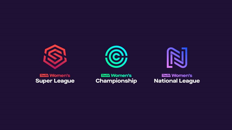
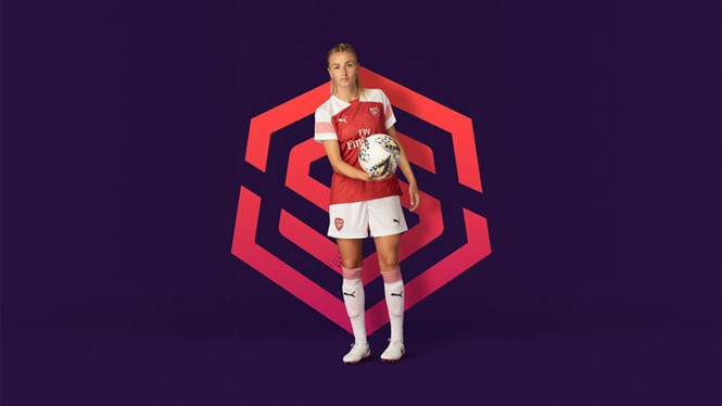
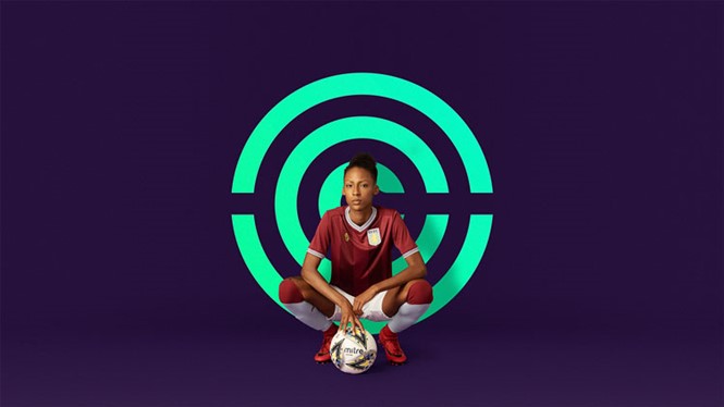
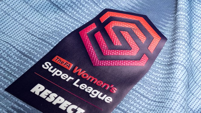
As part of the rebrand, Nomad designed three new logos for the FA Women’s Super League, FA Women’s Championship and the FA Women’s National League, as well as the FA Women’s Continental Tyres Cup. Each logo uses the sport’s monogram designed in an abstract way with the use of multiple lines in a wide variety of colour tones. The Super League logo is a red ‘S,’ the Championship logo is a blue-green ‘C’ made of concentric circles, while the Nation’s league logo is an indigo ’N’ with two intertwining sides.
The three logos are different in colour to be distinguishable from one another and therefore easier to use in wayfinding and communications. However, the colour palettes are designed to complement each other and most commonly appear against purple backgrounds that have textured patterns.
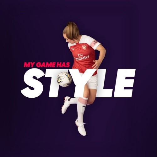
The new brand identity appears across all of FA’s touchpoints and platforms, including sleeve badges on team kits across the three tiers, marketing and communications, as well as merchandise and collateral material.
For more from Transform magazine, follow us on Twitter @Transformsays