Radio 1 rebrands to reconcile heritage with a modern audience
BBC Radio 1 is getting older while its audience stays the same age: enter Mother Design for a branding facelift.
At 51, BBC Radio 1 is home to the Live Lounge, Biggest Weekend and Teen Awards. To keep reflecting its youthful soul, the stalwart station recently enlisted Mother Design to give it a branding facelift. Radio 1’s mandate as BBC’s ‘new’ music station is broad, meaning new collateral crafted by Mother Design for the masses needed to be clear, current and adaptable.
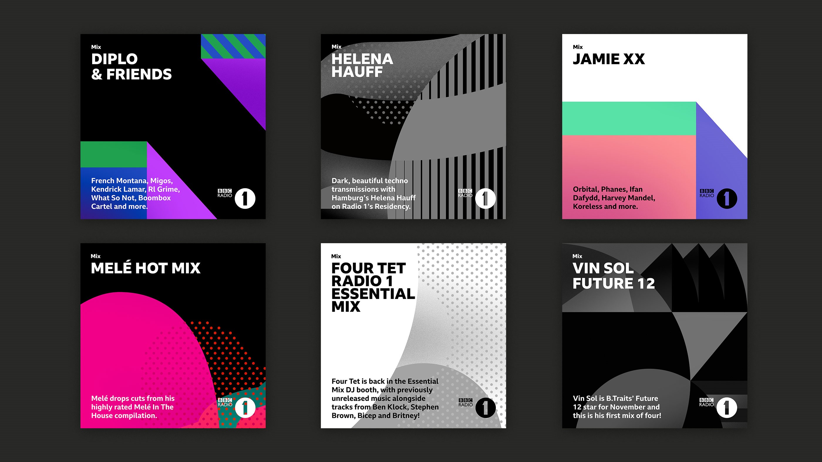
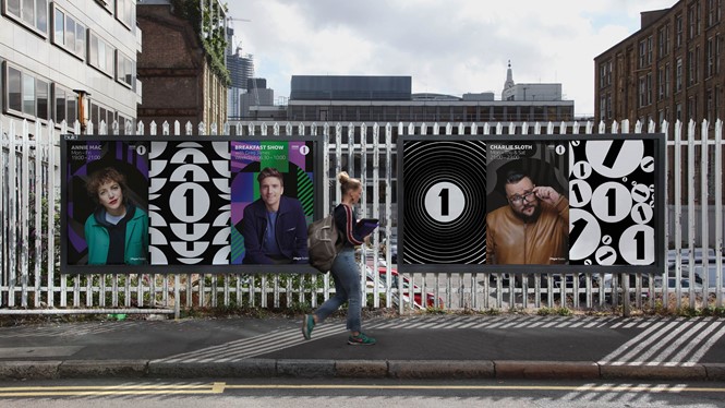
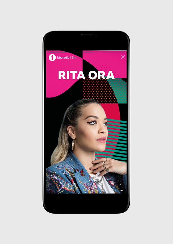
The new graphics include abstract shapes and lines, and bold, saturated colours that are clearly influenced by the late 1980s and early 1990s, balancing the very mod look of Radio 1’s logo.
This work is on-trend but not cutting edge; it likely won’t be long before its colour scheme will be replaced. However, with a remit as wide as Radio 1’s these visuals fit the brief and its layouts will stand the test of time. Though it’s not timeless, youth culture by definition will grow and change. The important thing is that the bones of this new visual identity will be easy to update in the future, and it’s in that skill that Mother Design has shown that sometimes, mothers know best.
As with many creative pursuits, the key to Radio 1’s visual success are the guidelines that keep its visuals consistent and clear. Mother included a comprehensive brand guide when it presented Radio 1 with its new identity graphics and how to use them with the BBC Reith typeface. Radio 1’s new branding collateral is recognisable and consistent across all platforms. It is currently being rolled out digitally, in-print and in outdoor advertising.
For more from Transform magazine, follow us on Twitter @Transformsays