Pearlfisher London creates new brand identity and packaging for Little Moons

With London being one of the most multicultural cities in the world and the UK's food culture growing, customers have developed palettes that always seek for new, exotic flavours.
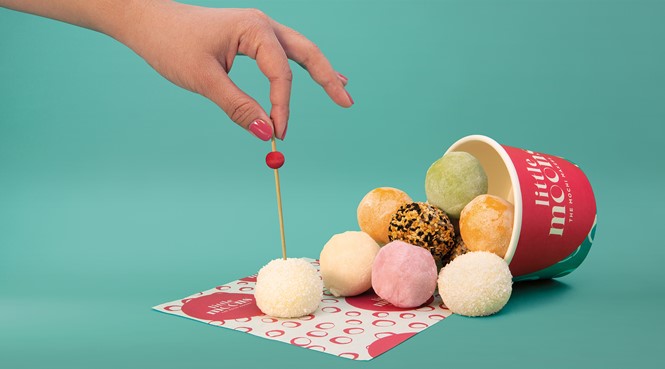
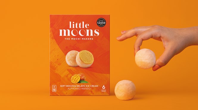
Trying to fulfil customers’ needs, a new brand called Little Moons has introduced handmade and bite-sized balls of gelato ice cream wrapped in mochi, a traditional Japanese rice dough, to compete in the UK frozen treat market.
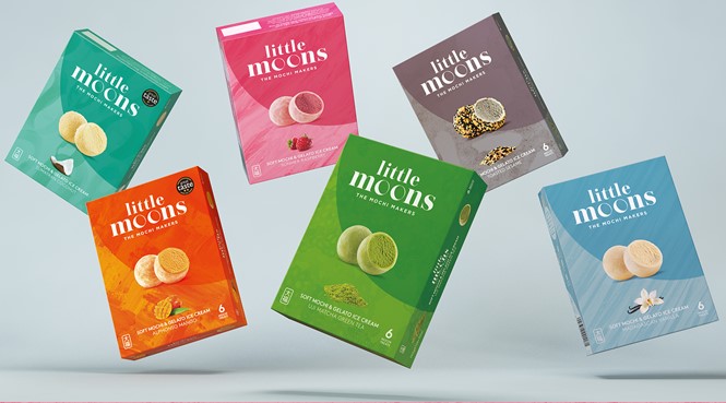
The need for Little Moons to adopt a brand identity derived from its desire to grow and enter the wider European market, following its establishment as a leading frozen treat brand, with presence in Whole Foods, Selfridges, as well as Nobu and Sushi Samba. In addition to a new identity, new packaging was also introduced to Little Moons’ range of products, to unify the ranges of frozen and chilled tsuki mochi.
Howard Wong, co-founder of Little Moons says, "We are thrilled with our new identity. The design had a lot to convey, and Pearflisher has exceeded our expectations with an identity and visual world that is contemporary, educative and artistic, whilst still referencing our mochi making heritage. We can't wait to see it on the shelves and start using the new identity and materials to build the Little Moons brand world and unique experience for our consumers."
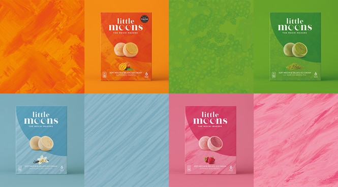
The new brand identity was led by international creative design and branding agency Pearlfisher. Pearlfiher’s design maintained the minimalist approach of the previous identity, enhancing it with a bolder, yet classy expression.
Harriet Ferguson, senior designer at Pearlfisher, says, "We wanted to retain the existing accessible and honest charm of Little Moons whilst elevating the brand into a more distinctive and ownable space. By conveying a world of flavour, texture and colour, we sought to capture the product's taste credentials and exciting proposition as a new way to experience a delicious bite-size treat."
The identity is simple and memorable with the 'o' of the word ‘Moons’ resembling the shape of the mochi. The focal pattern of the visual identity is a hand-drawn crescent moon. The tagline used, 'Enjoy the little things,' reflects the company’s core message, while the bright colour palette is designed to represent intense feeling the flavours of the range evoke.
For more from Transform magazine, follow us on Twitter, @Transformsays.


