McCormick spices things up in new pack designs
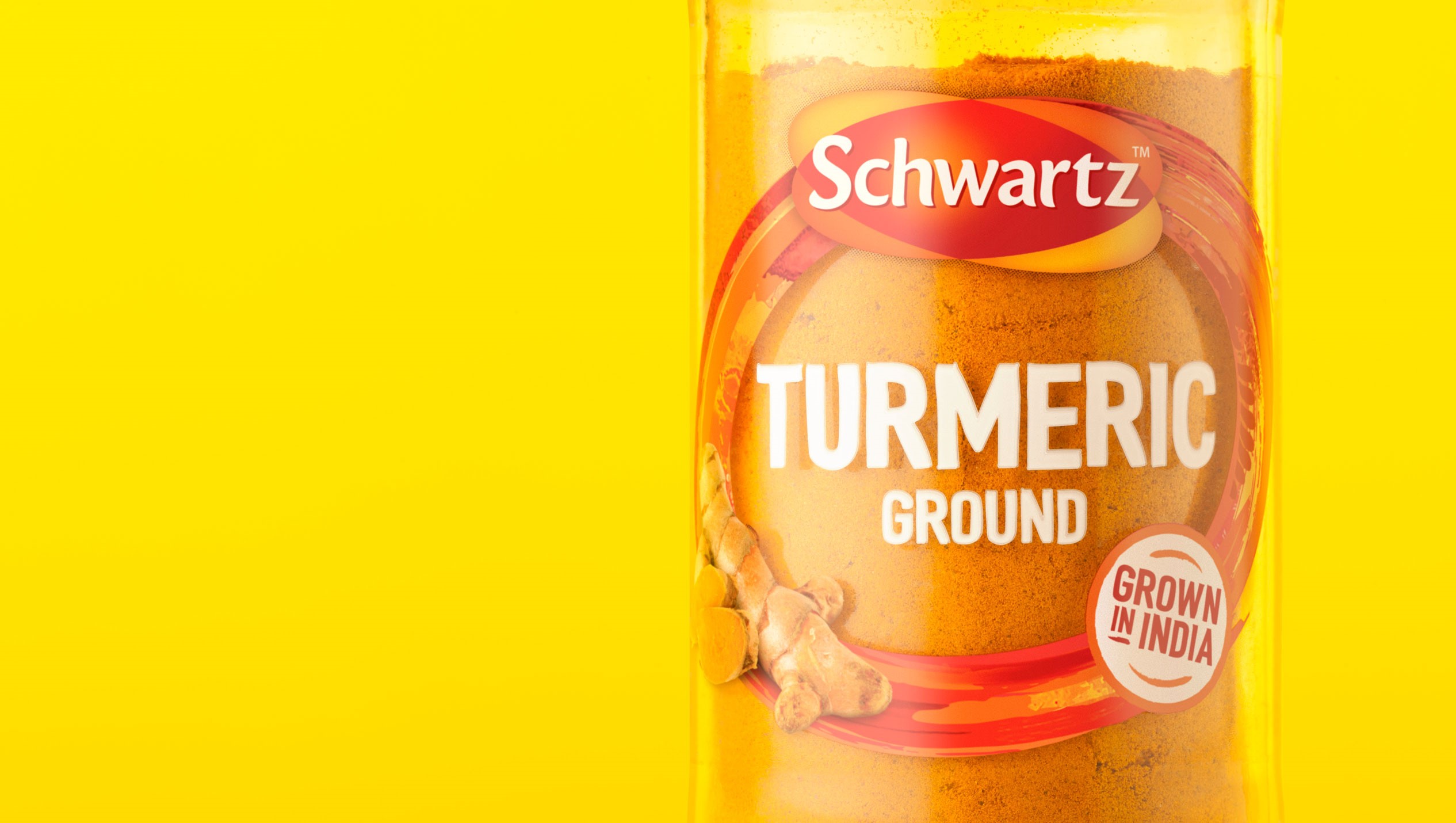
Every home cook knows that good spices means big flavours. From smoky, yellow turmeric to fiery, red cayenne pepper to earthy, warm cumin, spices play a big role in people’s lives. As a product, spice canisters are a tangible, everyday expression of a brand, often displayed proudly in spice racks the world over.
For McCormick, brand owner of European ranges under the Schwartz, Ducros, Margao and Silvo names, the way the products are presented should be as full-bodied as the flavours of the spices themselves. That’s why the company has turned to London-based agency BrandOpus to reexamine the brand and its packaging.
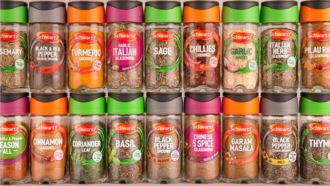
The challenge was multiplied by the 1,500 plus pieces of packaging needed to be redesigned and relaunched across seven markets. Additionally, competition for shelf space, and standout on shelves is key in supermarkets. Own brands are fighting back across product ranges and customers often choose to shop by cost, rather than choice. For some food brands, the key to remaining relevant is to reinvent their packaging, giving shoppers another reason beyond the brand name and product attributes to pick up a certain product.
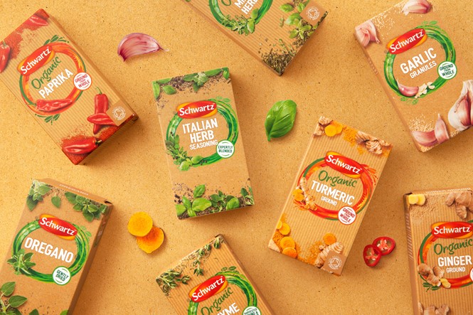
That was certainly the case for McCormick. BrandOpus transformed the spice company’s packaging into a vehicle for creativity. It sought to change perceptions of McCormick’s brands from simply being a high quality product to inspiring people to be more creative in their cooking. The design takes its cues from flavour, colour and texture, combining those elements into more dynamic shapes and more transparent packs.
Olivia Neville, EMEA marketing manager for McCormick says the rebrand has helped the company highlight the quality of its ingredients. “The stand out on shelf and ease of navigation across the range has also been improved allowing shoppers to find what they need more easily,” she says.
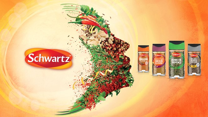
Paul Taylor, chief creative officer at BrandOpus adds, “We wanted to create a more vibrant and dynamic look and feel that will drive impact at shelf and shift perceptions from a commoditised ingredient to an exciting source of flavour and inspiration for their cooking.”
The packaging also more clearly states key facts about the products including their origins, flavour profiles or use in types of foods. The new spice canister lids are now big enough to allow a spoon to be used, which should please some cooks, too.