#TransformTuesday: 23 May
Every week, Transform examines recent rebrands and updated visual identities. This week's picks are below. For more from #TransformTuesday, follow @Transformsays
Air Business
London-based brand and design agency, the Allotment, has recently released a radically overhauled visual identity for Air Business, the UK-based distribution and subscription service which operates in the publishing sector. Owned by An Post (the Irish Post Office), part of the Air Business business model restructure sees Quadrant, previously its subsidiary, merged into the wider company. Based on a new brand proposition, ‘From A to Beyond,’ the Allotment devised a brand strategy for Air Business based on its intrinsic and intimate customer relationships. Paul Middlebrook, managing director of the Allotment, says, "This clever twist on language familiar to the sector perfectly sums up Air Business’ strong service mentality and illustrates the added value they provide through their brilliant customer service."
Cyprus Airways
A new pastel colour palette is the lead feature for Cyprus Airways’ updated visual identity, carried out by London-based branding agency Landor. In a break from the usual aesthetic of flagship nation airlines, island imagery is the lead visuals in its marketing collateral; cultural symbols are included on the aeroplane livery. Landor’s brand strategy also highlights the sense of serenity associated with Cyprus Airways. Peter Knapp, global creative officer of Landor, says, “The oceans, landscape, and history of Cyprus served as the perfect inspiration for our redesign, helping passengers capture a sense of the country before they’ve even arrived. The rebirth of Cyprus Airways presented an opportunity to tell the island’s story in skies all over the world.” The redesigned livery and associated collateral will be launched in June 2017.

Drew London
London-based design agency, Drew London, has released an updated visual identity to celebrate its 12th birthday. Carried out in-house, Drew London’s rebrand reflects the collaboration and partnership principles which form the base of the agency’s offering. The new design also highlights the agency’s continued maturity and change, recently accelerated through two new hirings. James Cameron, creative director at Drew London, says, “While the core icon works on its own monochromatically, with a fundamental strength stemming from the bold ‘D’ insignia and triangular slash, it also enables a fluid design versatility by acting as a framing device for any colour, pattern or photograph.”
Eredivisie
The highest league in Dutch football, the Eredivisie, has released its latest brand identity in a project carried out by Amsterdam, the Netherlands-based branding and design agency, Dog and Pony. A new logo forms the basis of Eredivisie’s renewed identity, with Dog and Pony providing a flexible application to ensure the design works across all platforms, including digital. The colour palette is simpler than Eredivisie’s previous iteration, which combined eight colours in its logotype alone; simple yet bold red and blue provides cut through in a sector competing for attention. Dog and Pony says the completed brand will roll out at the beginning of the 2017/2018 season.
iZettle
Stockholm, Sweden-based point of pay system company, iZettle, has unveiled an updated visual identity to reflect its ever-expanding product offering. The rebrand was undertaken in collaboration with Sweden-based creative agency Bold, with iZettle’s new brand imagery based on the real-life experiences and stories of its users. Its choice of typography and colour palette also reflects the humans at the heart of iZettle’s story. Johan Bendz, chief marketing and communications officer at iZettle, says, “Most people still only associate iZettle with card payments but today we can help small businesses with all kinds of payments, as well as register and track sales and get funding. It’s key that our brand both reflects and drives this change.”
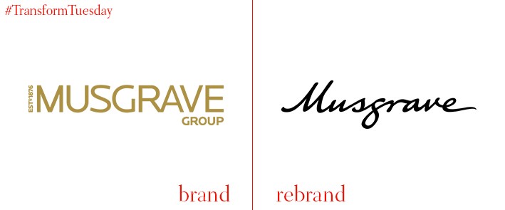
Musgrave
With over 35,00 employees, Irish retail group Musgrave – launched 140 years ago – is Ireland’s largest private sector employer. While its retail and wholesale brand portfolio, which includes SuperValu and MarketPlace, are individually well-known, the wider Musgrave parent brand is less recognisable. To enhance its visbility, London-based consultancy BrandCap has updated the retailer’s visual identity with a contemporary design based on Musgrave’s heritage to reflect the company’s six-generation history and forward-looking commitment to doing good business. Creative director of BrandCap, Ed Bolton, says, “Authenticity and heritage count for a lot. The new identity is grounded in Musgrave’s proud history, but also has a contemporary feel that people can easily connect with, and that reflects the brand’s energy and forward-looking attitude.”
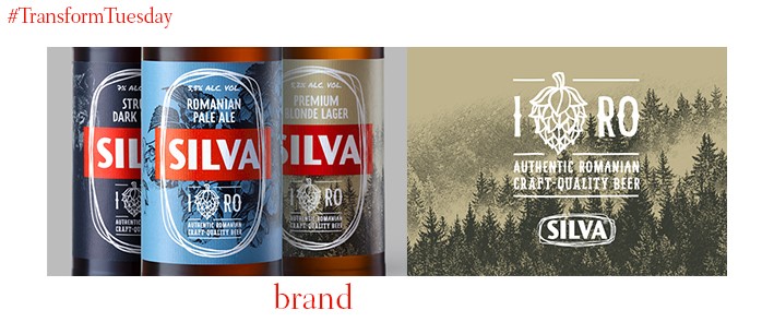
SILVA
The Bucharest office of brand strategy and design studio, Brandient, which also has offices in Singapore, has led the redesign for popular Romanian beer, SILVA. The beverage, part of Heineken Romania’s portfolio, has launched three new craft beer-esque offerings – Romanian pale ale Mandra Romaneasca, premium blonde lager Blonda Desavarsita and dark lager Neagra Legendara. Brandient designed the packaging for the new products and included a new tagline to reflect the extent to which SILVA’s heritage informed the forward-thinking beer brands – ‘New beer, old love.’


