Peer perspectives: Minute Maid
Coca-Cola’s Minute Maid leads the pack in packaged juice. But a broad brand portfolio required a new, consistent approach. Is the fresh brand and packaging as fresh as Minute Maid’s 100% juice products? JP Hunter analyses the rebrand
Project: Minute Maid rebrand by Taxi Studio
Reviewer: JP Hunter, head of design, Webb deVlam
Portfolio rebrand challenges: I’ve handled many large brand portfolios and they all present a particular set of challenges. It’s very difficult to create a new design system that works across many variants within a master brand;
one that’s adaptable enough to accommodate future expansion. It’s all about creating a balancing act between brand blocking at shelf, standing out in a crowd and understanding how each line can express its own personality under the umbrella brand.
Audiences are savvier than ever and demand a lot from the products they buy. They’re aware of sugar levels, the damaging effects of obesity, ethical sourcing and provenance. All of this information plays a part in the decision making process on the journey to shelf
and needs to be communicated clearly.
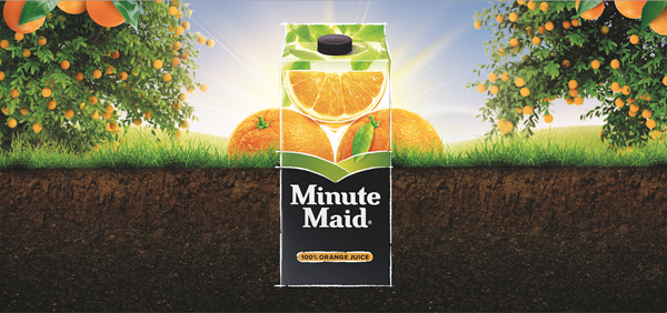
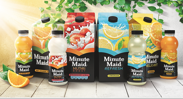
The approach: I think what Taxi Studio has done is to premiumise Coca-Cola’s juice brand Minute Maid with a dominant monolithic black panel that runs across the entire range. It’s a bold move. Will the consumer’s eye drift to other brands that pop out of the sea of blackness in that all-important three-second window of opportunity? But black does lend authority and evoke a higher-end product.
It should work well in an omnichannel environment, as it’s a consistent master brand approach. But the difficulty might lie in making individual products stand out within the line. With so much black space, will the more nuanced messaging get lost? Having said that, the brand name leaps out, as does the product information – 100% orange juice, for example – and these play an important role in influencing a consumer’s purchase intent.
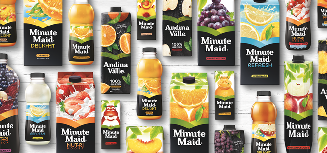
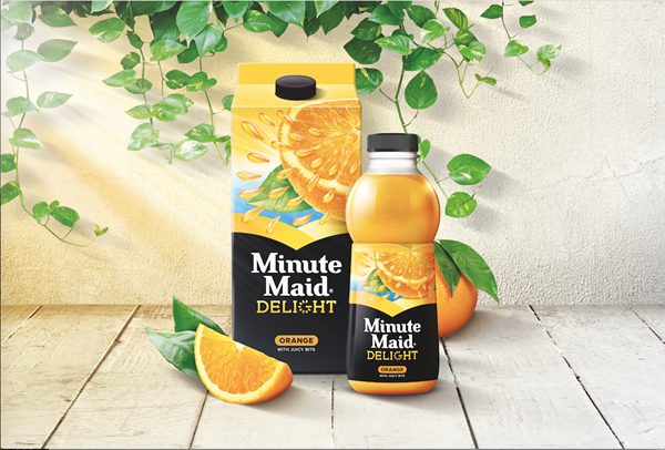
The fruit juice shelf is crowded and complicated. Taxi Studio has sought to address this with four colour-coded ‘need states’ – dubbed essentials, refresh, nutri and delight – which will help consumers navigate the range. Illustrative images, rather than pictures of real fruit, have
also been used to make it stand out from the crowd.
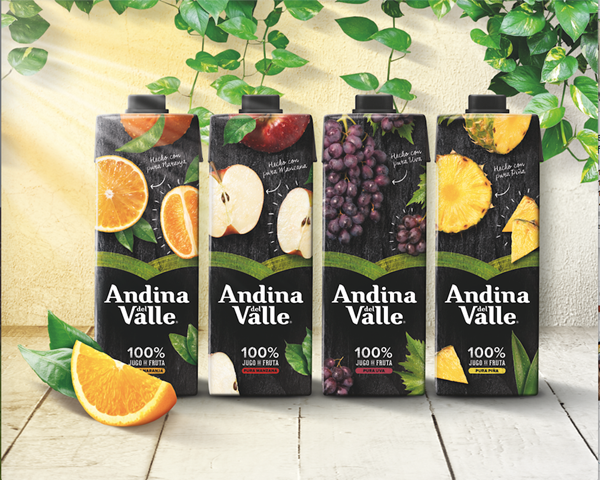
Design cues from the wellness, independent and startup sectors have been adopted, too. The use of ‘handwriting’ on the packaging, for example, speaks to a personally prepared, kitchen-table approach. This is a trend that is only going to grow, as big corporations borrow more design codes from smaller, artisanal ranges.
Niche lines are going to need to up their game to extricate themselves and stand apart on shelf. In fact, there are an increasing number of brands out there that you may think are from small-scale operations but are made by globe-spanning corporations – which makes life more complicated for consumers.
What lies ahead?: A lot of rebrands that are hitting the shops today are just the first step. The next wave is often already in development when the new look hits the shelf. I wouldn’t be surprised if Minute Maid was one of these – it could well be waiting to see what works across multiple platforms with this rollout before it starts adapting segments for a refresh down the line.


