Delivering a fresh identity for Batch Organics
In a food retail environment increasingly driven by organic produce, superfoods and the desire to eat well, food brands can find it difficult to stand out. Packaging design often reflects the artisanal credentials of its product; handwritten type, intricate illustration and a varied earthy colour palette are common among the numerous health-oriented food brands. Yet stepping away from the status quo and developing a new concept around healthy, natural eating can take packaging design in a new direction entirely.
For London-based integrated branding agency Ragged Edge, rebranding London-based on-the-go health food brand Natural Blender meant disregarding the tropes of organic food packaging. Beginning with the name, the agency developed a new moniker for the company with ‘Batch Organics’ – a true reflection of its brand mission, which delivers boxes of homemade, organic smoothies, breakfast bowls and vegan ‘milk’ to subscribers. The name change, says Max Ottignon, co-founder of Ragged Edge, was the first step towards creating a brand identity which would see Batch Organics hold its own in a competitive marketplace.
“[People] know what’s good for them, they just need quicker, easier ways of maintaining healthy lifestyles,” says Ottignon. “So we reimagined Batch Organics as the fuss-free, ‘nothing but the truth’ option for people on the go. It’s a brand that’s refreshingly frank and ‘straight up’.”
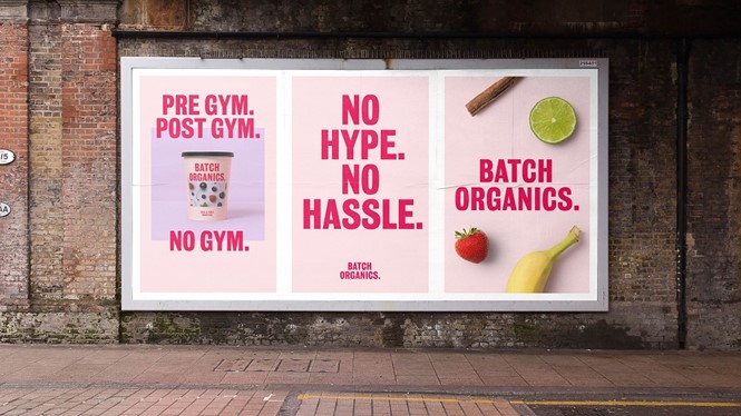
This is a sentiment shared by Charles Owen, CEO of Batch Organics. He says, “The health category is incredibly crowded, so we knew we needed to do something really different to cut through.” By creating a bold colour palette led with a visually stimulating pink shade, Ragged Edge created a visual identity and tone of voice which reflected the no-fuss approach Batch Organics has to preparing and eating healthy food.
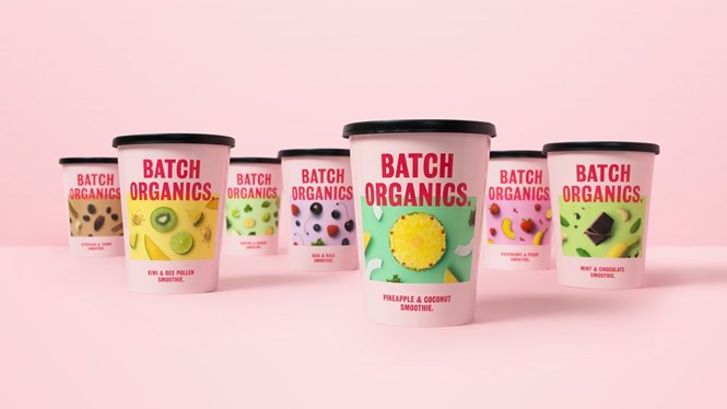
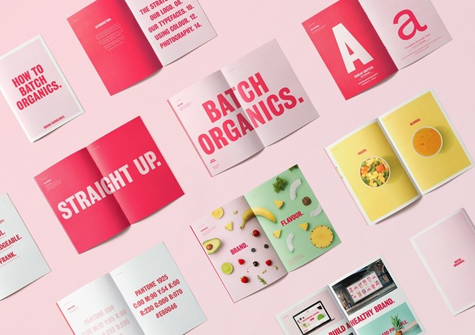
Ottignon says, “Food brands often package products in different colours for different flavours. To make it stand out, we gave Batch Organics a single colour it could own across a range of products. Verbally, an assertive tone of voice helps bring the new brand attitude to life. Pithy, straight-talking headlines communicate a ‘tell it like it is’ ethos.”
The new Batch Organics logo and brand typography also follow the strive for simplicity. Its bold approach to type is supplemented by clear product photography, reflecting the desire for Batch Organics to make clear its brand promise to even the newest of customers.
Owen says, “Ragged Edge’s ability to define a highly differentiated strategy and apply it to a powerfully disruptive identity was invaluable. They’ve helped us create a brand with genuine stand out in a market where almost everything has been tried already.”
With its brand promise characterised by the desire to be different, in a category difficult to penetrate, Batch Organics takes contemporary app-led food service and the demand for natural products one step further. The visual identity and associated collateral delivered by Ragged Edge truly reflect that this emerging brand has a purpose.


