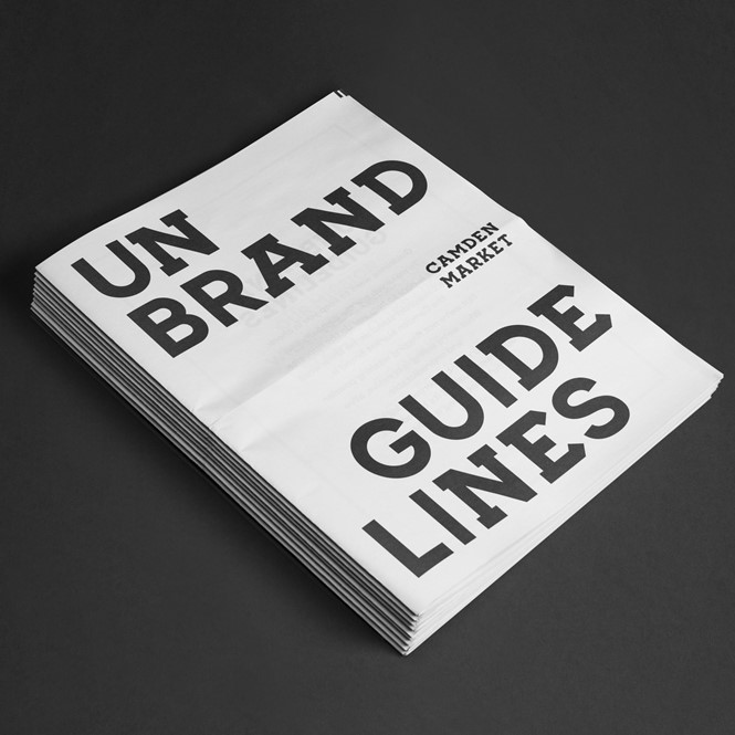
An exercise in unbranding
Situated in north London, between the terraced mews of Highgate and transport hubs of Kings Cross and Euston, sits Camden. Culturally significant with a famous art, music and nightlife scene, Camden has boasted some of the biggest cultural talents to emerge from London in recent years.
Since 2014, a statue of late singer Amy Winehouse presides over the Stables section of the market. In 1976, English punk rock band The Clash had their first brand practice in Camden. Its iconic music and culture venue, the Roundhouse, has played host to bands ranging from David Bowie to Motörhead, and also runs live theatre shows as well as creative programmes for 11-25 year olds.
Camden has also been a consistent hotspot for immigration, resulting in an eclectic mixture of food and cultural venues in the area.
Yet, perhaps for what Camden is most well-known is its market.
First starting in 1974, it quickly emerged as hotbed of entrepreneurialism, fusing the above themes with a unique atmosphere of its own. The market’s inclusive vibe created an atmosphere which, retained today, welcomes all regardless of creed or colour. And, with around 100,000 people visiting Camden Market each weekend, it is the capital’s fourth biggest tourist attraction.
Creative director for Camden Market, Robert Boon, says, “The borough of Camden has long been intertwined with radical thinking, a long and rich history of fostering the radical and the unconventional.”
Despite the market’s commitment to promoting independent retailer, it is however undergoing change. In recent years, Camden Market has been the recipient of increased outside investment and changes to the overall retail structure as a result of redevelopments.
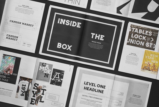
Keen to retain the rustic and individual feel of the market, its owners, Market Tech, approached London-based integrated branding agency, Ragged Edge, with a plan to design the Camden Market brand.
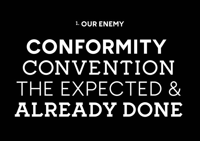
Mindful of the fierce integrity held by stallholders and visitors alike, Ragged Edge decided to pursue a strategy named ‘Unfollow Convention’ – its aim was to pacify the needs of Camden’s digital audience while retaining the quirks which make Camden Market what it is.
Co-founder of Ragged Edge, Max Ottignon, says, “Camden Market has a rich history of breaking the rules. It’s always been a place where people are free to express themselves and their ideas. We didn’t want to impose a corporate brand system because that wouldn’t have been true to the market’s spirit. Instead, we set out to create a kind of ‘unbrand’ – a toolkit for self-expression.”
And, to be completely certain the brand system strayed as far from the corporate sphere as possible, Camden Market creative team enlisted street artist, David Samuel, to help with the brand launch.
Boon continues, “It was important for me that this exercise was approached as an evolution of the brand, not a revolution. In the spirit of punk’s use of ready-mades, Ragged Edge referenced John Bulley’s bridge painting and developed a family of bespoke fonts and graphic elements. This Camden Market Toolkit forms the underlying structure that gives us the ability to express the brand in multiple ways while still aligning with the market’s long history of new ideas.”
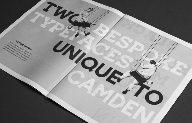
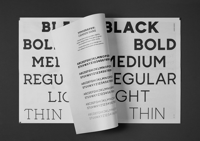
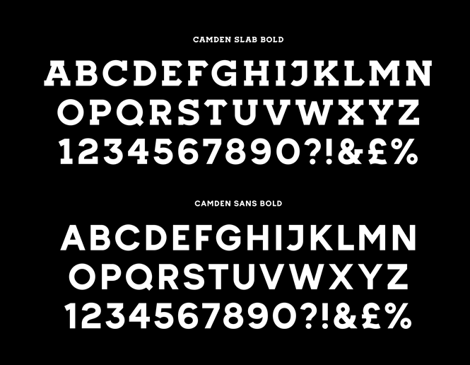
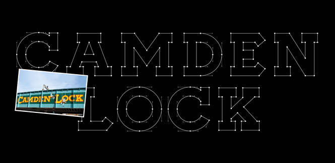
And indeed, by taking inspiration from the hand painted Camden Lock sign which adorns the bridge traversing Camden’s main market road, two bespoke typefaces were created. Named Camden Slab and Camden Sans respectively, the fonts complement the black and white colour palette of the new designs developed by Ragged Edge.
Ottingnon continues, “The market already had an iconic sign: the hand-painted ‘Camden Lock’ lettering on the bridge next to its entrance. It would have been crazy to try and compete with this, so we embraced it as a way to connect Camden’s past, present and future.”
“It meant that the typefaces it inspired are rooted in the market’s rebellious history, while the range of weights give the brand the flexibility to continue to conjure the unexpected.”
So while Camden Town may be undergoing the types of changes to expected from the expansion of commercial property, the wish of the stallholders – to retain an original, independent feel to the market – has been honoured through the non-branding strategy implemented by Ragged Edge. The black and white colour palette emphasises the market's colourful naturehe characteristic which should sustain its appeal for years to come.


