Vitalin’s brand redesign embraces the British countryside
Cranswick Pet Products’ dog food brand, Vitalin, partnered with London-based creative agency B&B studio to broaden consumer appeal while staying true to its ties with the British countryside.
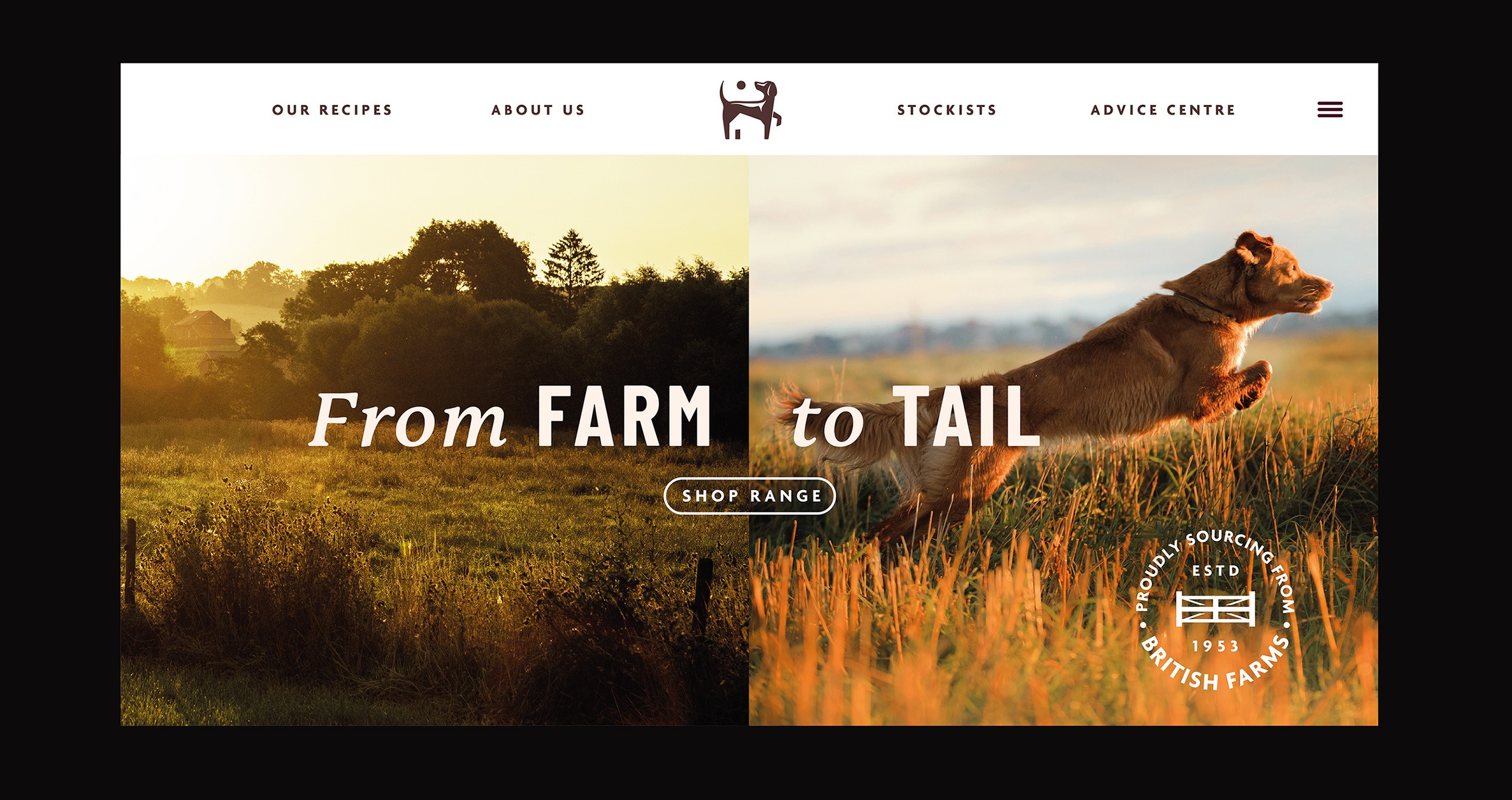
With the help of B&B studio, Vitalin’s new visual identity and packaging sought to appeal to new dog owners while also maintaining its connection to British landscapes and locally-sourced ingredients under its new brand idea, ‘Vitality, from Farm to Tail’.
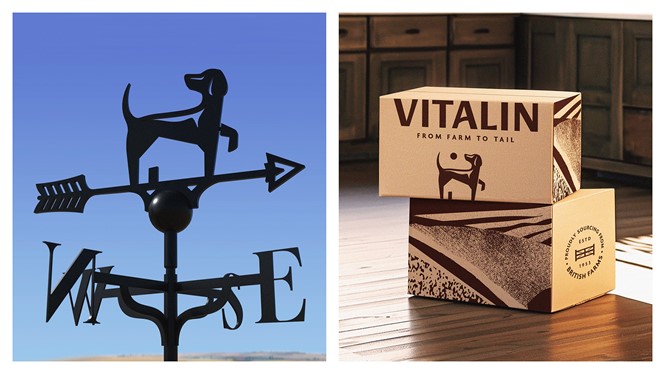
The brand’s new icon features a silhouetted dog with a barn, aiming to reflect an outdoor, active lifestyle. Along with the icon, the project also includes a new logotype with a contemporary, yet refined, sans serif.
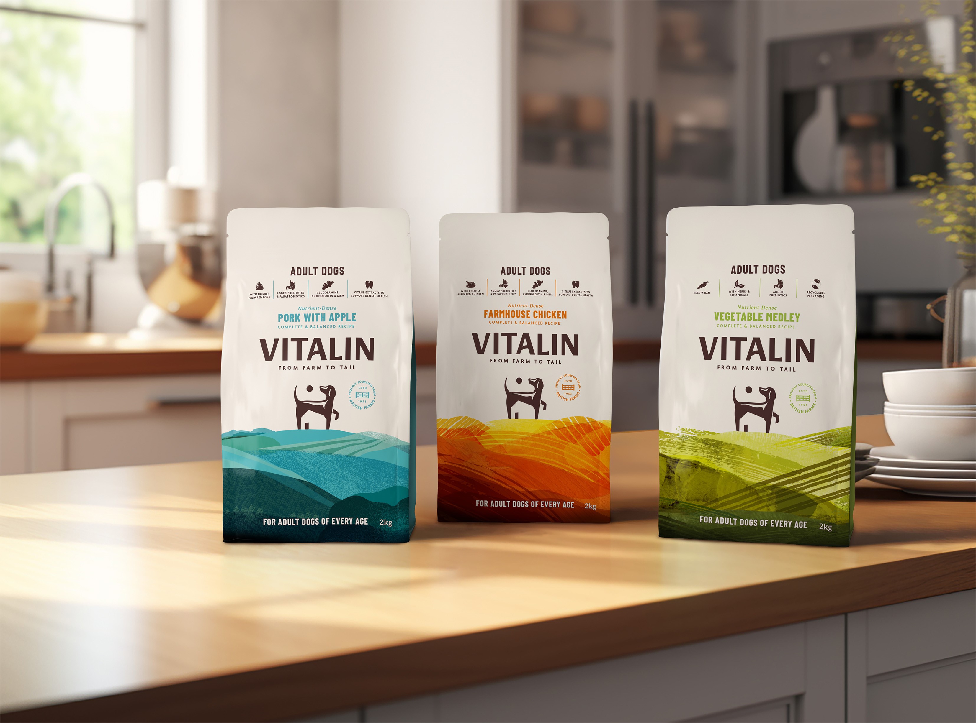
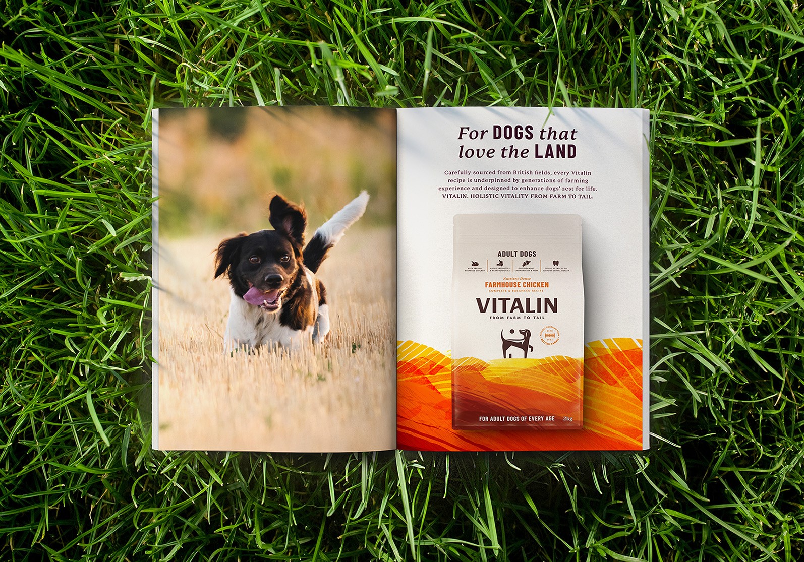
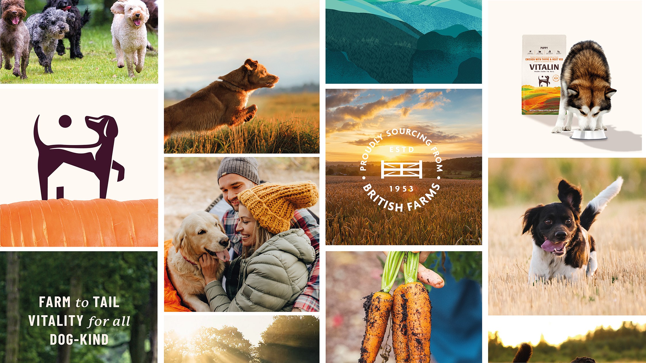
On the packaging, a colour coding system now differentiates recipes and shows off the company’s array of flavours. Countryside imagery futhers the brand idea with natural, bright and bold illustrations.
A series of icons and a flag are placed on top of the pack as well, signalling product highlights and its distinctly British heritage.
B&B studio’s creative director, Jennie Potts, emphasises the importance of maintaining the brand's authenticity. She adds, “We've held on to the brand's pragmatic, no nonsense personality but given it a progressive feel to enable and inspire innovation."


