Nature, beauty and history for everyone: The story of the National Trust brand
From the seed idea of preserving British historic places and green spaces, the National Trust is now Europe’s largest conservation charity. Jack Cousins details the fascinating history, present and potential future of its brand identity.
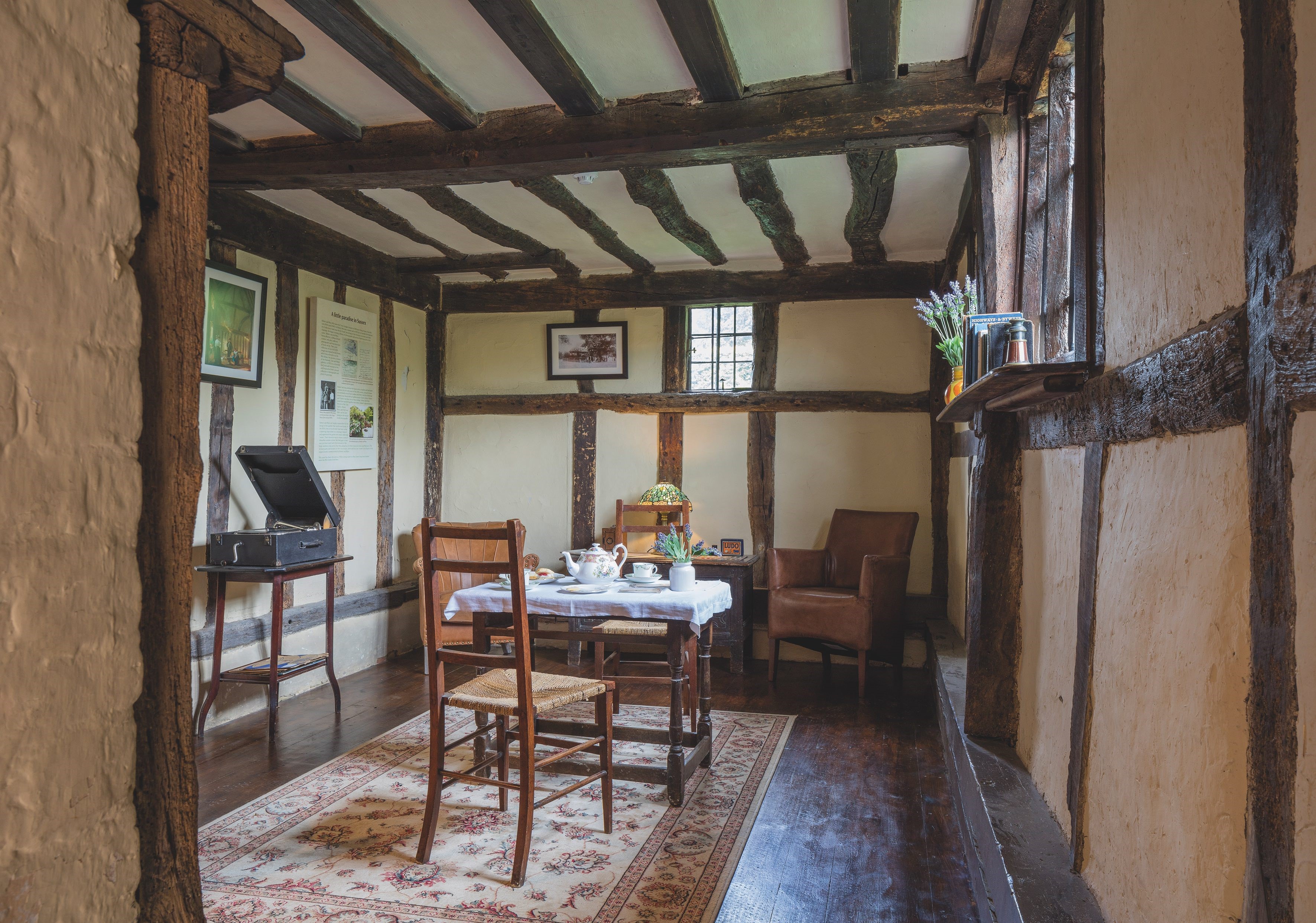
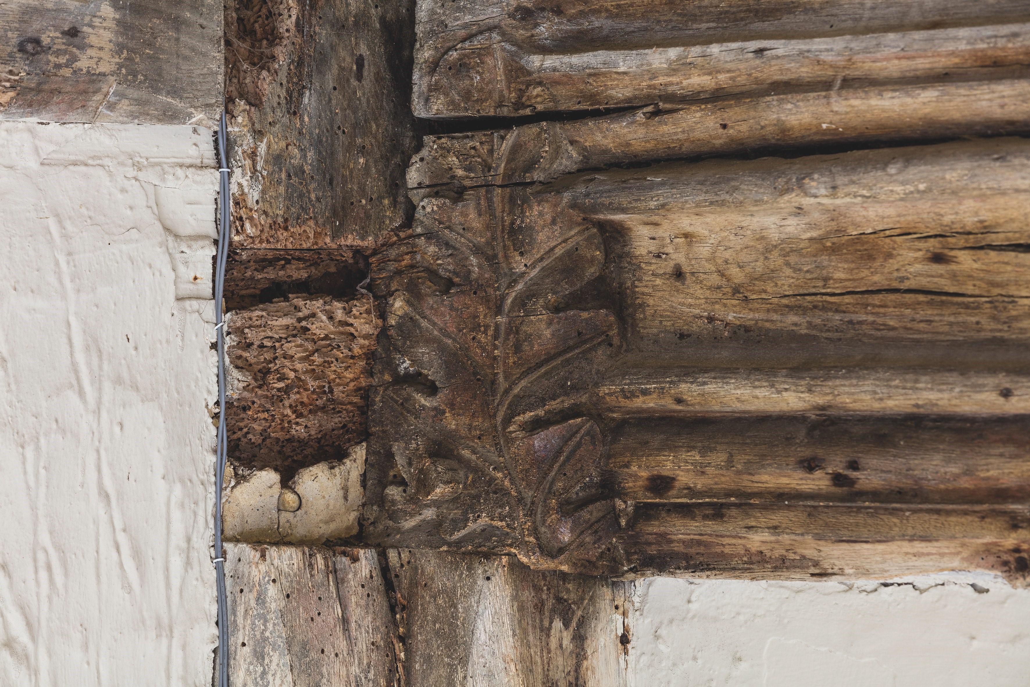
While sleepy and somewhat unassuming, the countryside village of Alfriston in East Sussex is of great importance to England’s heritage. Hidden away by the Wealden South Downs, the tiny settlement – replete with pretty cottages, idyllic tearooms and crooked inns – also hosts the thatched medieval Clergy House. A stone’s throw from the grand St Andrew’s Church which the property served for some 300 years, it might just contain the key to understanding the origins of the National Trust’s modern-day brand.
Look beyond the whimsical decorations and sour milk and chalk floor, typical of the building’s 14th century origins, and you will find the carving of an oakleaf adorning a wooden beam. Some believe the link is obvious: the National Trust was founded in 1895 and the Clergy House was saved the following year. The discreet oakleaf so perfectly resembles the Trust’s logo that it must have been the direct inspiration for the original brand design.
©National Trust Images/James Dobson
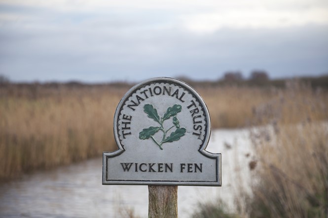
But sadly not. A lovely story, agrees National Trust brand manager Craig Robson, but one without truth. Instead, the logo’s inception came in 1936 when Joseph Armitage, a talented wood and stone carver committed to the Arts and Crafts movement, won an open competition run by the charity in which he proposed the discernible sprig of oakleaves symbol. To this day, Brits may still find the original Armitage logo on faded cast aluminium signs up and down the countryside, and with it the promise of adventure.
©National Trust Images/James Dobson
A Gentleman’s touch
For a long time, that was the National Trust brand in a nutshell. Perhaps parochial as a branding device but always loved, it wasn’t until the 1980s when the brand was next tinkered with by revered English artist David Gentleman. Robson explains, “The Trust commissioned him to redo the logo, sort of. I suppose [it was to meet] a more modern world in the sense of it needing to be robust enough to be reproduced in both small sizes and for large road signs. So, he created what is the current version of the oakleaf and actually engraved it out of wood, and that was adopted from around 1983 onwards.”
The Trust’s journey towards adopting a more sophisticated and encompassing brand had begun. The 1980s redesign was afforded greater depth by the introduction of the authoritative Albertus and Bembo serif typefaces, further evoking importance and stature. Elsewhere, a dark green – in keeping with the 1930s signs – was used prominently throughout the identity. The brand had attained consistency, but its traditional nature meant it had problems speaking to a vast swathe of its target audience. By 2009, the next stage of the Trust’s brand evolution that had been 25 years in the making finally came.
Robson explains, “Some perceptions research showed that people felt we were perhaps a bit formal. Our strategy from that point onwards was very much about engaging families, making sure they felt we were a place for them. We really needed to signal from a visual and verbal perspective that we are an ‘arms open’ organisation.”

©National Trust Images/Ben Selway
With that in mind, a complete identity refresh was undertaken with the help of Wolff Olins. As if opening a window, the Trust’s identity was imbued with the fresh air of new ideas. One key decision taken in the hope of speaking to the charity’s warmer side was to use its oakleaf logo far more prominently. Now a distinctive brand asset, the logo became bigger, bolder and more visible across a multitude of touchpoints including digital.
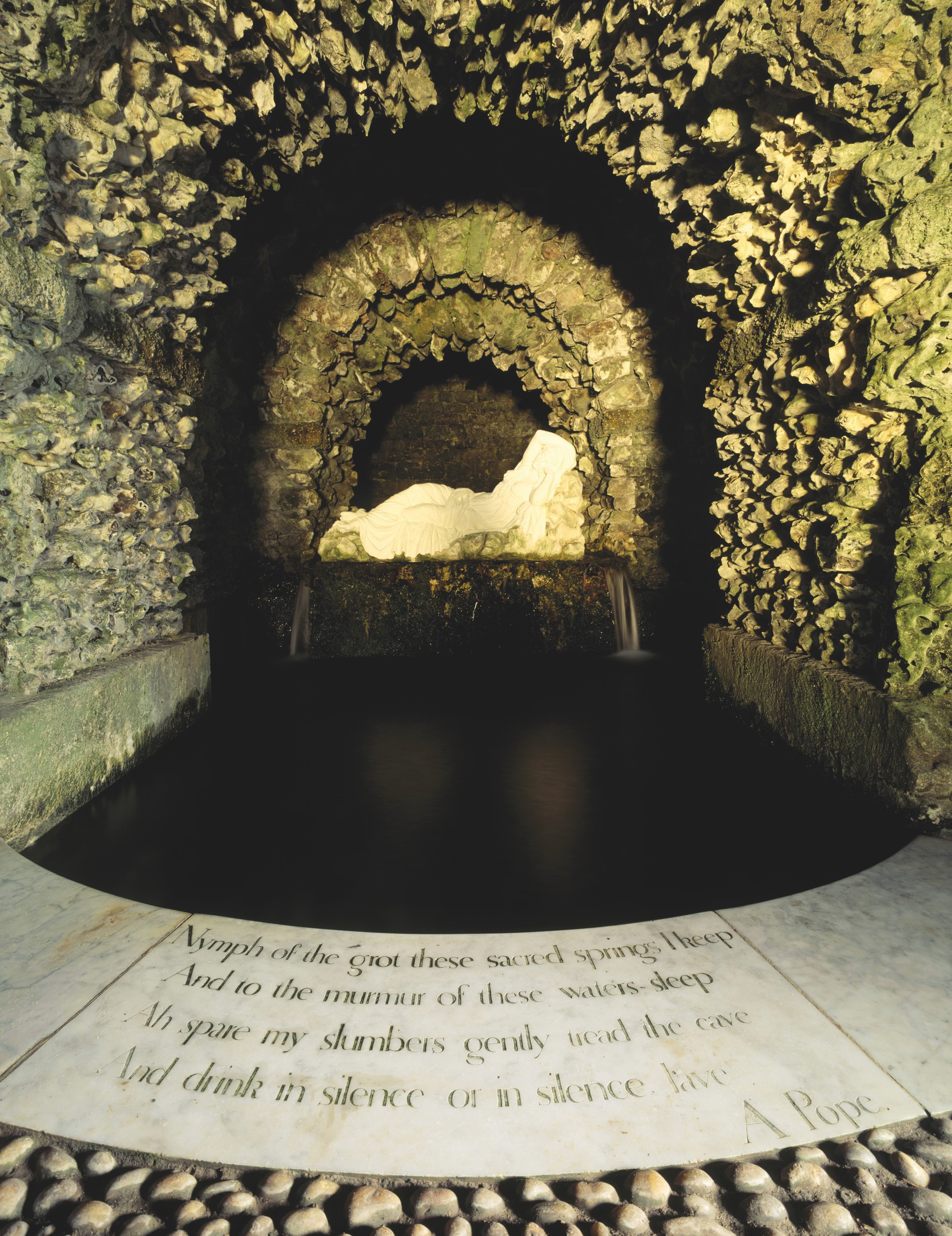
Elsewhere, a custom sans-serif typeface – eponymously named after the charity – was created by designer Paul Barnes. Adding a truly unique dimension to the brand, its design was inspired by the inscription of a poem found inside a grotto at Stourhead in Wiltshire, one of the many National Trust sites. The new colour palette, meanwhile, was much more straightforward in its design. Broader and brighter, it aimed to signal to the world the fresh and open nature of the Trust.
Listening closer
What Wolff Olins brought to the brand was a greater sense of friendliness, and, ignoring minor tweaks, has remained much the same ever since. But the origins of why this was appropriate may be derived from the charity’s founding pledge which, according to National Trust brand strategy manager Gemma Lapping, still drives the direction of the brand today.
She says, “Essentially as a brand, we look after nature, beauty and history for everyone. That 'everyone' aspect is very much a central and critical thread to our brand and the most recent creative execution of it. And that will continue to play a key role in how we present the brand looking forwards, too.”
The importance of fostering inclusivity was evident in the Trust’s recent creation of an audio identity, its most daring brand design work for some 15 years. The idea of moving into the sonic space was taken on the back of recommendations the Trust received to adopt more neurologically diverse assets as a means of generating greater brand recall, and inclusivity featured at the heart of the project from the very beginning.
Hiring MassiveMusic, a Songtradr company, the Trust tasked the global creative music agency with designing an audio identity that sparks a real connection with its founding pledge. The brief, which also demanded a modern twist that could appeal to younger, more diverse audiences, delighted MassiveMusic’s Emma Byford.
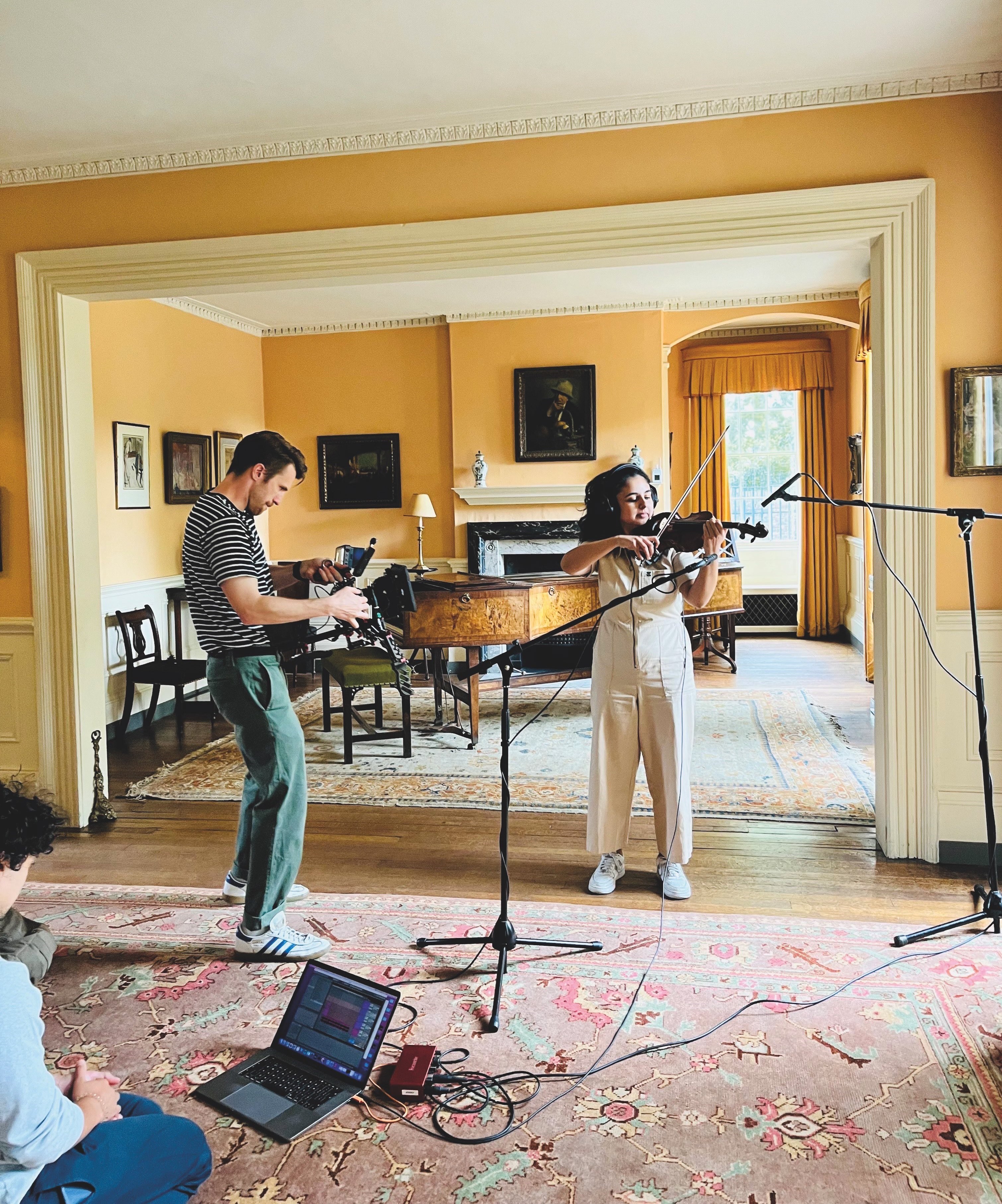
The account director recalls, “It was an honour to work with the Trust to create a sonic identity that reflects their mission. To engage with a wide audience, we had to develop a sound that truly resonated with them. To achieve this, we collaborated with many people from across the Trust’s network throughout the process, including members of their Inclusion Council and Race Equity Network. We also conducted extensive market research to ensure that the new sonic identity would resonate with their audience and captured key brand attributes in the music: ‘vibrant’, 'dynamic’, ‘warm’ and ‘inspiring.’”
Aiming to create a sonic identity that sparked an intuitive connection to its cause, Byford and her team opted to record unique sounds from National Trust sites while also weaving in electronic elements to elicit a sense of modernity. From Fenton House in London to Manchester’s Castlefield Viaduct, the MassiveMusic team travelled to National Trust sites across the UK to find the right sounds. Often, they were sourced in unusual places, from the tick of an old clock to the creaking of floorboards to the rustling of trees.
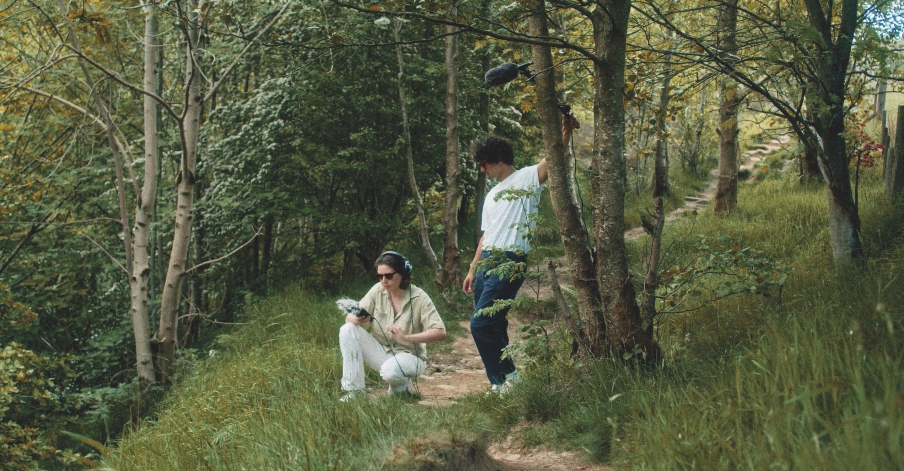
The distinctive sounds were then recorded and woven together to form the National Trust’s first ever sonic identity. Taking cues from the oakleaf logo, Byford describes the sonic version as “an ascending arpeggio in G major [that] leads into the core three-note motif, which continues to melodically rise.” Colloquially speaking, the five-second piece consists of a soft crescendo and calming melody. Accompanied by a strong underlining bass, the sonic logo branches outwards, copying the visual logo. The smooth and tranquil audio brand aims to capture the sense of fulfilment when experiencing or supporting National Trust sites.
A longer, 90-second sonic DNA track was also composed. Filled with unique melodies that cater to various moods, the track holds the full sonic blueprint for the National Trust, which may now be used across a plethora of touchpoints including podcast and video. “I think it really arms them with the tools they need to be recognised and continue building recognition for the amazing work that they do,” Byford concludes.
Trust issues?
While evolving the brand to meet the needs of a changing Britain might be a necessity, the execution of it isn’t without its challenges and potential missteps. Criticism of the Trust’s branded content and strategy of inclusion has made its way into national papers over the past few years including The Times and Daily Mail, where the editorialising of history is often cited.
©National Trust Images/James Dobson
©National Trust Images/Nick Meers
It has even culminated in the creation of Restore Trust, a pressure group comprised of sceptics of the way the National Trust is run and the direction it is headed. One such example the group questioned on its website in 2021 was what it deemed to be the “highly selective presentation of history” at The Clive Museum in Powis Castle.
“To others [in Britain] he was a greedy bully,” an information board claimed about British imperialist Robert Clive, while a quote from historian William Dalrymple, describing him as an “unstable sociopath”, also made the cut. As this is branded content on a National Trust site, some felt uncomfortable by the language used, and believe it is an important responsibility of the Trust to remain historically neutral.
In response to general criticism of the Trust and its brand, Robson says, “We have a large and skilled content team, but the thing to say about anything in this space is we've had research recently come out saying that we are one of the most trusted brands [in the UK]; we've had independent research indicating that trust is actually way up there and continues to grow.” The research he refers to is a recent poll carried out by More in Common UK and UCL’s Policy Lab, indicating that only the NHS holds greater levels of trust amongst the British public.
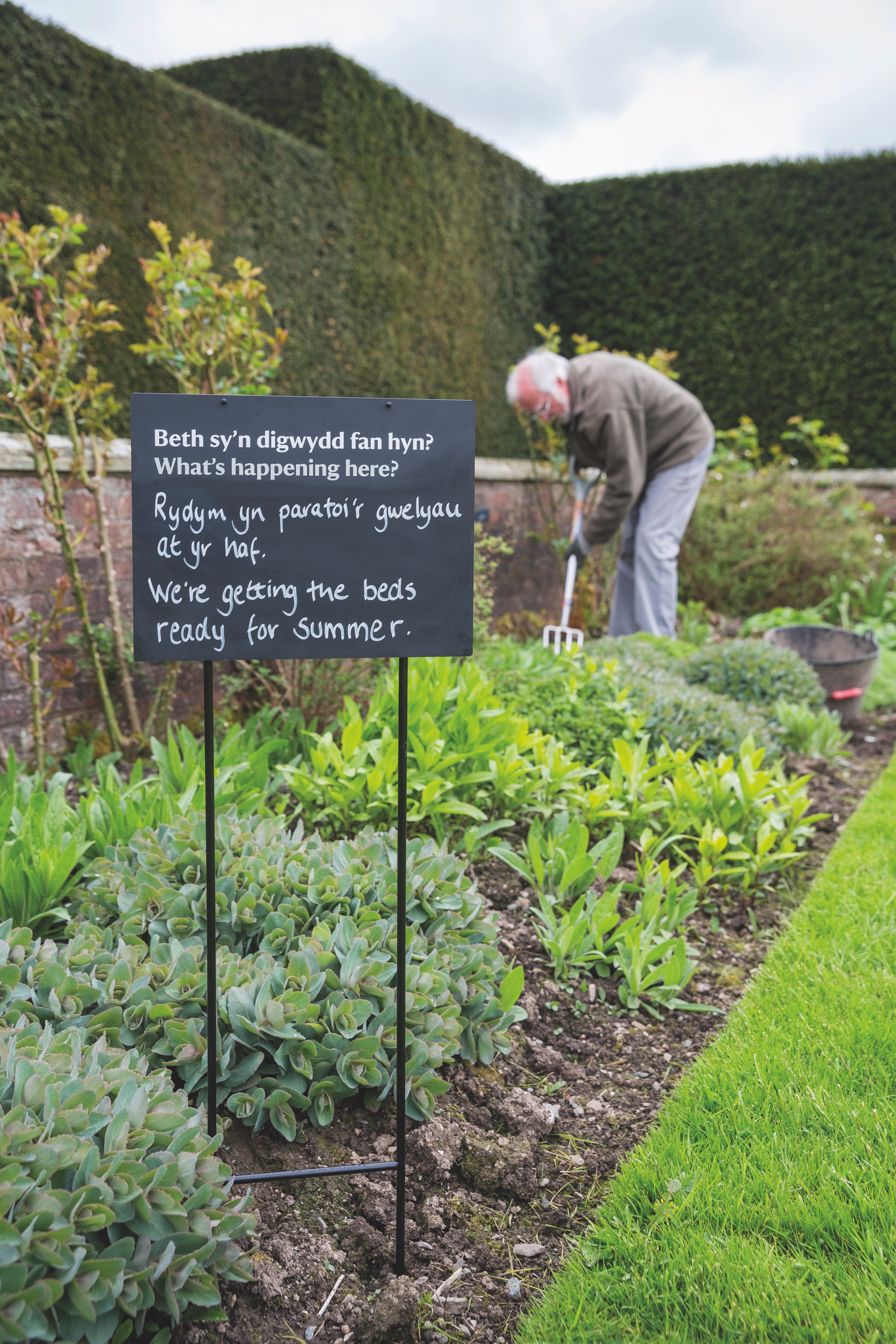
It therefore seems likely the Trust will carry on down the same track of evoking inclusivity throughout its brand. But to Lapping, this simply follows the charity’s initial motives from 129 years ago. Quoting Octavia Hill, one of the Trust’s co-founders, she says, “We all want quiet. We all want beauty… We all need space. Unless we have it, we cannot reach that sense of quiet in which whispers of better things come to us gently.”
Lapping adds, “We look after places in nature for the benefit of everyone; it's particularly the 'all' aspect that reinforces putting people at the heart of the brand thinking.”
Alfriston Clergy House was in a terrible state when the National Trust bought it in the 1890s for £10. Dilapidated and in despair, it is because of the care and attention the charity offered the property – and many others like it over the following decades – that the Trust found its way into the hearts of the British public. Its mission for the next 100 years will therefore be to further that reputation, and by adding to its five million-strong membership, it can secure greater funding for its vital work. It may sound glib, but without public trust there can be no National Trust, so its brand identity will play an almighty big role in securing that future.
This article was taken from Transform magazine Q1, 2024. You can subscribe to the print edition here.


