KOTEX’s education kit reimagines menstrual health for South African tweens

‘The Pack’, a unique kit from Kimberly-Clark’s menstrual hygiene brand KOTEX, aims to equip schoolgirls with the tools to manage their menstrual health with pride. Designed by global creative branding agency Pearlfisher, The Pack hopes to inspire its young female audience.
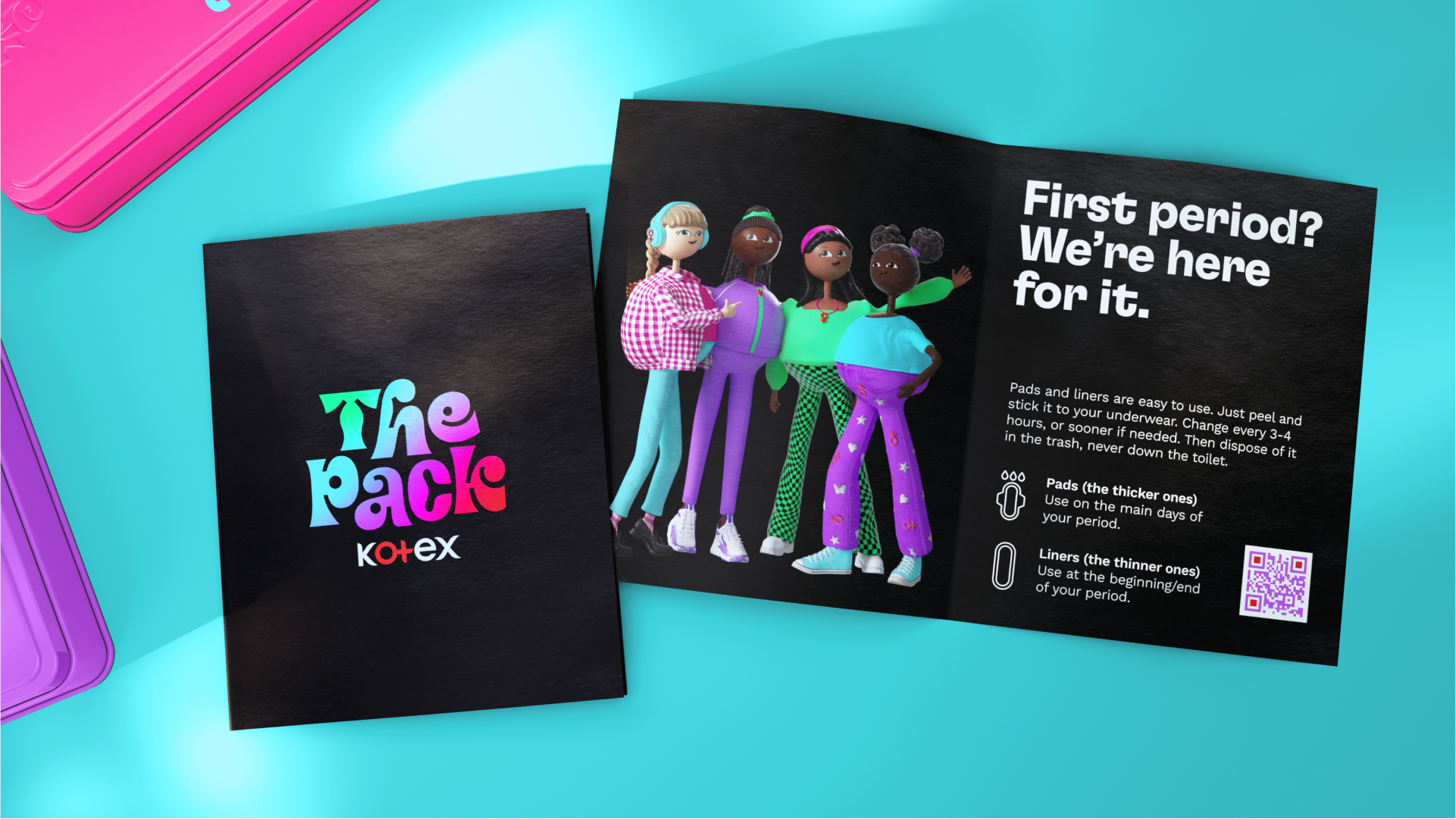
Pearlfisher deemed it important when crafting The Pack to avoid stereotypes of tween girls, instead opting to design four unique characters (Kiara, Thembeka, Amy and Mia) who help guide the girls through their journeys. Each with her own personality, vibe and style, the characters aim to be relatable to The Pack’s young target audience.
The stylised logotype further reflects the four characters’ distinctive qualities with its exaggerated and bouncy nature. Ditching passive pastel pinks, the brand instead opts for lively shades of purple, green and blue as a means of integrating KOTEX’s core brand colours into the new visual world.
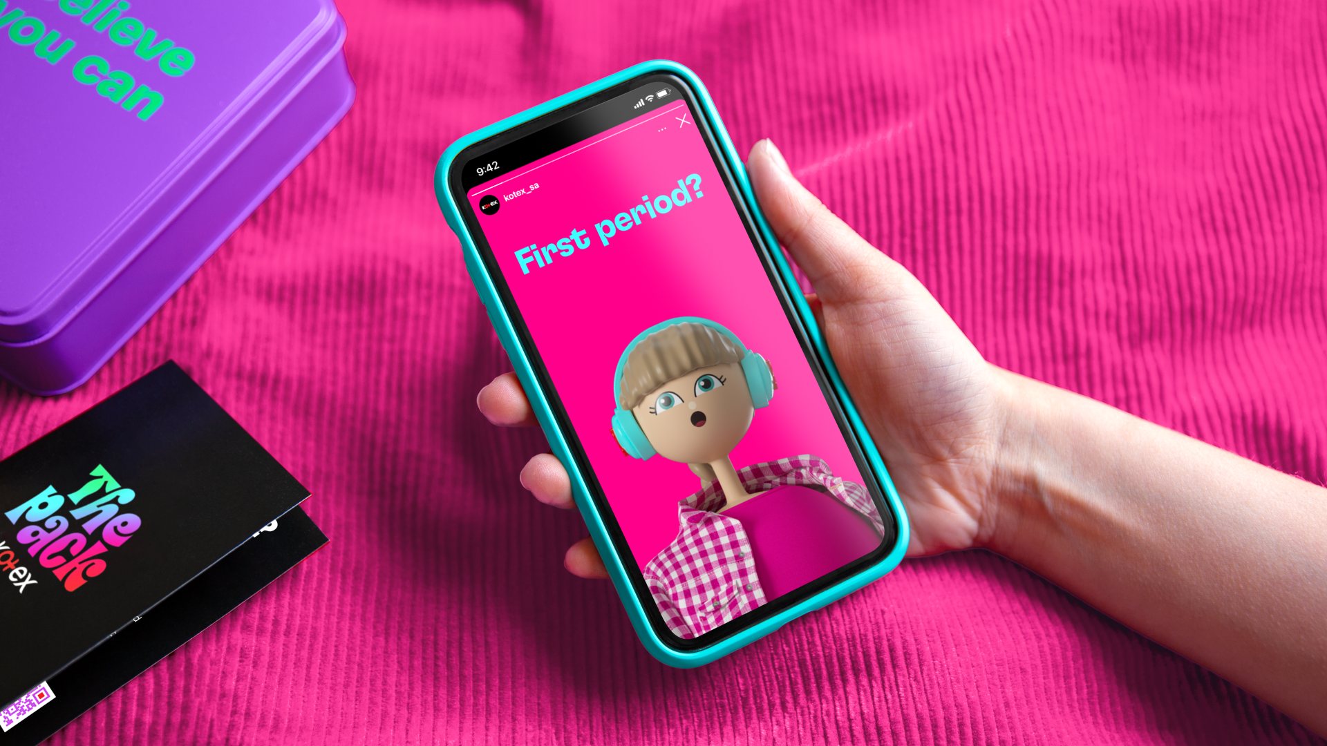
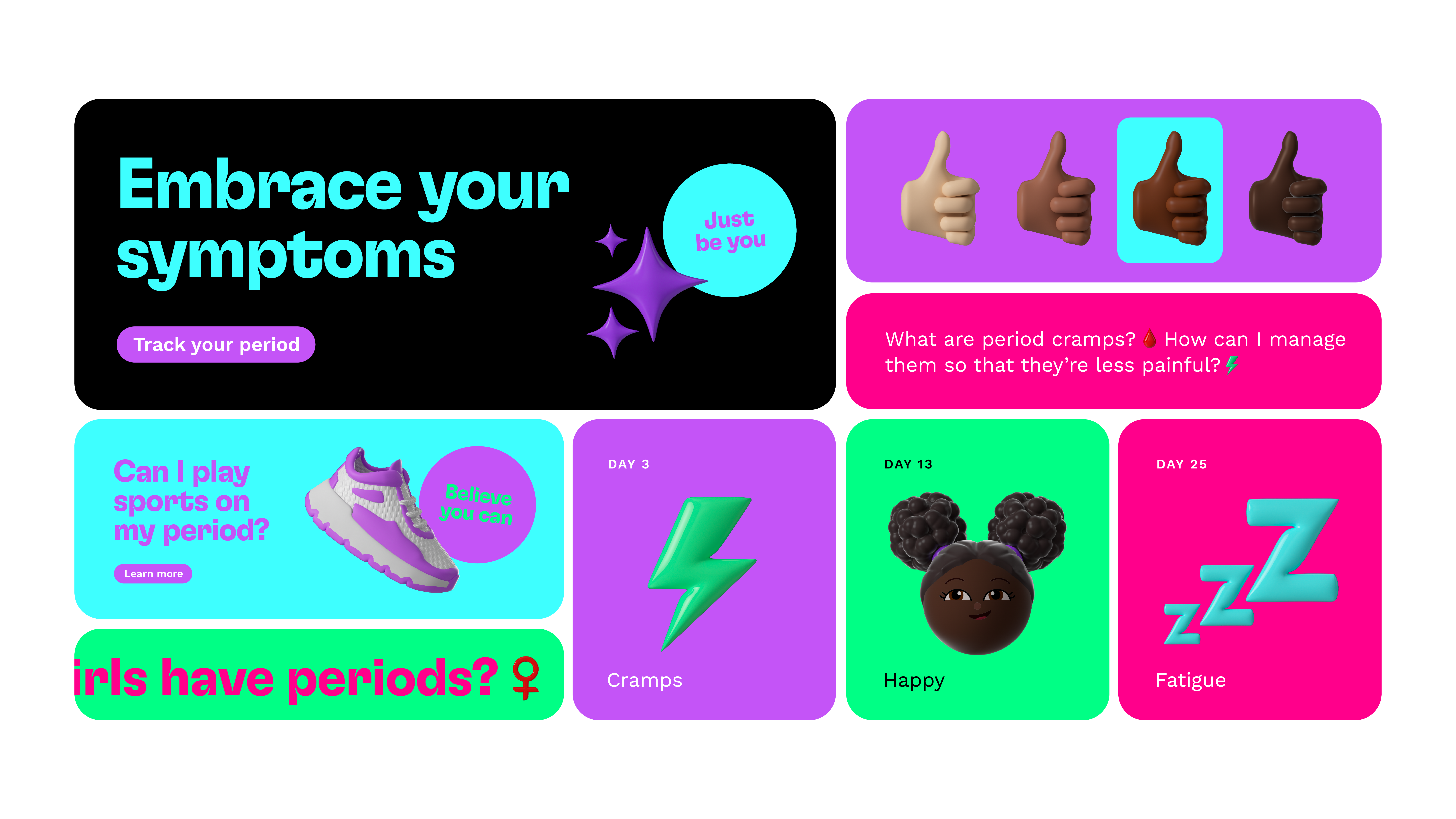

Jess Phillips, creative director at Pearlfisher, says, “The Pack goes beyond the traditional functionality of fem-care to transform menstrual education into an engaging, empowering experience for girls navigating puberty. The design needed to reflect this, both to engage and empower this young generation and to help foster a sense of community and unity among students.
“As a group that's maturing at a faster rate than previous cohorts, young girls crave learning that's relatable, fun and informative. It was so important to create a design for The Pack that spoke to this generation in their language, facilitating community, dialogue and empowerment among tweens who are aspiring to grow into Gen Z shoes.”


