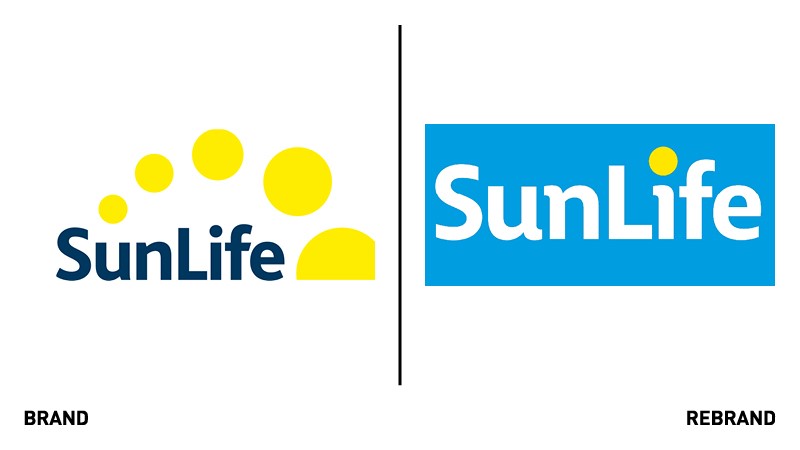
SunLife reveals fresh, modernised logo
Undertaken by the over 50s life insurance and equity release firm’s in-house design team, the latest logo update marks the next phase of the company’s 214-year history. The simplified redesign sought to place the brand’s name front and centre, while offering improved digital accessibility.
Ditching the yellow ‘sunset’, the latest SunLife logo design has retained a degree of recognisability – particularly within its colour palette – and aims to fall in line with the company ethos of ‘Simple, Certain, SunLife’.
Mark Screeton, CEO at SunLife, says, “We’re delighted to reveal our refreshed logo to the world and can’t wait to hear what our customers make of the change. At SunLife we’re all about keeping things simple, so that’s exactly what we’ve done, resulting in a clean, sharp new logo that is still recognisably us.
“It’s also of huge importance to us to be an inclusive and accessible brand, and our yellow circles weren’t meeting our high standards for accessible design on digital platforms. The new design is not only cleaner and free from low-contrast colour, but allows for the text itself to be larger within the same logo footprint.”