Ragged Edge cooks up Omlet rebrand
The D2C pet brand required a new identity which could allow for global growth. London-based branding agency Ragged Edge sought to encapsulate Omlet’s whimsy, curiosity and engineering excellence.
Omlet crafts pet products that prioritise the needs of animals over human assumptions, such as its popular Eglu Chicken Coops, and following a successful funding round is ready to take on the international market.
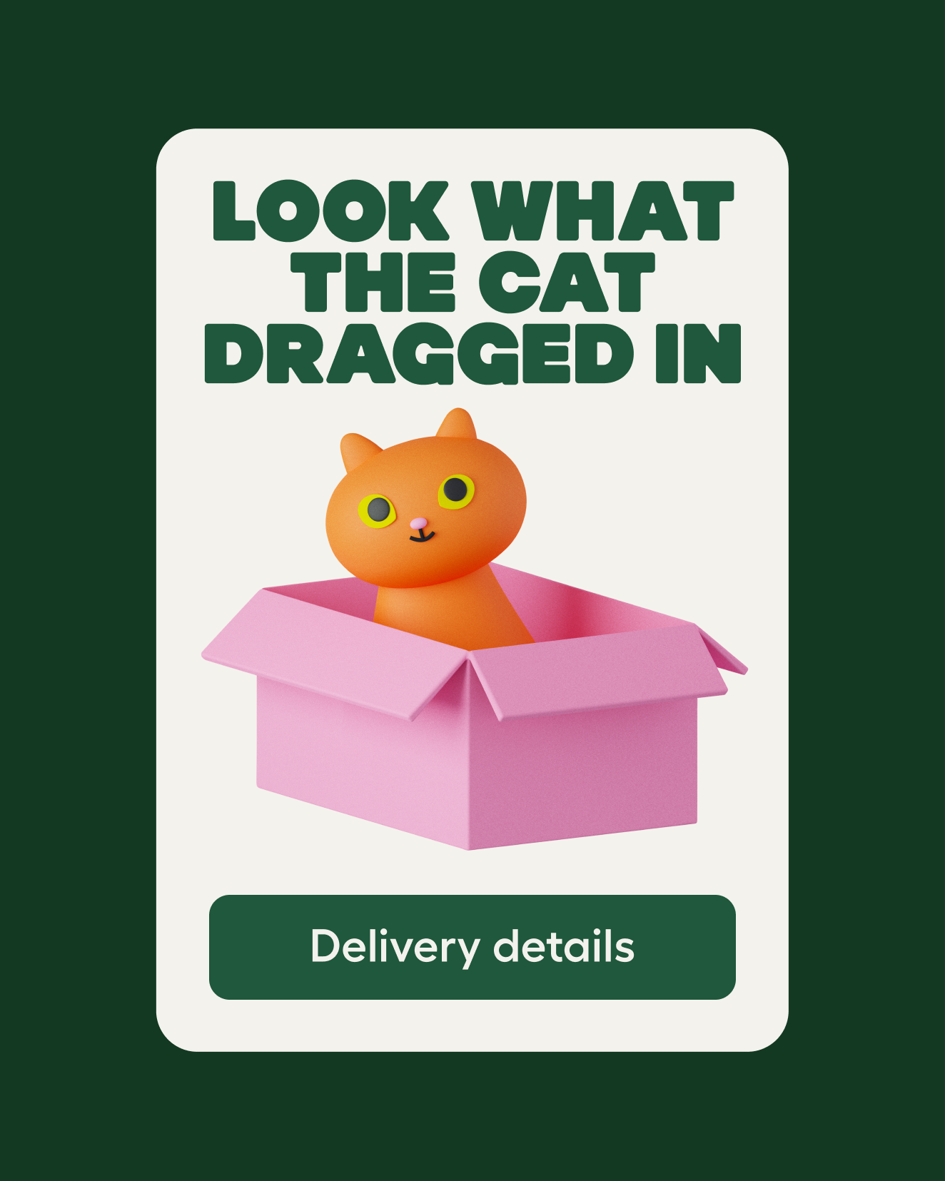
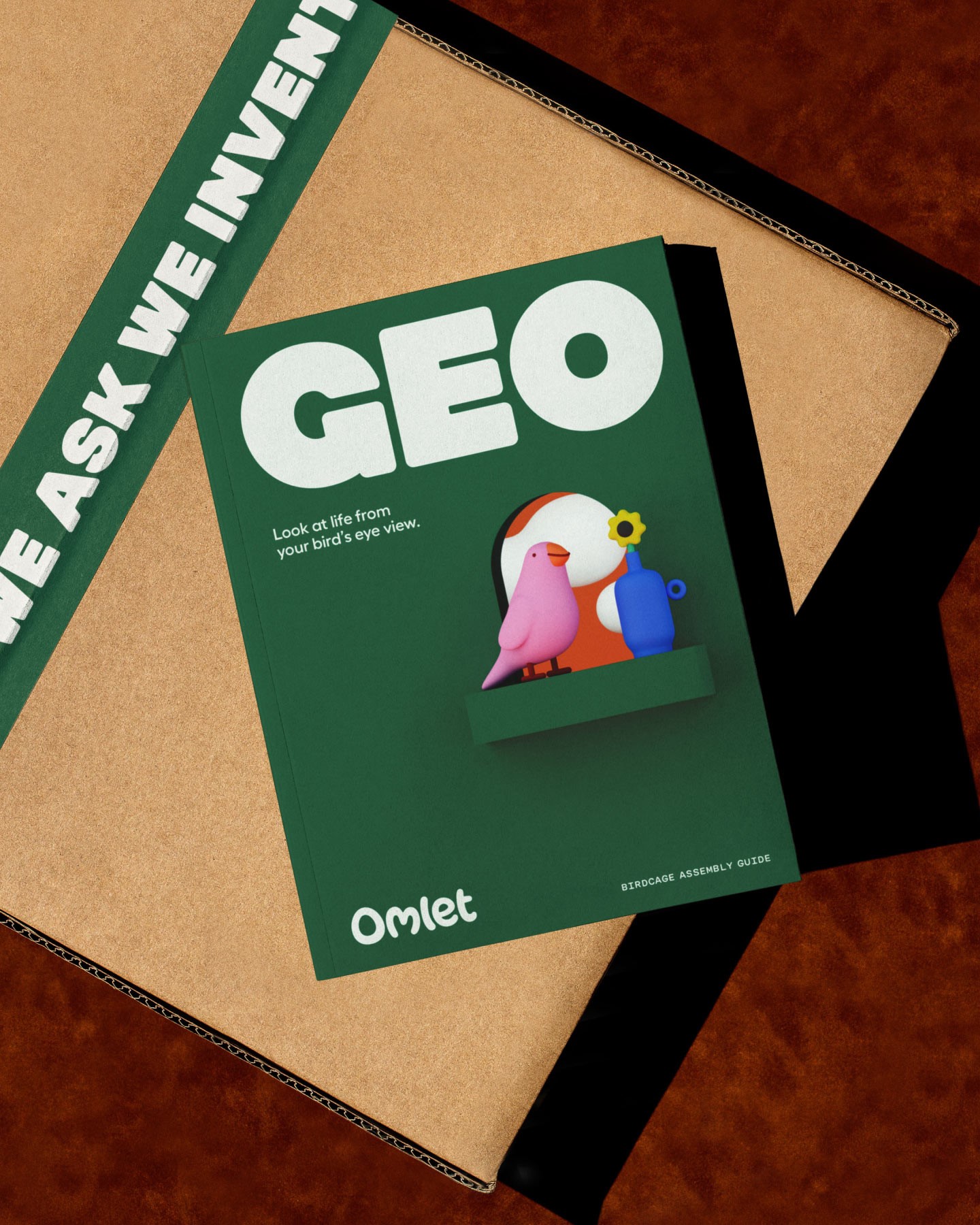
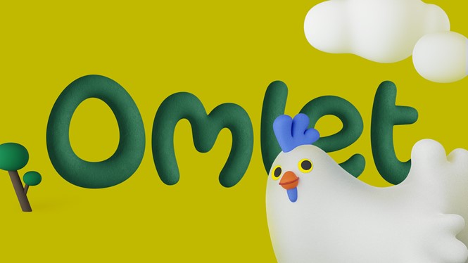
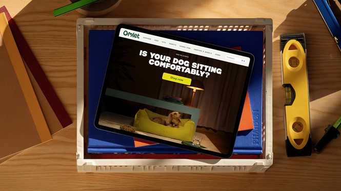
Embracing the humour and imperfection of interacting with our pets, the new Omlet identity is inspired by product design prototypes, underpinned by the use of a tactile 3D illustration style. Elsewhere, the colour palette is derived from the inside and outside habitats of pets.
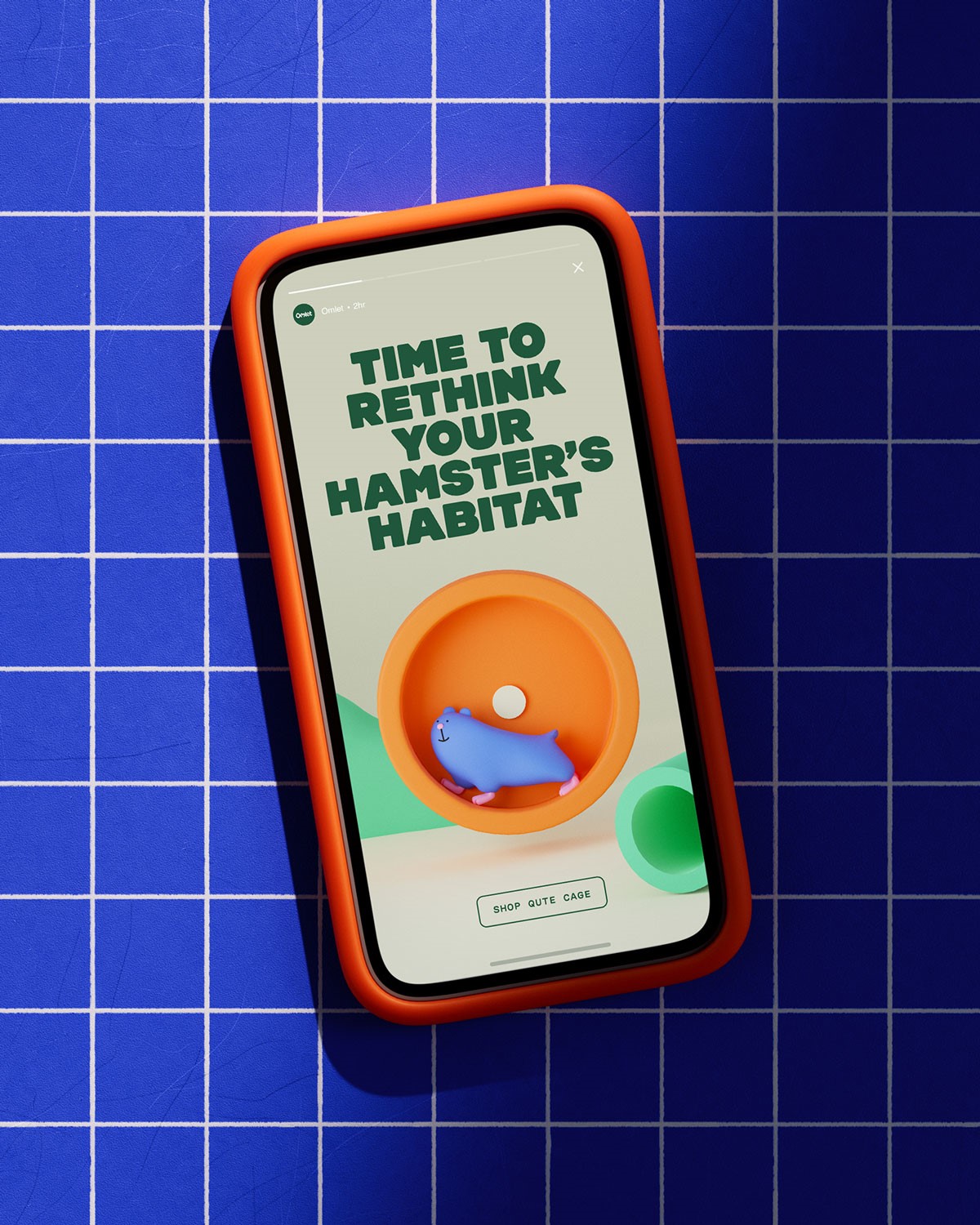
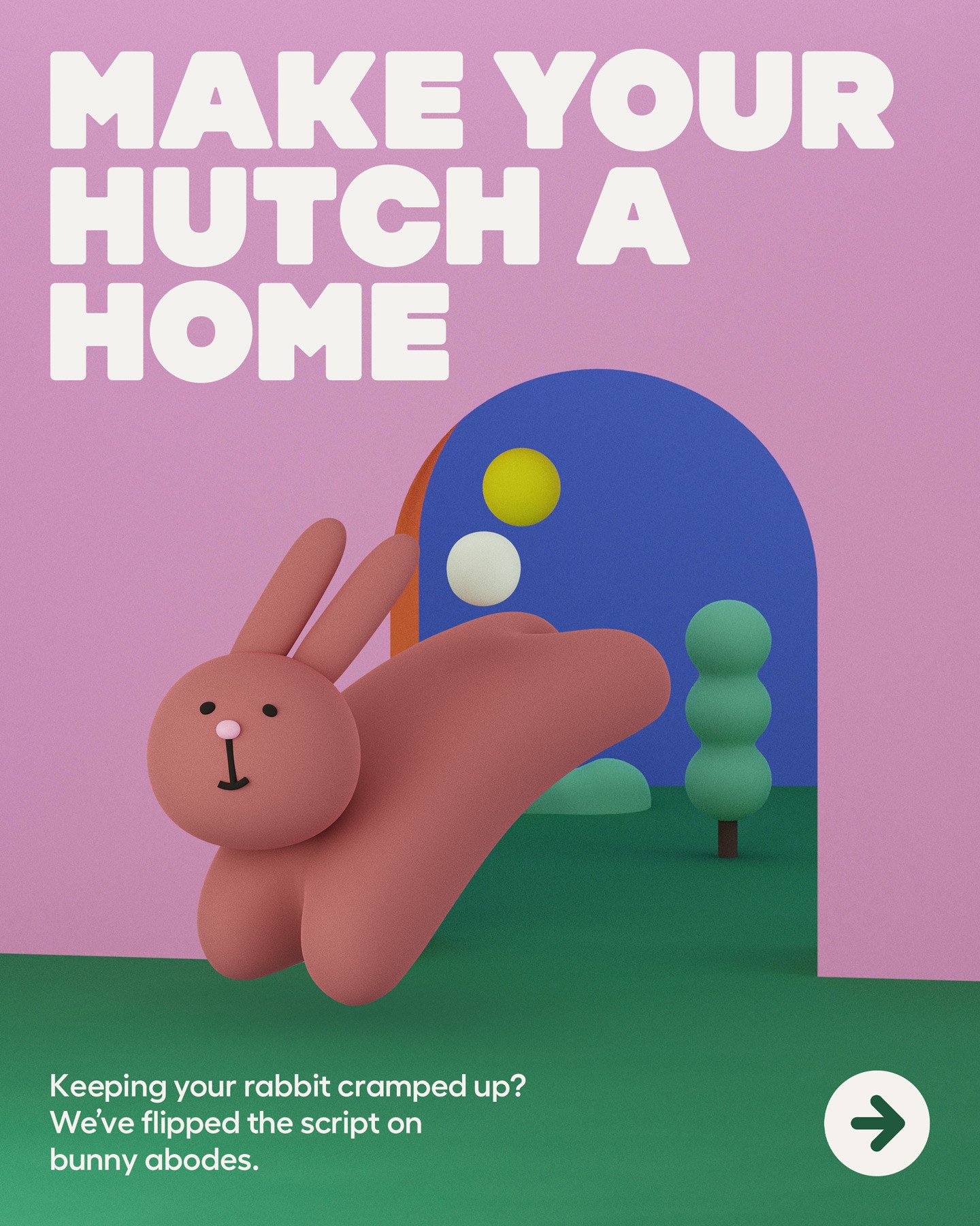
Ragged Edge also created an inquisitive and witty tone of voice which aims to highlight the brand’s insightful curiosity. The redesign, specifically crafted to work across the entire brand, will be rolled out across its ecommerce website, packaging and products.
Max Ottignon, co-founder of Ragged Edge, says, “The pet product category is full of stuff designed for humans – wendy-house coops and toys that look like fast food. We’ve projected ourselves onto pets instead of designing for them.”
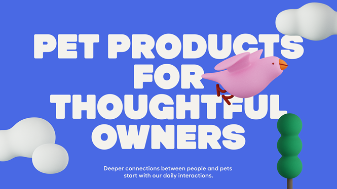
He adds, “Omlet takes the opposite approach, starting from scratch to design solutions for pets, not people. Every product they create aims to deepen the connection between pets and their owners. That gave us rich territory to create a brand that was fundamentally different to anything out there. A world of wonder for pets and pet owners alike.”