Travelport launches bold visual identity
For the first time in its history, worldwide travel retail platform Travelport, launched an end-to-end rebrand. Working with London-based creative agency Studio Parallel, it created a bold and distinctive new visual identity.

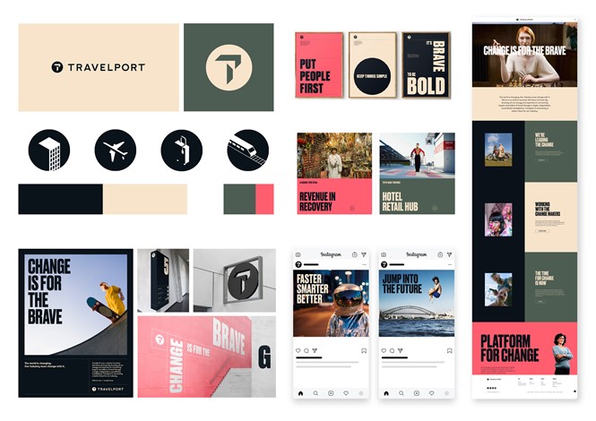
Studio Parallel created an identity that reflects Travelport’s renewed and sole focus of connecting buyers and sellers that share the brand’s passion for delivering travel experiences. The rebrand retains Travelport’s most identifiable brand aspects while refining its vision and what it stands for, embracing its strengths in agility, independence and ability to make the bold long-term decisions needed to simplify travel’s complex ecosystem.
“Our new brand reflects all this – who we’ve become, through our investments in the right people, products and technology and our vision for the future, as we get ready for a year of significant advances for Travelport,” says Greg Webb, chief executive officer of Travelport. “We’re proud to show it to the world today and are looking forward to following it up very soon with the launch our next-generation platform, which will change the game in travel retailing.
The new logo is simpler yet sleeker and more modern, in total black and without any graphics to distract viewers from the distinctive name. The letter 'T' becomes the central aspect of the wordmark, which can be used both by itself and with the rest of the logo.
The new visual identity features a primary colour palette of Travelport Sand and Travelport Black, a secondary palette of Travelport Olive and Travelport White, and an accent colour of Travelport Cora
Travelport’s new visual identity can already be seen on its website and social media channels.


