Greenspace creates brand identity for a new hospitality destination
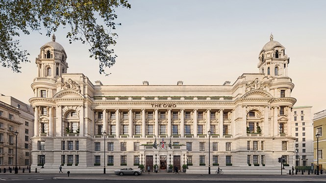
The Old War Office, a London Grade II* listed building, has undergone a transformation over the last five years, which sees it reimagined as The OWO.
The landmark building, originally completed in 1906 and designed by British architect William Young, was once the site of the original Palace of Whitehall, home to Henry VIII and other monarchs. In 2017, Greenspace was appointed by Westminster Development Services to develop the brand strategy, name and identity for the destination.
Greenspace sought to respect the building’s past, while creating a legacy for the next generation to enjoy. “It seems obvious to us now, but there was a period at the start of the project when the words, ‘old’, ‘war’ and ‘office’ were not felt to convey the desired sense of luxury nor hospitality. Nevertheless, the building could never comfortably fit a different name whilst remaining true to its roots,” says Greenspace founder, Adrian Caddy.
“The key insight for branding and naming this iconic heritage destination was always to remain as authentic as possible, this has been the constant connecting thought throughout the project,” adds Lene Nielsen, strategy director at Greenspace.
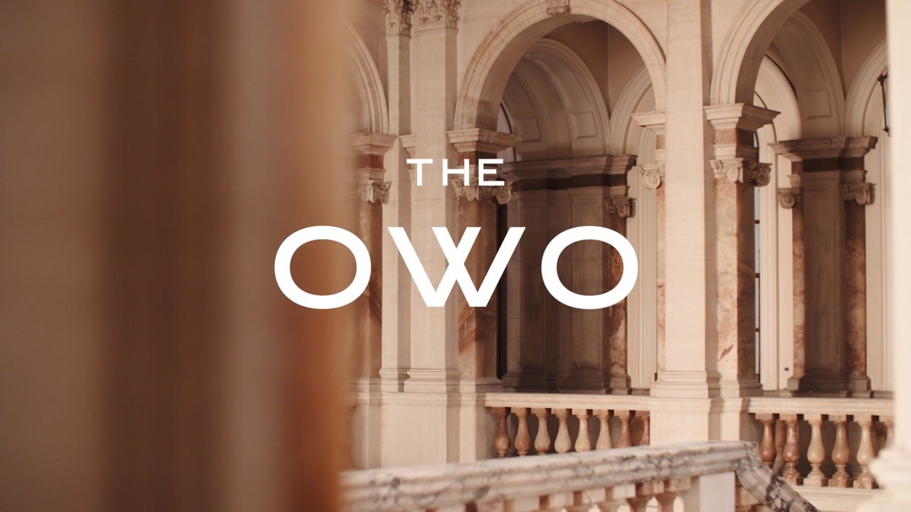
In its search for the right name for the destination, the Greenspace team looked into The National Archives in Kew, where they discovered thousands of letters sent to and from the Old War Office. Almost always, the typist used the acronym OWO. “Seen written, the word is beautifully balanced and perfectly palindromic – you can even fold a W in half,” says Caddy.
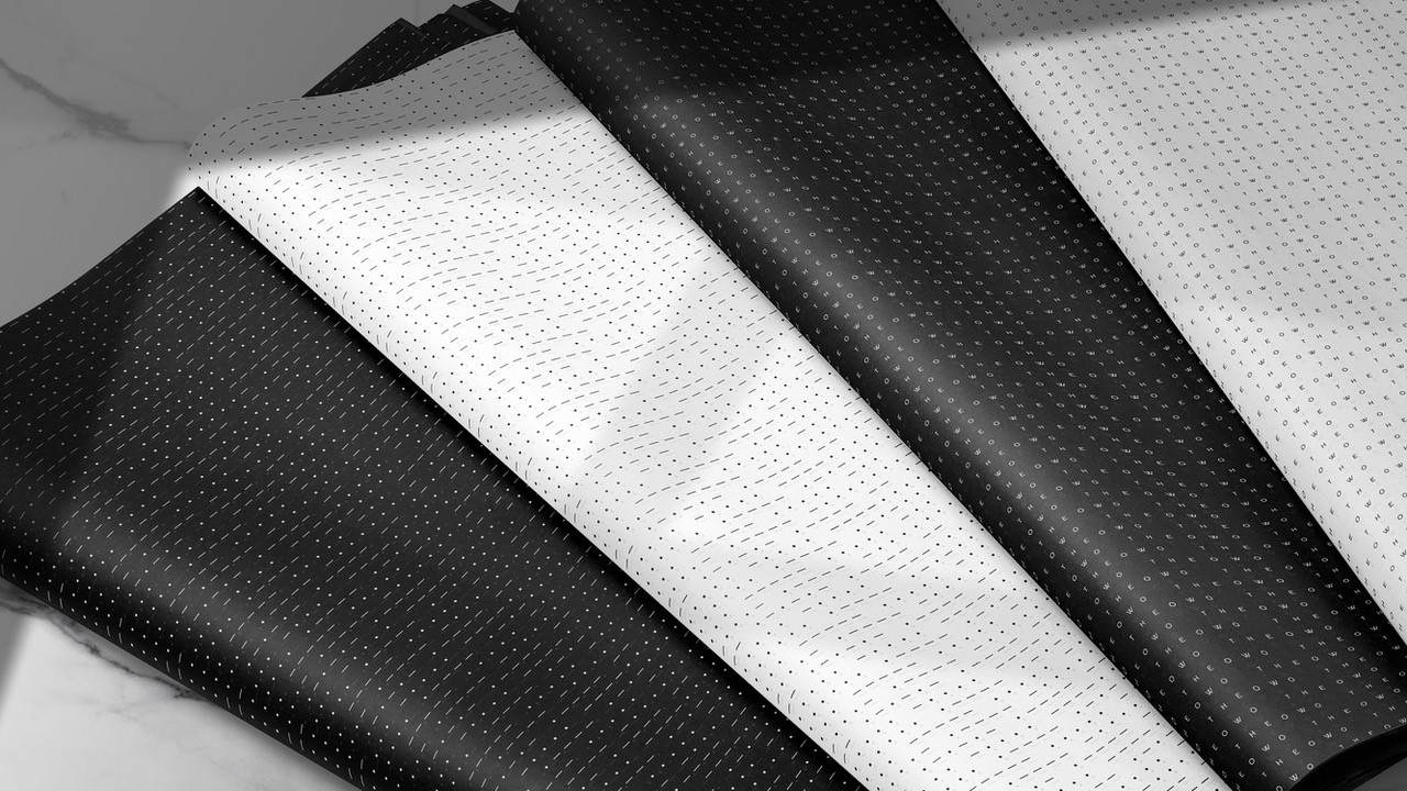
For the design of The OWO brand identity, Greenspace studied numerous early 20th century period Grotesque typefaces by British type foundries such as Stevenson Blake of Sheffield.
“We felt it was appropriate that the logotype should be understated and rooted in the heritage of the building itself. We concluded that to make an old typeface work in today’s digital realm, and to create an asset that would be of lasting value to The OWO, we should recommend the design of a bespoke typeface,” says Lee Deverill, Greenspace creative director.
Greenspace worked with Colophon Foundry on the design of a new Grotesque typeface family, which is used across all The Owo applications, from physical signage to printed publications, websites and social media. The name of the typeface – 1906 – came from the year the building was first opened.
The OWO brand colour palette was chosen by Greenspace to reflect the materiality of the building’s Portland stone, the Alabaster marble of the grand staircase and the black and white mosaics that line its hallways and private residences.
“Our guiding vision is to transform The OWO into one of the world’s iconic destinations for luxury, authenticity and hospitality, and in so doing to create a stunning legacy for future generations. With the help of Greenspace, we feel our brand is well positioned to match this vision,” says Jenny Naylor, in charge of The OWO’s marketing.