#TransformTuesday: 24 November

Here is this week's selection of rebrands from around the world. For more from #TransformTuesday, follow @Transformsays on Twitter.
FactStory
A decade after it was first created, AFP-services, a subsidiary of Agence France Press specialising in on-demand custom content, has become FactStory, a distinct service offering commissioned production to companies and institutions. The name change is seen as an essential step to solidifying the identity and the position of the operation, which has developed since its creation, and help differentiate between the services offered. FactStory works with a global production network, combining strong image expertise and journalistic vision. With the new name comes also a renewed brand purpose which focuses on the core pillars of FactStory, including its global aspect, whereby the production teams are available in over 150 countries in the world, 24 hours a day, and the image expertise that allows creative talents to produce on-demand original and optimised content. FactStory’s DNA also matched the required editorial standards of AFP when it tells its stories.
Louisville City FC
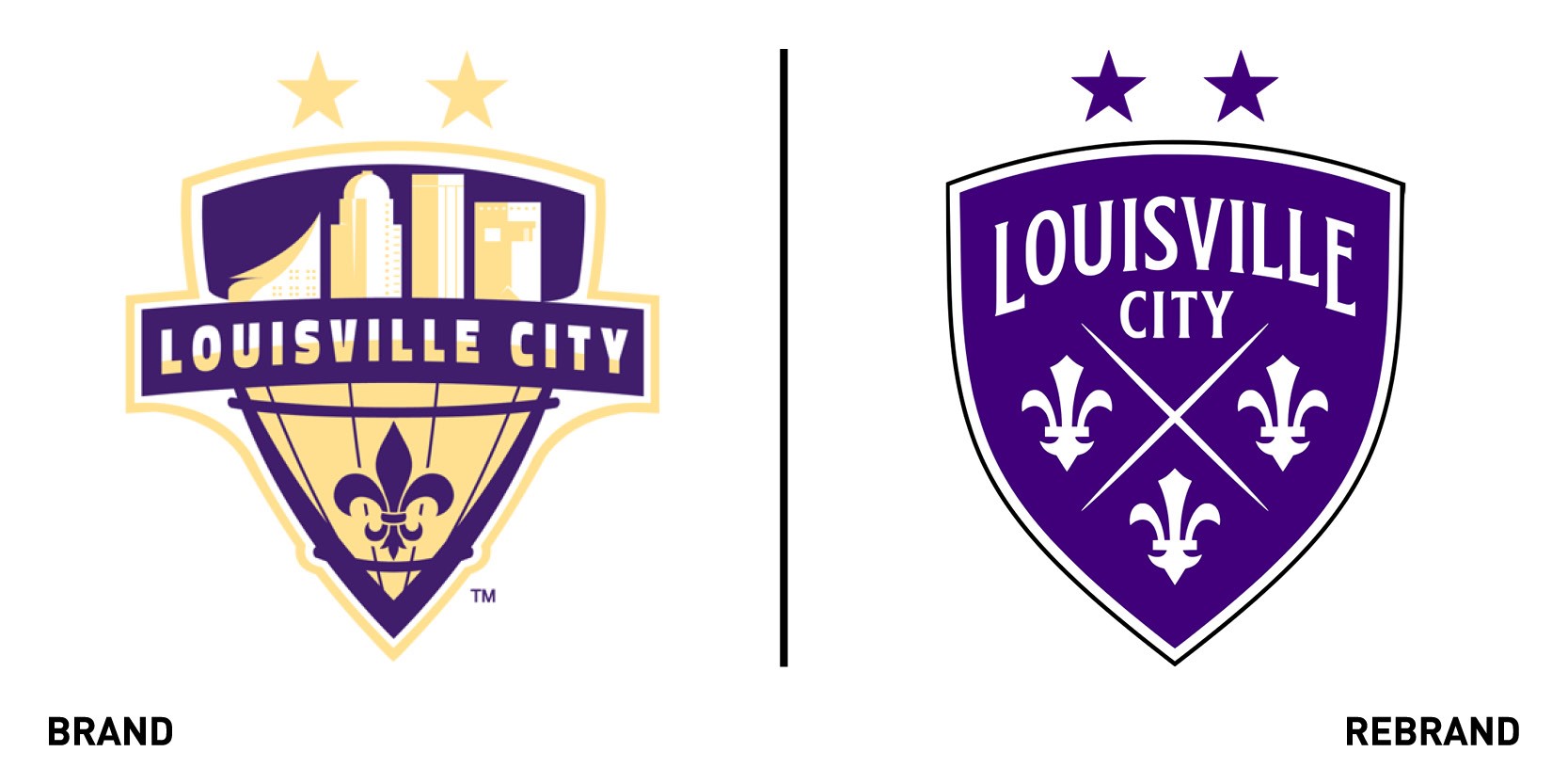
Kentucky-based professional soccer club Louisville City FC revealed a rebranded crest designed by Matthew Wolff Design. The new, bold and distinctive shield-shaped logo is filled primarily by custom colour, LouCity Purple, and a trio of fleurs de lis, a stylised flower synonymous with Louisville. Both elements, which are embedded in the city’s history and culture, are a way to pay homage to Louisville while also making the mark distinctive and easily recognisable wherever it is placed. The club president, Brand Estes, stressed that the rebrand is not about overhauling the brand’s identity but about reflecting its growth and evolution as an organisation.
“We will always pay homage to our original crest used for LouCity’s first six seasons, We also felt as our organisation has grown from not only a USL club but also into a beautiful new stadium, youth academy and an NWSL franchise that we needed to accordingly update our brand. The goal for us was to create something simple, bold and timeless that works in harmony with Racing Louisville FC,” says Mitch Ried, vice president of sales and marketing.
PepsiCo
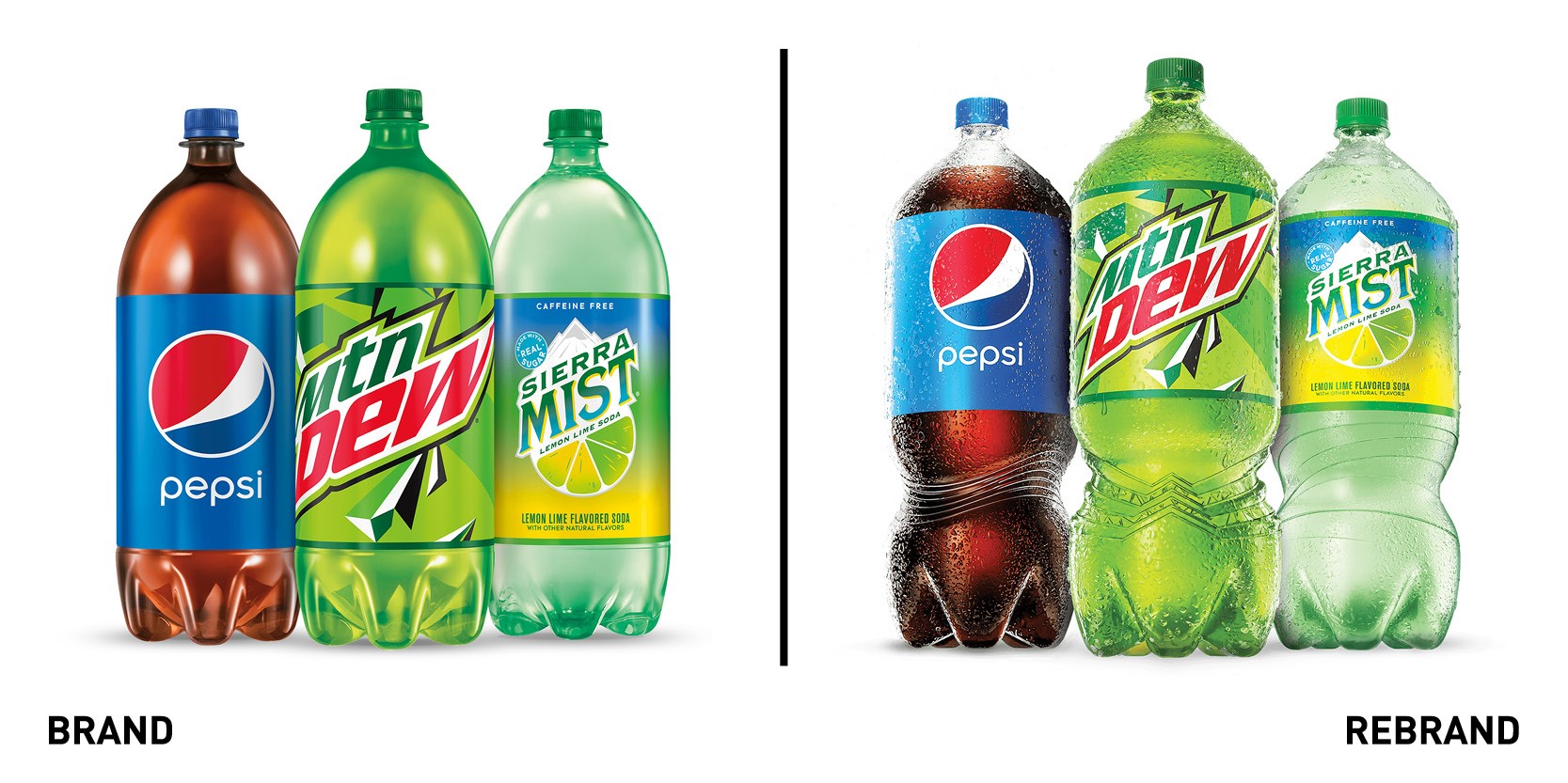
For the first time in 30 years, PepsiCo has announced a refresh of its the two litre pack design across its entire portfolio. The new bottle design is born out of the desire to keep improving the PepsiCo portfolio with the customer in mind and to create a more enjoyable drinking experience, through a modern, functional and easy-to-use bottle that undeniable retains the PepsiCo brand personality. The new bottle design, with a slimmed down circumference, is substantially easier to grip and pour, and has a look that stands out on shelf, in the fridge and everywhere in between. Central portfolio products such as the Pepsi 2 Litre trademark, will feature unique designs on the bottle grip point, reflecting each soda’s legacy branding. The rest of the visual identity will have a uniform design at the grip point meant to stand out visually while maximising form and function
“Beyond improved usability, this new bottle will be the billboard of the soda aisle, catching the eye and shouting PepsiCo, louder and prouder, from top to bottom, with branding no longer constrained to the label, and the exact right balance of form and function,” says Mauro Porcini, SVP & chief design officer at PepsiCo.
Royal National Institute for Deaf People (RNID)
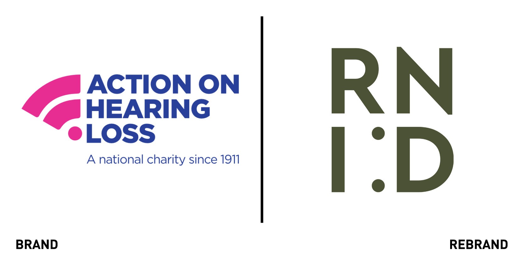
The charity Royal National Institute for Deaf People (RNID) worked with creative agency SomeOne on a rebrand and name change from Action on Hearing Loss, launching the most significant changes since its founding more than a century ago. The return to the UK’s household name of RNID, which dates back to the beginning of the 20th century is part of the charity’s plan to reach more of the one in five adults in the UK who are deaf or have hearing loss. With Covid-19 exacerbating the barriers to communication caused by face coverings, RNID realised it needed to become a stronger brand. The new brand purpose, ‘Together, we will make life fully inclusive for deaf people and those with hearing loss or tinnitus,’ which goes hand in hand with the new name, helps to clearly communicate to the public why the charity exists in the first place and all the work it has done and will continue doing in the future. The new wordmark sees the introduction of a colon, or eyes, to highlight the ‘D’ or smile so that when the brand needs to use a symbol the original text-based emoji smiley face can be deployed. The unusual colour palette of softer colours that moves away from the over-used primary colours helps set it apart from other charities and attract the target audience. Being deaf presents the challenge of being a nearly invisible disability, so SomeOne chose to photograph people who, while deaf, signalled a positive attitude. It also combined the photography with the bold graphic shape made by the ‘Smiling D.’
“RNID is one of the nation’s most important endeavours – it deserves a visual and verbal identity to help it maintain its position as the leading organisation in its field,” says Simon Manchipp, founder of SomeOne.
Swisscom Blue
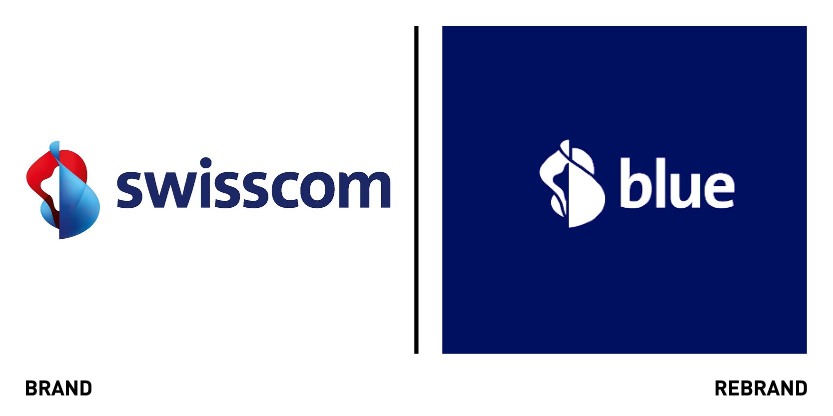
It’s all about blue. International brand consultancy Saffron worked with telecoms group Swisscom’s corporate branding team to unify the brand’s offering. This has transformed its growing entertainment portfolio, from news to gaming, into a single product with a unified brand architecture and design system. Colloquially known as ‘the blue giant,’ because Swisscom was known as ‘the blue window’ upon its entry into the market many years ago. The colour blue is still a highly recognisable brand asset and was therefore natural for the newly entertainment offer under the name ‘blue.’ This pays homage to Swisscom’s legacy and reflect its heritage in the field. At the centre of the visual identity sits the ‘Gateway,’ which encompasses two sides: a hard edge representing the blue platform and an expressive side out of which an energetic blue light emanates from, manifesting the content and emotion on offer from blue. The Swisscom design language of light assets were repurposed into a refined, singular gesture to allow for blue to have a degree of visual autonomy while remaining part of the masterbrand. The Gateway also adapts to specific content, with sports, for example, gaining an increased pace and intensity to reflect the aesthetic qualities of stadium floodlighting. Fiction, drama and comedy on the other hand take on a cinematic treatment of lens flare. Swisscom’s identity as a whole was honed to create a specific toolkit for blue, ensuring enough visual equity to maintain recognition of the brand product while allowing for dynamism to best represent the world of entertainment on offer. Saffron also created a component-based motion graphic kit for blue’s TV broadcasting offering, which includes grid system and typographic stack.
Thinktank Property Finance
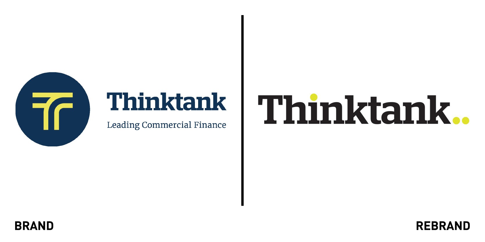
Sydney-based independent property lender Thinktank Property Financworked with Sydney’s Create Design & Marketing and research agency Get in the Loop to launch a rebrand. The modernised branding reflects the company's values, ethos and way of doing business. The new approach aims to reflects our core company values and relationship centric focus, while continuing to grow and evolve as the country's leading property finance providers. While its name remains unchanged, Thinktank has updated its logo using a new colour scheme of black and mustard. The new logo also has an updated font, which features two unique, ellipsis-like dots. The new wordmark also gets rid of the previously used ’T’ brand icon and has removed its tagline of ‘leading commercial finance.'


