#NewBrandMonday: 23 November
Here are this week's selection of newly launched brands from around the world. For more from #NewBrandMonday, follow @Transformsays on Twitter.
Casa Blanca
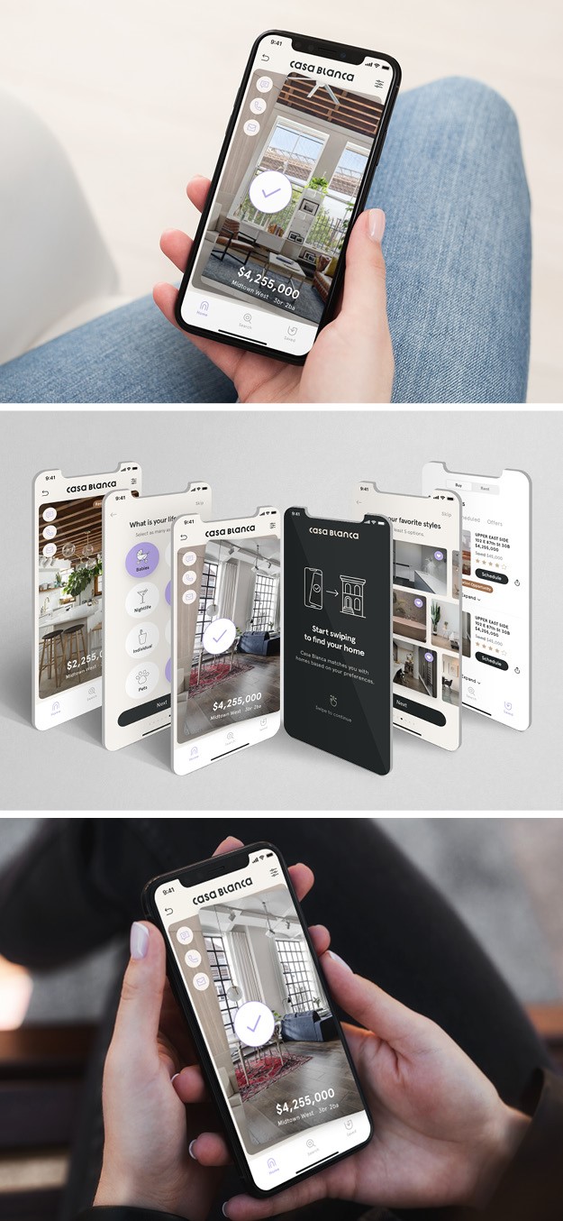
New York City-based design agency Combo and sister company strategy consultancy Verdes collaborated to design Casa Blanca, new real estate app that brings a new level of engagement and transparency to the New York City real estate market. The concept behind the app is like that of a dating app, complete with a swipe right function to further explore the properties you love. Combo and Verdes worked to develop an inviting design, simple user experience and calming colour palette to engage users and communicating clearly everything an apartment or home had to offer. The founder of Combo, Kapono Chung, sought for the user experience to be the main priority and therefore for the app to be completely transparent and enhance the overall real estate experience. When the app is downloaded, it walks the user through a style questionnaire to gauge specific preferences to personalise the feed, such as if they’re looking to buy or rent, number of rooms, and budget. It also curates the main feed by showing the user mood boards and asking about their lifestyle choices.
“The worst thing about home hunting is that feeling that you are being deceived; that a home can be shown as bright with lots of windows and actually have no windows, or way more expensive than the price range stated. This is beyond frustrating for users, so transparency was our number one priority in our design for this app,” says Kapono Chung, founder of Combo.
“We found that single women make up the second largest segment of homebuyers after married couples, and even with couples who are buying, women tend to be the majority influencer in home-purchase decisions. Once we understood this reality, it helped us build a female-centric brand, product and experience,” says Greg Matson, partner at New York agency Verdes.
Coconutea
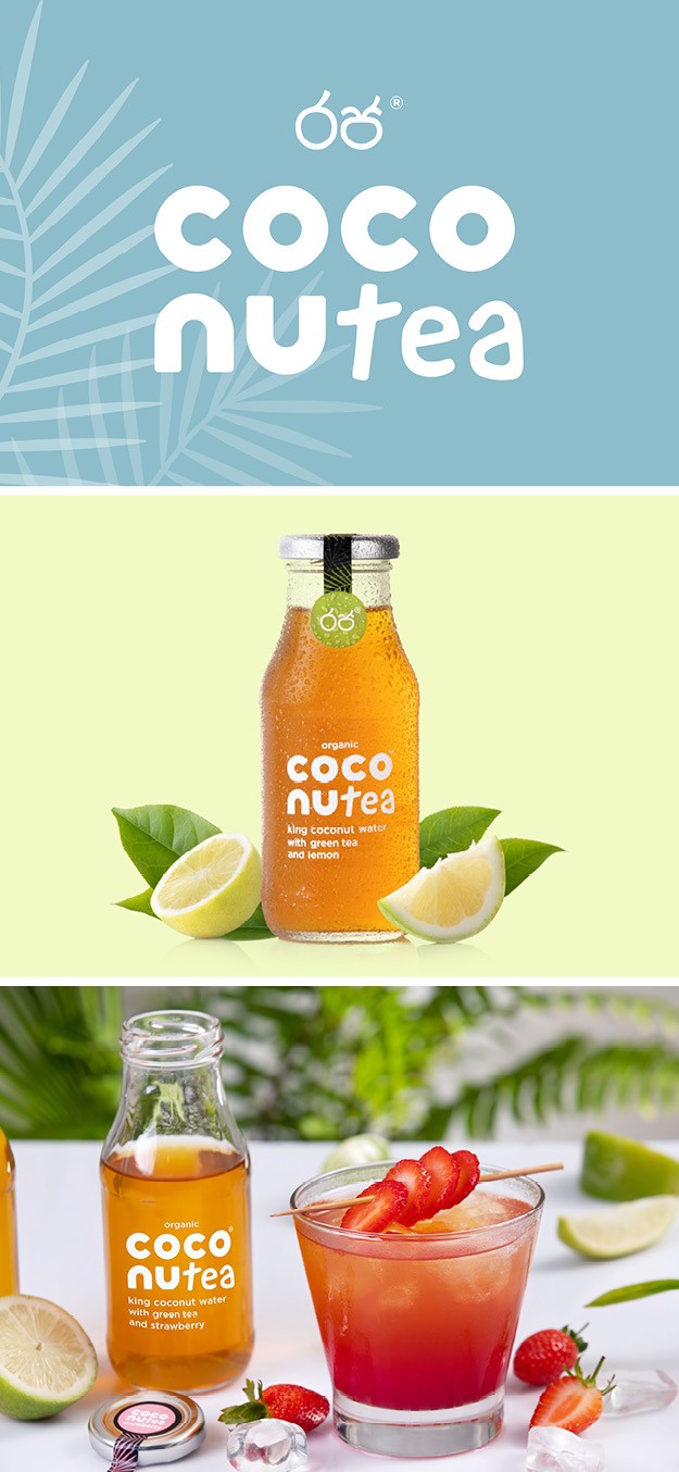
Design agency Lewis Moberly worked with Coconutea, a new organic food brand focused on the virtues and health benefits of King Coconut water, to create a brand identity, packaging design, website creation and consumer experience. The goal was to create a holistic design solution that would disrupt the luxury health drink market, targeting the young, affluent and healthy conscious consumer market. The name in itself sums up the ingredients and joyfulness of the brand, reflecting the simple and vibrant combination of King Coconut and Sri Lankan green tea flavours. The name became the central aspect of the brand, taking over outdated juiciy coconut graphics and heroing the product to attract shelf attention. The refreshing drink is presented in single-serve 250ml, easy-recycle, glass bottles; an important consideration of the design and brand overall. The ‘Coconu’ echoes the rounded shape of this exotic fruit whilst the ‘Tea’ has a more spontaneous experimentation letter. The design separates the two main ingredients, engaging the consumer. Pops of colour and graphics of palm tree leaves seal the drink, next to the Sinhalese icons which translate into ‘King’ and pay homage to the Sri Lankan heritage, reinforcing authenticity.
Creo
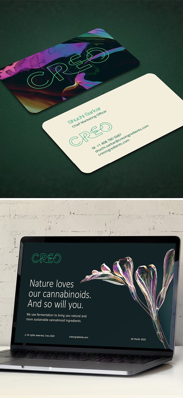
Global consultancy Brandpie launched the brand story, purpose and visual identity for cannabinoid ingredient brand Creo. The bold brand identity breaks away from the typical design seen in the industry whilst being able to compete against the big ingredient and biotech company and establishing itself as one of the leaders. Creo set out to create a strong, differentiated, purpose-led, world class brand that matched the ambitious and unique nature of its offering. Reflecting Creo’s mission of sustainability and doing good for the planet, Brandpie created the purpose ‘Enable the creation of cannabinoid products that help people without doing harm to our planet.” From there, Creo and Brandpie worked together to build the brand story and positioning around a simple creative idea: ‘Nature loves our cannabinoids. And so will you.’ The simple and easy to remember and the distinctive logo made up of a single continuous line encompasses how the company’s ingredients unleash a wave of creativity across multiple industries without there being any limit. Using a variety of plant photography, Brandpie inverted the color spectrum, to form an X-ray-like effect, which serves as a metaphor for looking at nature through a different lens, to reveal the infinite possibilities of what the Creo brand can produce through their expertise.
“There is so much more to the cannabis industry than THC or CBD. New discoveries are being made every day about what ingredients like CBG can do for you. By pairing its audacious ambition and groundbreaking technology with a compelling brand, Creo is now primed to become the innovating leader the industry needs,” says creative director at Brandpie, Rik Haslam.
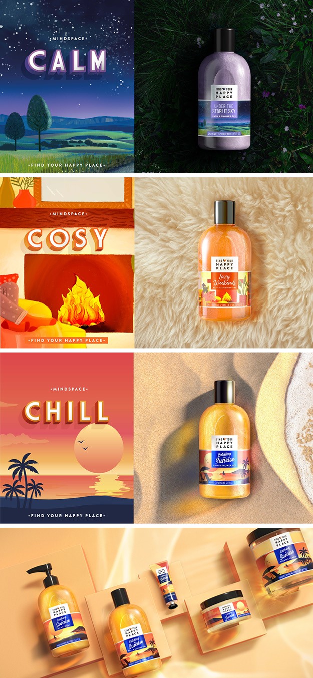
'Find your happy place'
Inspired by stories about reclaiming ones ‘happy place’ in these uncertain times, Unilever US Bath and Body team worked with London-based creative agency PB Creative to launch a new collection of bath and body products under the label ‘Find your happy place,’ to allow people to immerse themselves in positive experiences shared by others. The sub brand is designed to transform people’s mood and help wash away life’s stress and anxiety, with each collection inviting consumers to return to these happy experiences which awaken the senses through colour and scent. Illustrators with distinctive styles helped bring these experiences to life by emphasising special moments like catching the sunrise and lazy weekends. Each illustration transports the customer straight into bath heaven, be that near a fireplace or under the stars. The idea was that of creating a strong brand architecture for the portfolio to work across countless variants, while at the same time allowing each collection to retain its own distinct personality without losing a sense of fun.
"The team at PB Creative helped us bring to life not only a new brand identity, but also to craft each unique collection to tell its own story. The end result is a set of collectible, giftable and truly one-of-a-kind products,” says Sonali Doshi, global brand manager on Bath & Body innovations at Unilever.
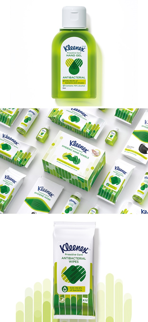
Proactive Care
Independent brand agency Echo worked with Kleenex to design the packaging for its new range of Proactive Care™ products that help consumers adopt positive hygiene habits while offering a sense of control amid the uncertainties of the pandemic. The Proactive Care™ range includes hygiene face makes, antibacterial hand sanitiser and antibacterial wipes. In the inclusive spirit of the Kleenex brand, all written labels have been designed using a clear typeface with open and helpful descriptions, removing any intimidation, which is essential for new-to-market products. The packaging as a whole is very consumer focused: simple icons supplement the illustrations and descriptions to simplify and streamline what could otherwise be an anxious process for some consumers; and the packs are readable from a 2-meter distance. This is a new yet essential consideration for the design process which ensures potential customers do not have to touch products on the shop before buying them. The vital green colour palette, which departs from the clinical blues, aims to inspire feelings of optimism and shift perceptions from distress purchase to a wellbeing choice. The hand motif and interlocking pattern represents the power of individual actions can have collectively, whereby looking after oneself and helping the spread of germs can help others as well.
“Through creating a consistent visual language with colour, iconography and pattern, we have unified an eclectic range so that they work together as a complete and complementary set of products for hand and face,” says design director at Echo Christy Davies.


