#NewBrandMonday: 17 August
Here are this week's selection of newly launched brands from around the world. For more from #NewBrandMonday, follow @Transformsays on Twitter.
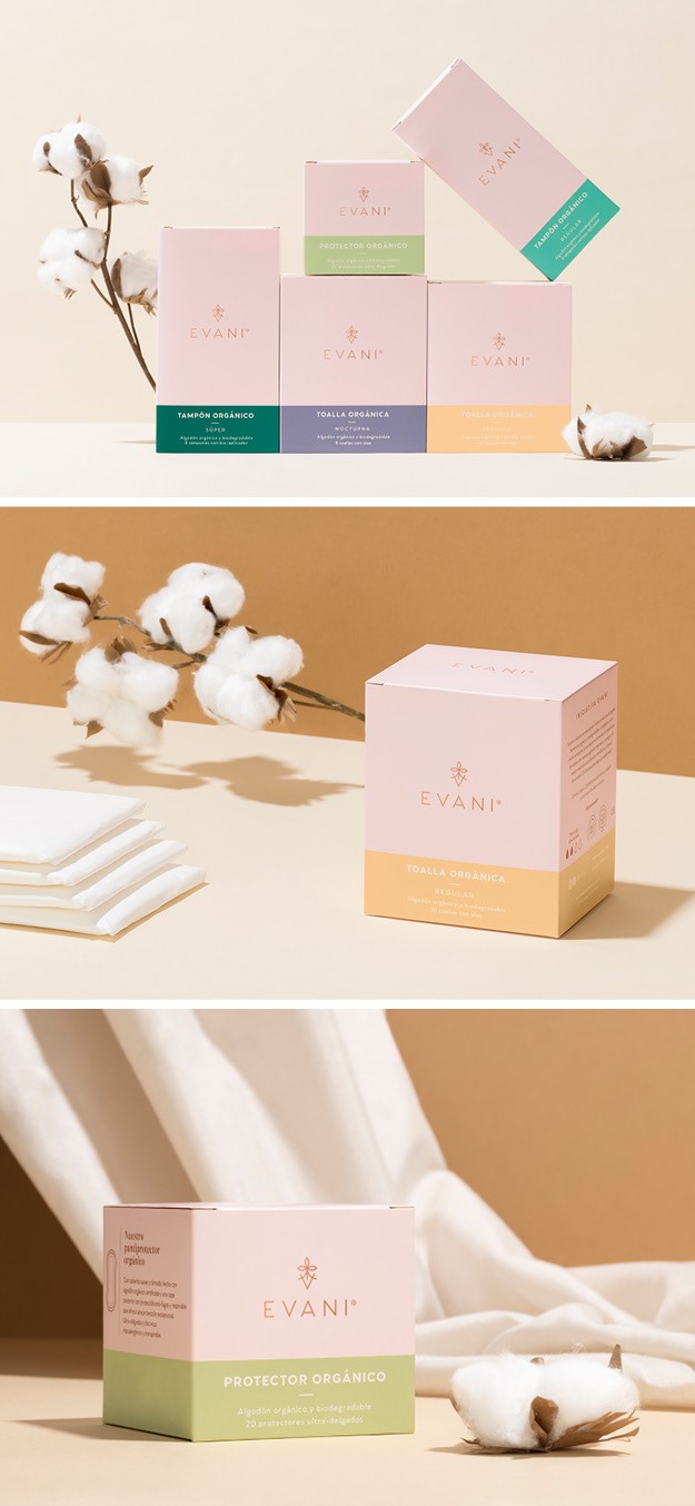
Evani
Mexico City-based design studio The Branding People created the brand identity and packaging for Evani, the first Mexican brand to offer organic, environment-friendly menstrual hygiene products in the country. Evani proposes a range of plastic free, cotton products, which adjust to every lifestyle while being kind to the environment. The Branding People designed a colour palette, centred around pastel neutrals, that evoke the softness of the cotton and the feminine side to it, while making make the brand stand out from its competitors. Similarly, the packaging, linear and simple, represents a light-hearted lifestyle that helps communicate the brand’s organic approach, also incapsulated in the strapline ‘Free, light and safe.’ This is also reflected in the high-res photography depicting
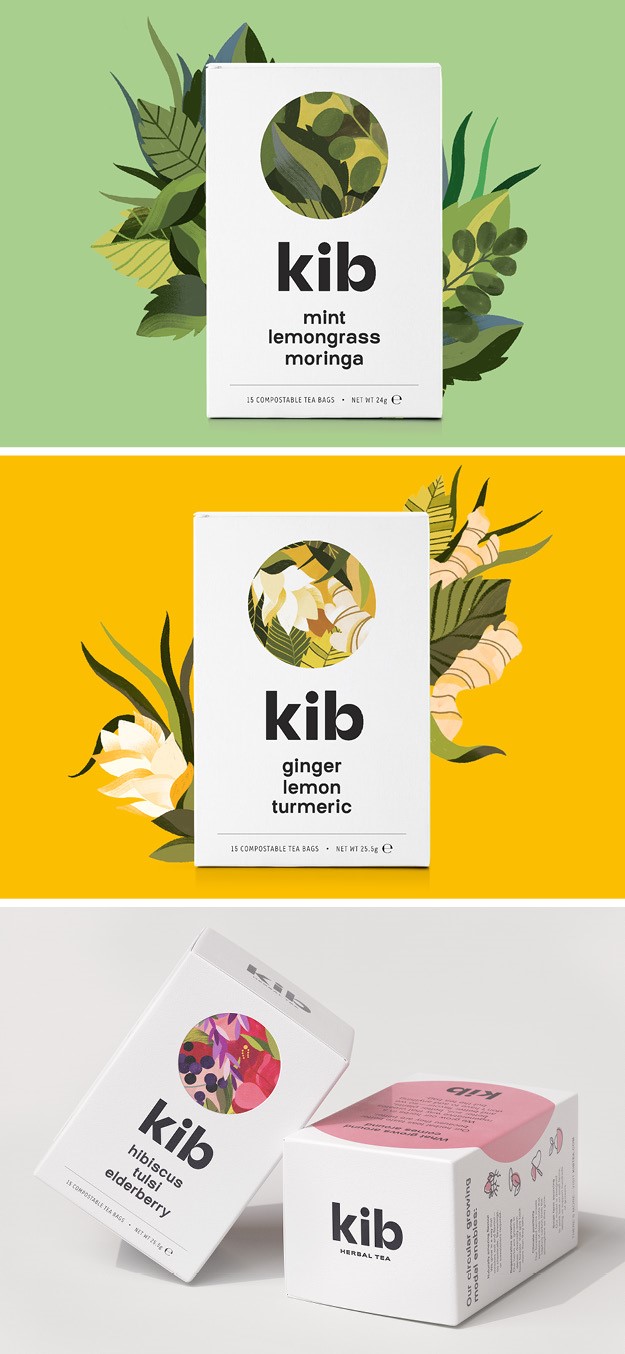
Kib
London-based agency & SMITH unveiled its branding and packaging design for Kib, a new herbal tea range launched by East African speciality food company The Perennial Foods Group. Using herbs grown by Ethiopian smallholder farmers in ‘food forests,’ Kib offers a new, more hopeful direction for global agriculture. The design of the range is a fresh take on the saturated theme of ethical food and drink packaging, featuring lush illustrations that combine images of verdant food forests inside of the pack, surrounded by a a simple black and white exterior packaging that will stand out on shelf. The inner pack also explains in more detail how circular growing creates products of the highest quality.
“Kib is Amharic for circle, and the idea of circularity is at the heart of everything we do. We use circular methods to grow the herbs we use in our teas and the packaging we use is all recyclable or compostable so that it can keep circulating instead of going to landfill. Our commitment to circularity is what delivers the naturally delicious flavours of our herbal teas. That’s the story we asked & SMITH to tell,” says Kib’s commercial manager Andrew Weiler.
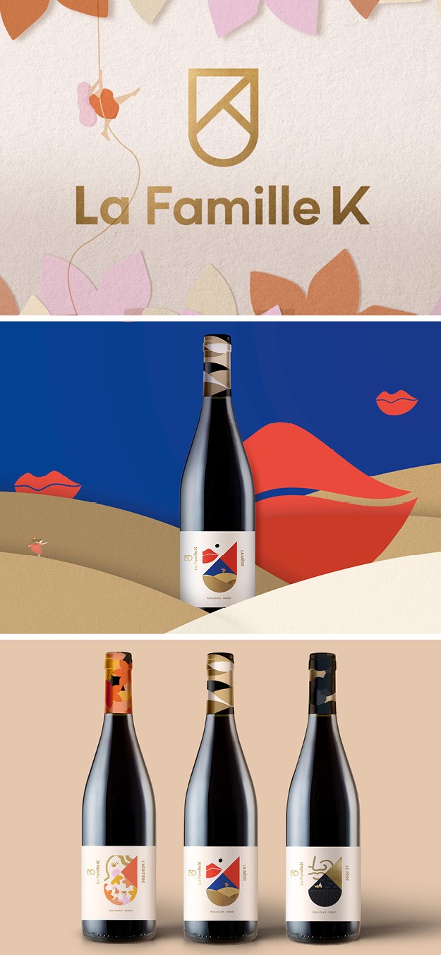
La Famille K
Brand transformation company FutureBrand worked on the brand identity and packaging for La Famille K, a range of organic, sustainable and affordable wines harvested in the Beaujolais region of France. To counter the mixed reputation Beaujolais wines can often suffer, FutureBrand focused on creating a design that would convey the high quality of La Famille K, reflect the spirit of the family whilst also respecting the rich and old terroir of the wines and region. To do so, the agency designed a family crest for the brand, a K within a coat of arms which creates a contemporary sense of heritage around the wine.
“An essential challenge we had to face with this project was to stand out from an overcrowded category with a truly unique and embodied story: La Famille K have two bottles of wine to represent each family member, one red, one white. We used this opportunity to personalise the labels of the wines offering a quirkiness and personality unique to La Famille K. The result is fun and playful, capturing the spirit of the family through jubilant yet uncomplicated illustrations,” explains Charlotte Gosset, consumer client director at FutureBrand.
Jeanne, for example, daughter and heiress to the business, is embodied in the deigns for the younger wines, whereas Benoit the father who takes on the main farming duties in the vineyard, is represented in the designs for the more mature wines.
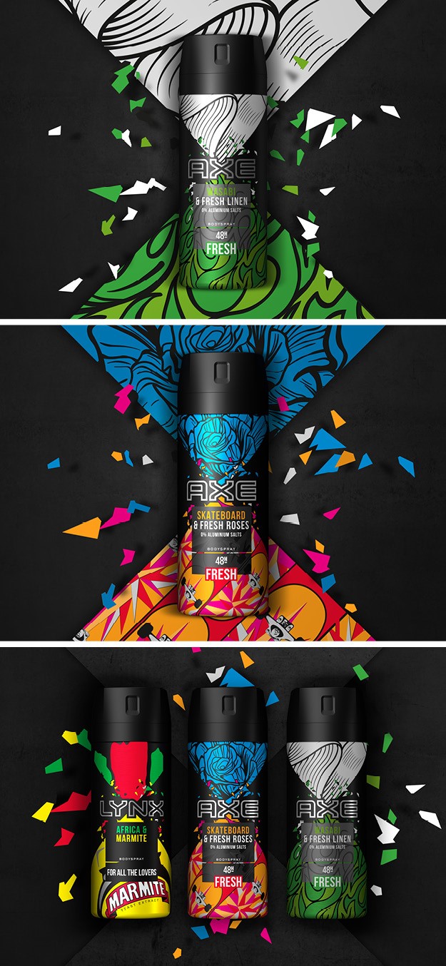
Lynx/Axe
Brand design agency PB Creative worked with Lynx/Axe to create another addition to the collisions range, Skateboard & Fresh Roses and Wasabi & Fresh Linen, following the success of the Lynx Africa and Marmite brand mash up. The Axe team asked PB Creative to develop a design system that had the flexibility to act as a framework for each collision expression and messaging while retaining a range look and feel. Each collision concept needed to be fully comprehensible and easily recognisable on shelf while also having the longevity required to reinforce a powerful campaign. Each variant represents the collision of unexpected fragrance parings that challenge gender stereotypes, allowing men to express themselves, even if it means showing their softer side.
“While we’ve retained Axe’s tone of voice, this limited edition brand expression is a much more literal and edgy iteration than the core range with intense graphics and bold hits of colour to bring these unexpected combinations to life,” says design director at PB Creative Agata Racka.
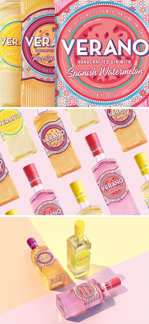
Verano
Scottish family own-ed distiller and distributor William Grant & Sons worked with London-based creative agency Butterfly Cannon to launch a new variant to its Verano Fruit Gin range, the Verano Passion Fruit. Verano, Spanish for ‘summer’, aims to appeal to casual gin drinkers who look for something informal and relaxed to enjoy with friends in the summer. It was therefore important that the overall aesthetic for Verano reflected this warmth and inclusivity, transporting the sense to Spanish bars and cafes with an instant hit of freshness. At the heart of the design are juicy slices of fruit, which convey the all-important taste appeal, framed by tactile detailing inspired by Spanish tilling to communicate the provenance of the fruit used in the distillation. The chunky structure of the bottle is perfect for sharing and easy pouring, with the arch at the shoulders echoing the shape of the fruit.
“We asked Butterfly Cannon to create a premium yet accessible gin which introduces more vibrancy and sociability into the gin world. Their design perfectly encapsulates Spain and its relaxed lifestyle,” says Emily Young, global innovation marketing manager at William Grant & Sons.