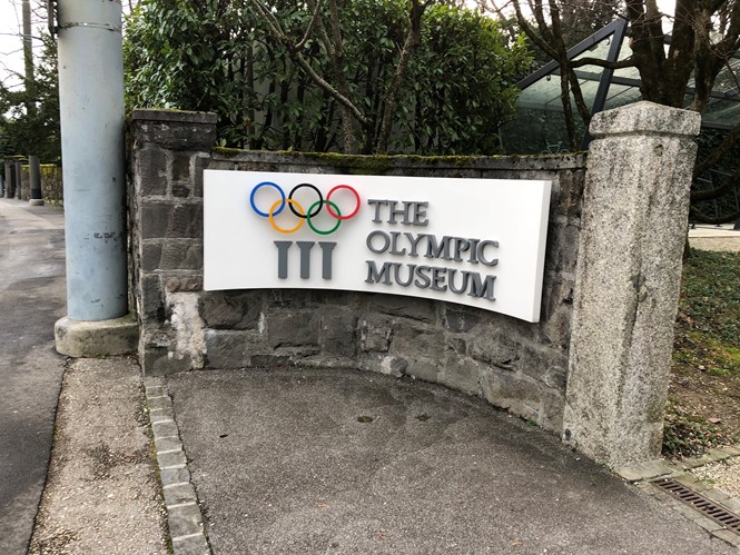
Uncovering the Olympic brand story at the Olympic Museum
For two weeks every two years, millions of people around the world will be staring at a single brand. No matter the feeling it evokes, there is one thing certain of Olympic Games branding, it will be seen and experienced by millions.
No pressure then, for the designers and agencies tasked with creating those brands.
For some agencies, like Interbrand, Olympic branding becomes something of a specialty. For others its a once-in-a-lifetime opportunity. But more often than not, the brand development process entails something of a moment of serendipity when it all, suddenly, seems to work. Developing these brand worlds and uncovering these moments of opportunity is what the Olympic Museum’s current ‘Olympic Language’ exhibit is all about.
The Lausanne institution has an extensive permanent collection focusing on sporting triumphs and the development of the modern Games. But its temporary exhibit – running until 24 March – offers one of the only opportunities to explore the stories behind some of the Olympics most iconic brands.
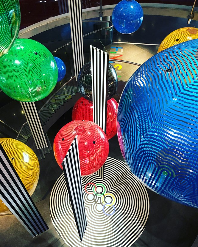
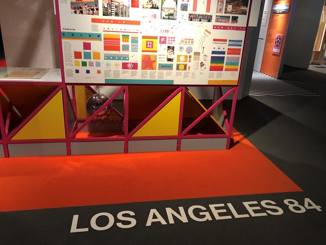
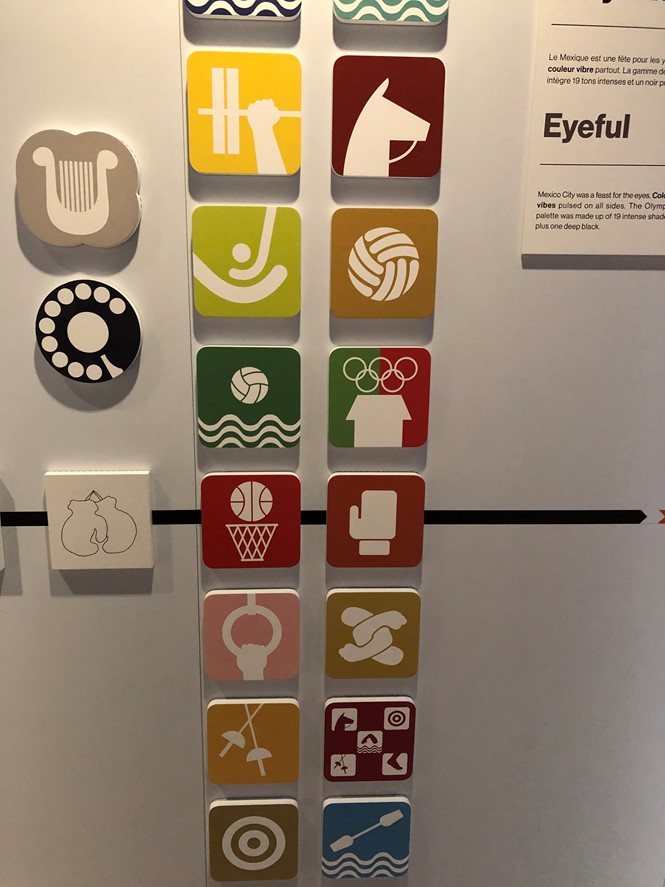
The exhibit highlighted a selection of brands in depth – like Los Angeles 1984, Mexico 1968 and Lillehammer 1994 – to tell a more detailed story. It then explored 21 brands through a series of videos. As the exhibit progressed, it builds a cohesive story about how the modern branding process has been constructed.
Did you know? The Tokyo 1964 poster designer nearly forgot about the commission. He was reminded when a friend asked him about his progress and then completed the iconic Rising Sun design in about two hours.

In the Los Angeles display, designers talk about how the brand expanded beyond a logo and used a colour palette to build one of the first sets of brand guidelines in Olympic history. Tokyo’s 1964 Olympics too, made history, for the introduction of the first set of pictograms – now omnipresent in Olympic branding – as a way of overcoming the language barrier. The Lillehammer games set out the expansion of the brand world from beyond a poster, logo and colour palette. Its use of local granite, cave art and Northern Lights-inspired iconography built a full brand world for maybe the first time.
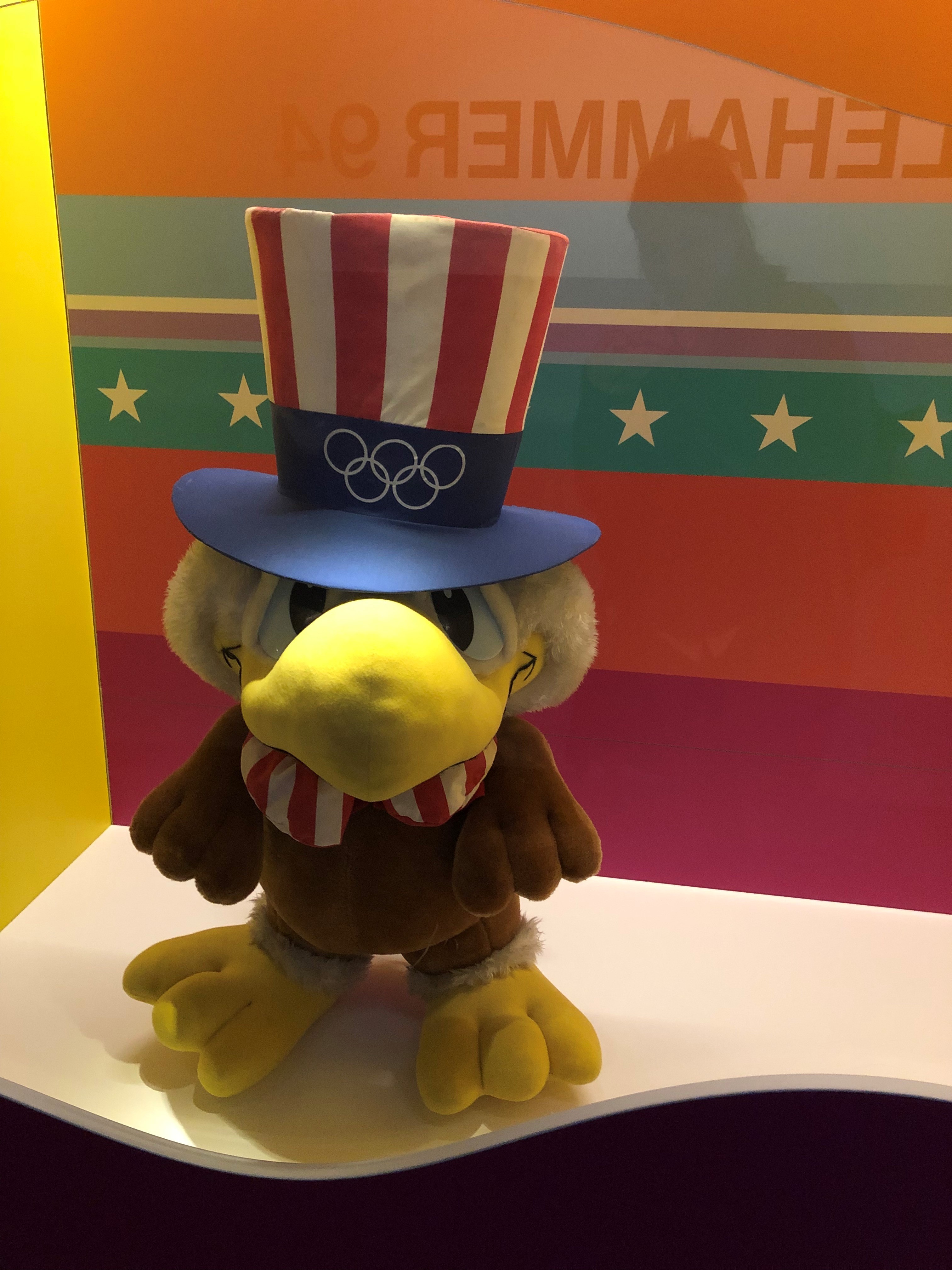
Also on display were some of the most beloved and iconic mascots from throughout Olympic history, as well as explorations of those Games that did not feature prominent branding. Using filmed interviews with brand developers and artists, the story of each brand is told in a fascinating, narrative-based manner. The comprehensive story helps build an understanding of why Olympic branding is so challenging to get right as well as the impact it has on viewers, participants and host cities alike.

For more on Olympic branding, see our stories on: Russia's team brand, PyeongChang, the Winter Olympics and Beijing 2022


