Timeline: Winter Olympics
In the Olympic Charter, the distinction for sports played during the Winter Games is that they must be “practised on snow or ice.” As the world prepares for the 2018 Winter Olympics to kick off in PyeongChang, South Korea, here is a look back at the branding history of the Games
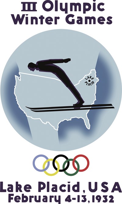
1932 The Lake Placid games held in 1932 – the first of two times the New York town would play host to the Games – was the third Winter Olympics, but the first to have official branding. Previous events, held in Chamonix and St Moritz, used posters to support the Games.
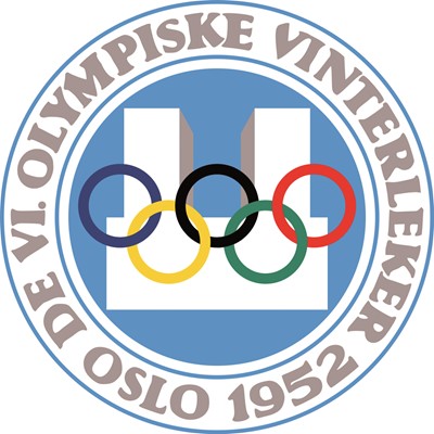
1952 With hand-drawn lettering and the Olympic logo overlying a rendering of Oslo’s city hall, this seal was arguably the first modern Winter Olympics brand. Previous iterations are much more complex. The 1952 brand pares the drawings and intricacies of previous games down to create a simple, effective rendering.
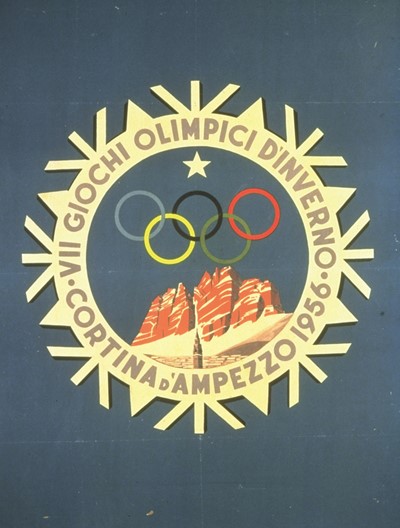
1956 For Cortina d’Ampezzo’s logo, a snowflake and a dramatic landscape of the imposing Italian Dolomites provide all the inspiration necessary. The icy, winter blue chosen for the background completes the logo and proves to be the last of the ‘landscape with words in a circle’ trope that pervades previous Winter Olympic branding.
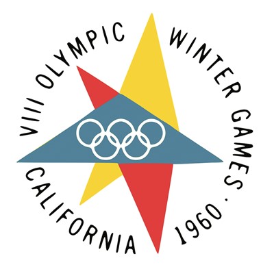
1960 The 1960s ushered in an age of modernism and the 1960 Squaw Valley branding surely doesn’t disappoint. The Lake Tahoe, California ski area played host to a Games which had a brand that was decidedly modern, decidedly Californian and led to a new era in Winter Olympic branding. Later years would adopt similar approaches using small colour palettes and interesting shapes to best represent the Games, rather than the more intricate drawings of the past.
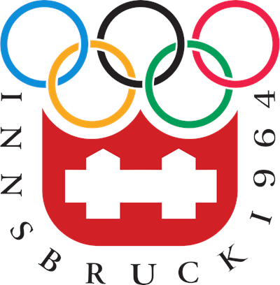
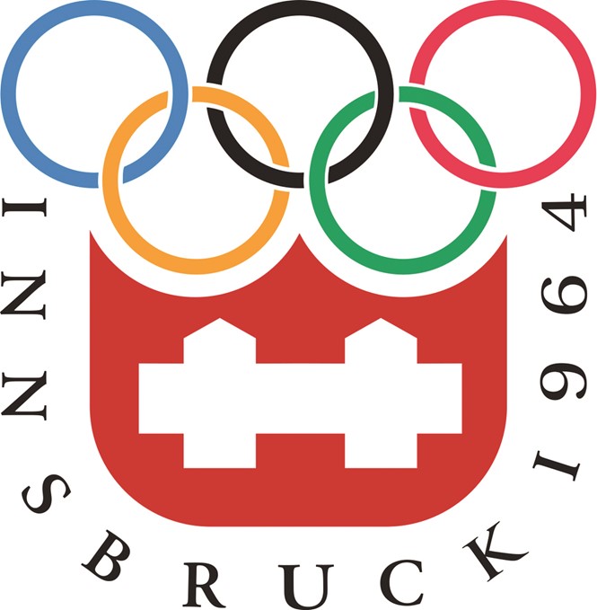
1964 Innsbruck did not disappoint its predecessor. The two-time host used a similar brand both in 1964 and 1970. Its use of a serif font and the Olympic rings in association with a red and white design that echoes the Swiss flag carries through both Games. The 1968 Games in Grenoble would be the first to include a mascot and pictogram system.
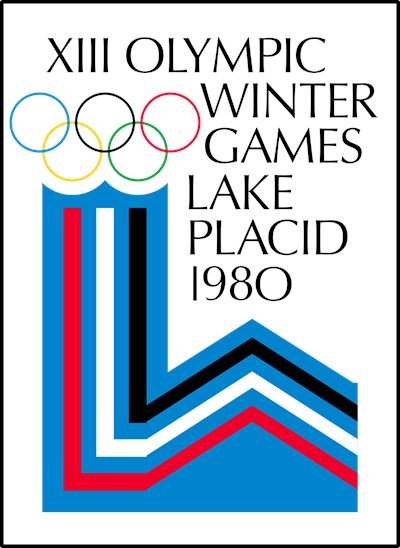
1980 In 1980, Lake Placid’s second go-around as host of the Winter Olympics got off to a good start with an L-inspired geometric shape and a thin rendition of the Olympic wordmark and rings. The Games concluded with the iconic showdown between the USSR and US hockey teams in which the US won and went on to secure the gold medal.
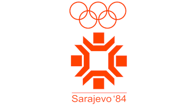
1984 Often perceived as a strange host city due to its lack of existing winter sports facilities, Sarajevo rose to the challenge. Its unique logo, Vucko the wolf mascot and motion-inspired pictograms were supported by a graphic standards usage document. Over three decades and a long, difficult siege on the city later, the logo still adorns public spaces in Sarajevo.
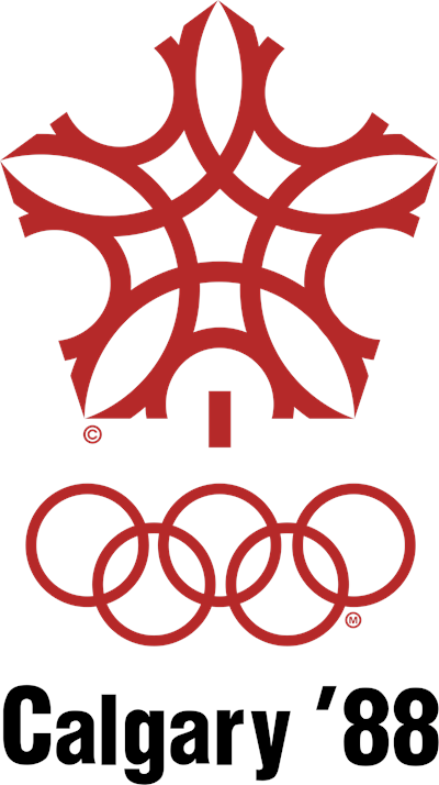
1988 Calgary’s logo has become one of those Olympic brands that is memorable and still beloved. Its red, stylised snowflake helped to launch Calgary onto the world stage. The pictograms in use in 1988 were the first to be organised into a system that could easily identify the three major types of Winter Olympic sport.
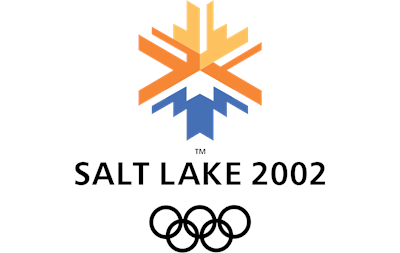
2002 The Salt Lake City Olympics took a modern approach to brand development. The organising committee took inspiration from the American west when designing the logo and pictograms. The pictograms reflect branding irons – part of Utah’s cattle ranching history – and the logo is designed in the style of the region’s Native American weaving tradition.
2010 Vancouver echoes Salt Lake’s use of Native American art and folklore in the development of its ‘inukshuk’ logo and cuddly looking mascots – a sasquatch, a black bear, a killer whale and a marmot. The mascots united the Olympics and Paralympics, though the primary brands for each were still quite different.

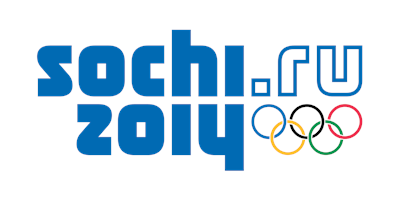
2014 Sochi was the first Games to include its URL in the logo itself. It also uses a text-only logo for the first time in the Winter Olympics. But, the wordmark is supported a brand system that drew on traditional Russian patterns and winter sport themes to wash the Games with colour.
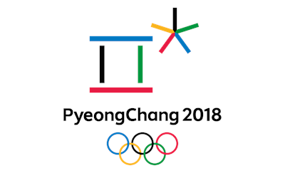
2018 PyeongChang’s uber-simple logo is derived from the Korean letters spelling out the first sounds in the city’s name and uses the Olympic colours effectively. The Korean alphabet – hangeul – provides the inspiration for the rest of the system and the pictograms are meant to evoke a sense of movement and dynamism. The 2018 Winter Olympic Games begins on 9 February.
For more from Transform magazine, follow us on Twitter @Transformsays


