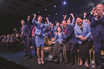
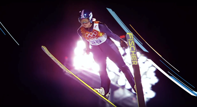
Peer perspectives: Beijing 2022
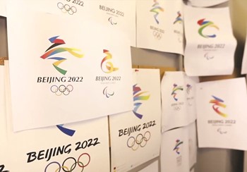
Olympic brands are notoriously challenging to get right and they can fall victim to longstanding visual clichés. With the unveiling of the Beijing 2022 Winter Olympics emblem, Gregg Finlay examines the approach, the successes and the pitfalls of the new designs. The
full visual system is yet to be released, but will rely on the strength of these emblems to be effectively implemented
Project: Beijing 2022 Olympic emblems by Lin Cunzhen
Reviewer: Gregg Finlay, creative director, Prophet
The challenge: When I was initially asked to review this ‘Winter Dream’ Olympic logo, my eyes twitched. A short, sharp shock ran down my spine. And seventeen imaginary-browser windows opened in my mind recalling every blog and every review ever written on Olympic logo design. The design community pouring its scorn upon a poor unsuspecting logo. Whether the design itself, or the comments below it, they have not always seen our best moments; creating discord around an event intended to promote international unity.
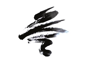
The Beijing Winter 2022 logo is not a particularly great design. Script-style illustration: check. Rainbow colour palette: check. Poor typography: check. The Olympic identikit has been rolled out once more. The form itself (at least for the Olympic version) is beginning to grow on me, if you isolate it there’s nice balance and flow, but the actual execution lets it down. And let’s not talk about the typography, it’s going to keep me awake at night. However, I will reserve full judgment until we see the identity rolled out at the event itself.
It’s an unbelievably hard brief: Aside from creating a temporary national emblem, it has to sit alongside one of the most iconic symbols on earth – the Olympic rings. That’s no mean feat. The trouble is criticism (as I have written above) often focuses on the execution, not the process which created it or the brief it had to fulfil.
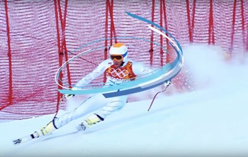
The Beijing logo has every hallmark of a consensus-driven design. With each and every layer of rationale is a nodding member of the Beijing 2022 organising committee ticking off their checklist. Incorporating a skater at the top and a skier at the bottom; a flowing ribbon-like motif symbolising rolling mountains and Olympic venues and ski pistes and skating rinks and pointing to the fact that the Games will coincide with the Chinese New Year. Hold on, and let’s not miss the use of blue in the emblem to represent ‘dreams and the future and the purity of ice and snow.’ But to achieve what?
Why it matters: Symbolism and meaning is important here, but it is so overdone it becomes meaningless. Beyond the symbolism, the design doesn’t feel like it had a champion, it feels like it had a committee and a near impossible brief; hardly a boundary-pushing purpose.
How one of the best Olympic brands was developed: Say what you will of the London 2012 design, but it was clear there was a bigger idea of what the Olympics could be. It had a purpose to go beyond city clichés and create a uniting force. And this would have needed a lot of effort to get it through the organising committee, going against all the tropes of previous Olympic logo designs. I was lucky enough to attend back in 2012, as well as being glued to the telly right through the summer. The athletes, the opening ceremonies, the volunteers, in both versions of the event, were extraordinary; people who pushed their boundaries to be the best they can be. They were champions.
It’s this characteristic that defines the Olympics. And this is what I yearn for. Someone to champion the creation of each event incarnation and the true meaning of the Olympics.