#TransformTuesday: 22 January

Every week, Transform examines recent rebrands and updated visual identities. This week's picks are below. For more from #TransformTuesday, follow @Transformsays
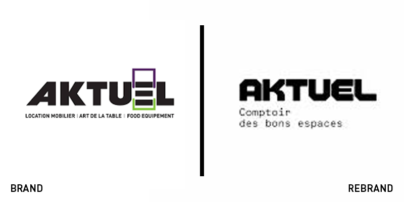
Aktuel
Events managers are busy people. Furniture hires is often a box to tick on a long list of things to do, so finding a partner that can deliver for any type of need and any type of event is necessary. Enter French rentals brand Aktuel. The company offers huge amounts of stock for nearly any space. French branding agency Brand Brothers used the concept of space planning and infinite adaptability to craft a colourful, ever-changing brand. The new typeface allows for differentiation but the brand comes to life in colour and animation as any type of space can be configured using the brand’s assets. It allows for innumerable touchpoints to be developed – much like the company’s service offer – and makes for a bright addition to an events manager’s checklist.
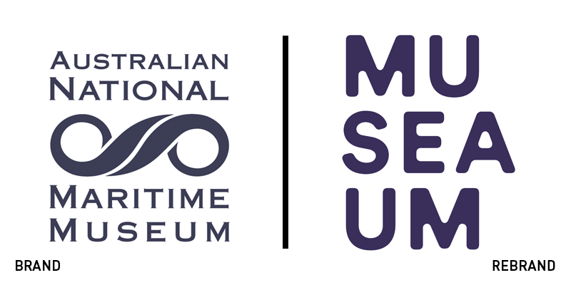
Australian National Maritime Museum
Maritime museums are typically one of two options: a historical survey of a country’s naval and seafaring history or an interactive, immersive dive into the depths of the ocean. The Australian National Maritime Museum has shifted its positioning toward the latter with its recent rebrand. Working with Sydney-based brand agency Frost Collective, the museum has introduced a bright, modern identity that puts the ‘sea’ in ‘museum.’ Cat Burgess, strategy director at Frost Collective says, “One of the key insights we came across during our research was that visitors want immersive experiences, rather than passive history lessons.” For that reason, the brand strapline became the ‘spirit of adventure’ and the new visual identity would reflect that. The wordmark is the centrepiece, but it is deployed ably across digital and physical touchpoints with a unique colour palette and nice typeface family.
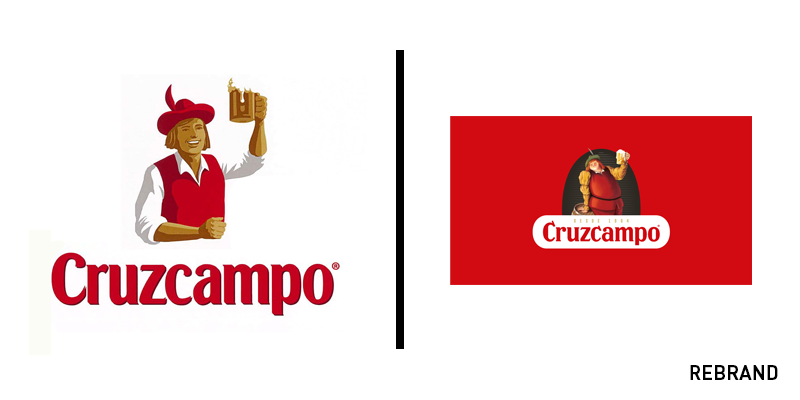
Cruzcampo
One of the biggest breweries in Spain and the sponsor of the Spanish national football team, Cruzcampo is well known across its home nation. However, its positioning didn’t reflect the quality of its ingredients. Parent brand Heineken is one that puts its ingredients at the heart of its offer. Reflecting that in the Spanish brewer’s brand would be a fitting change Cruzcampo. It enlisted the help of London-based brand agency Bulletproof to reexamine the beer. It needed to retain its prominent identity while still reinforcing the message of quality ingredients. An updated pack was complemented by a positioning campaign, a craft beer-like pub in Malaga and a renewed energy to the brand.
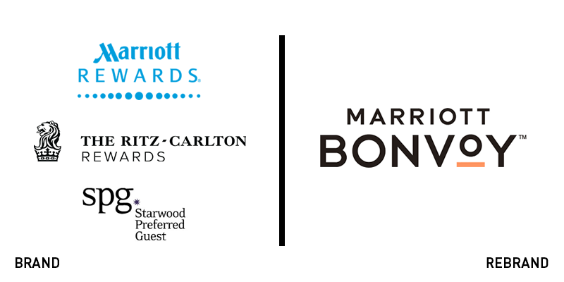
Marriott Bonvoy
Consolidating three of its loyalty programmes into one required Marriott International and agency partner Mother to examine why people choose Marriott’s family of hotels and how they interact with their existing loyalty schemes. The newly names Marriott Bonvoy will replace the Starwood Preferred Guest, Marriott Rewards and Ritz-Carlton Rewards programmes. Focusing on events, experiences and unique travel opportunities, Bonvoy will expand the programme beyond the hotel room. “Marriott Bonvoy marks an evolution in travel because it represents more than a loyalty program,” says Stephanie Linnartz, global chief commercial officer for Marriott International. “Marriott Bonvoy is a travel program designed to bring to life our extraordinary portfolio of global brands in 129 countries and territories, while also providing endless inspiration for members to keep traveling and pursuing their passions.” The new logo is crisp and modern with a friendly, colourful touch.

Slack
A high-profile change for a useful workplace tool, Slack has unveiled a new brand with the support of Pentagram’s Michael Bierut. Pentagram wanted to update the hashtag logo and the colour palette while still retaining familiar elements of the brand’s personality. The new logo is an eight-legged take on the hashtag icon. The new colour palette will allow for cleaner navigation within the app and more exciting communications externally. The eggplant colour that has been added to the wordmark also helps in the app version, giving its icon some standout among the prevalent blues and greens typical of mobile apps.
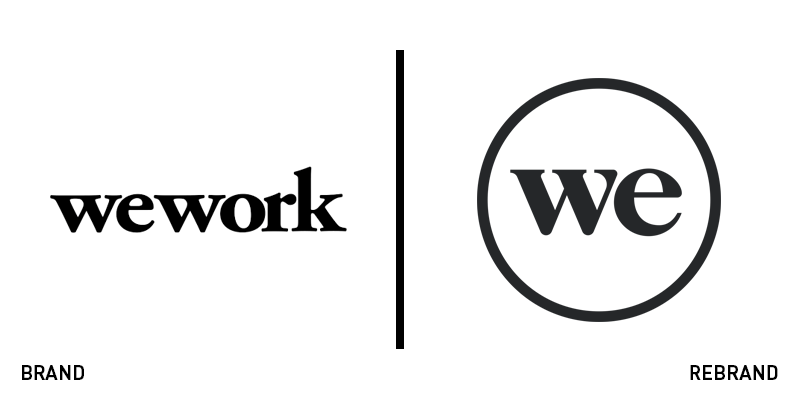
The We Company
Much like Google, and others, before it, WeWork is a classic example of a company with a single great proposition that, on the brink of expansion and brand extension, needs a more inclusive brand. The WeWork name, well-known and successful though it is, only really works for workspaces. With the company wooing further investment from SoftBank and with plans to branch into new sectors, it needed a brand that would support it in its growth. Thus has come the We Company. For the moment, the We Company will consist of three sub-brands: WeWork, WeLive and WeGrow. The two new sub-brands will enable extensions into financial services, education and housing. And the brand architecture solution will allow for the introduction of further sub-brands as necessary.


