#TransformTuesday: 24 November
Every week, Transform examines recent rebrands and updated visual identities. This week's picks are below. For more from #TransformTuesday, follow @Transformsays

NYC’s MeatPacking District is home to a wide range of businesses and attractions; from studios, indoor markets and museums to hotels, the Google office and the High Line public park. The Meatpacking District Improvement Association and Base Design have just created a new visual identity for the District that aims to communicate the diversity of the neighbourhood, expanding its reputation beyond nightlife.
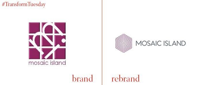
UK-based Workbrands have rebranded Mosaic Island IT consultancy. The hexagon-shaped brand mark is intended to represent the company’s band promise, to integrate with its clients and deliver digital transformations. Tom Ovens, art director at Workbrands, says, “The hexagon shape suggests structure while the emanating dots represent growth and business-engaged change. An animated ripple effect in a digital version of the logo places further emphasis on transformation.”
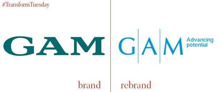
Research showed that a history of various acquisitions had left the public with a misunderstanding of asset management firm, GAM and its business proposition. The company was previously owned by UBS and acquired by Julius Baer in 2005 before it emerged as an independent company again in 2009. For its re-branding, GAM was advised by Siegel + Gale. The global brand strategy firm developed a new logo and visual identity based on illustrations inspired by technical blueprints.
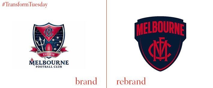
Aussie-rules football club, the Melbourne Football Club, released an in-house rebrand that simplifies its shield down to the core elements. Gone is the trident, football and stars cluttering up the previous logo. The new shield focuses solely on the wordmark and strives for longevity through its simple, bold design.
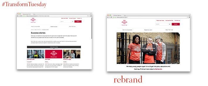
UK charity, The Prince’s Trust, partnered with independent agency, Rufus Leonard, to launch a refreshed visual identity and newly redesigned website. The charity’s new look aims to appeal to the young people that it helps, and the rebranding process included workshops with youth ambassadors, allowing Rufus Leonard to assess the perception of The Prince’s Trust before it embarked on the redesign.
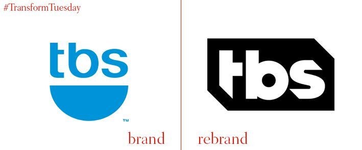
US cable outlet, TBS, has dumped its 11 year-old brand in favour of a hipper, more adaptable system that allows for versatility on air and online. Like many TV channels in the past couple of years, the new logo will be adaptable to different idents and flexible enough to marry with TBS’ wide range of programming. The work was carried out in-house.
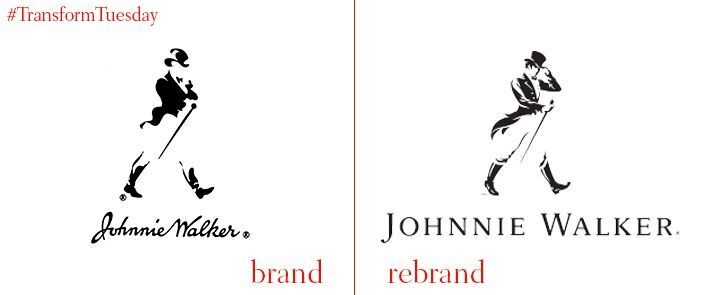
The iconic Johnnie Walker Striding Man has been walking for over a century. In the most recent brand refresh, the man gets his face back. In the previous iteration of the brand the logo was smoothed over and lacked features. The new wordmark, by Bloom, has a bit more definition. The ‘Keep Walking’ strapline will form the basis of a major brand communications campaign.
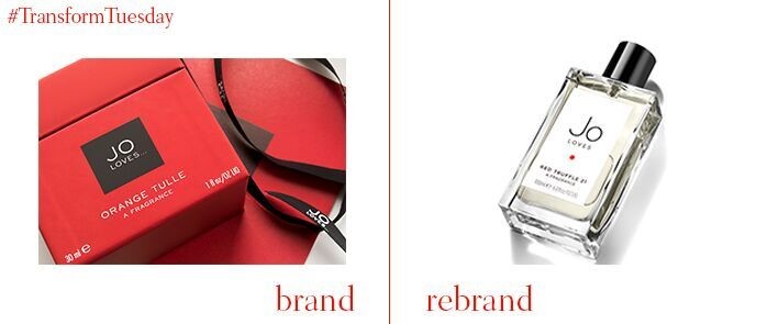
Pearlfisher created an identity for Jo Loves, a brand by the creator of luxury perfume and cosmetics brand, Jo Malone. Jo Malone MBE launched Jo Loves in 2011, but the product needed a brand that would stand out in a competitive luxury goods category. The new packaging design uses British elements such as an embossed Union Jack and a red ribbon as well as a red dot that symbolises Malone's sign-off; a mark of quality.

