Monotype reveals top 10 typography trends for 2023
The font and typography specialists released its annual Type Trends Report, detailing the typographic trends we can expect to see throughout the year. From structured grids to bombastic 3D modelling, we can unquestionably expect some big shifts in design.
Monotype’s latest Type Trends Report aims to demonstrate how changes in culture and current affairs manifests in design. The 2023 report highlights changes in how expressions and digital touchpoints are increasingly becoming important to brands.
Monotype creative type director, Terrance Weinzierl, says, “Type is a gateway to an entire conversation around technology and today’s trends. This report is an educational collection of work that fascinates and excites us and, most importantly, represents a ripple coursing through the ocean of design. Through these 10 trends, we provide perspective of how our daily life is impacting letterform.”
Along with technological changes, such as augmented and virtual reality, typography design has also been impacted by social influences such as a drive towards diversity and inclusion. Here are the 10 trends reported by Monotype.
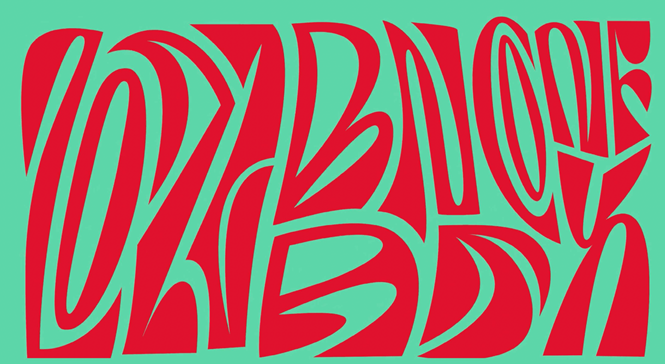
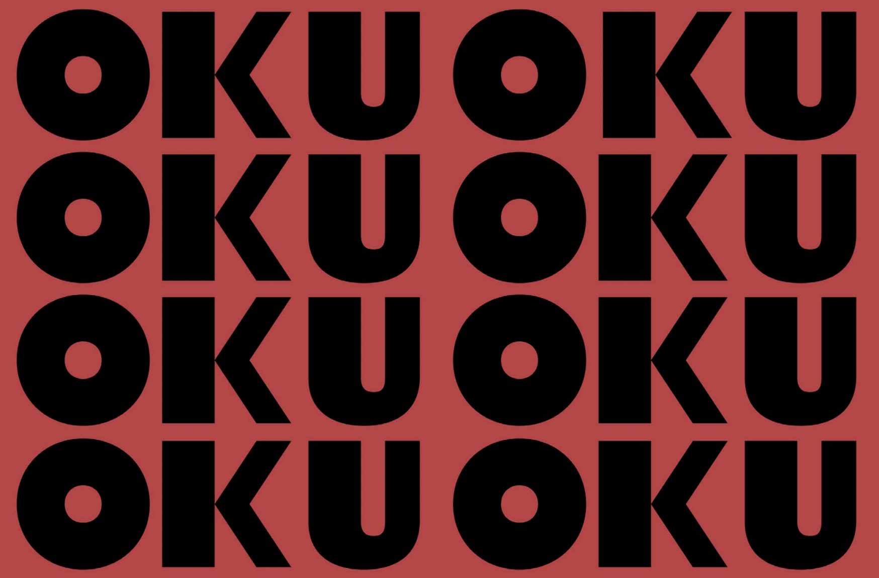
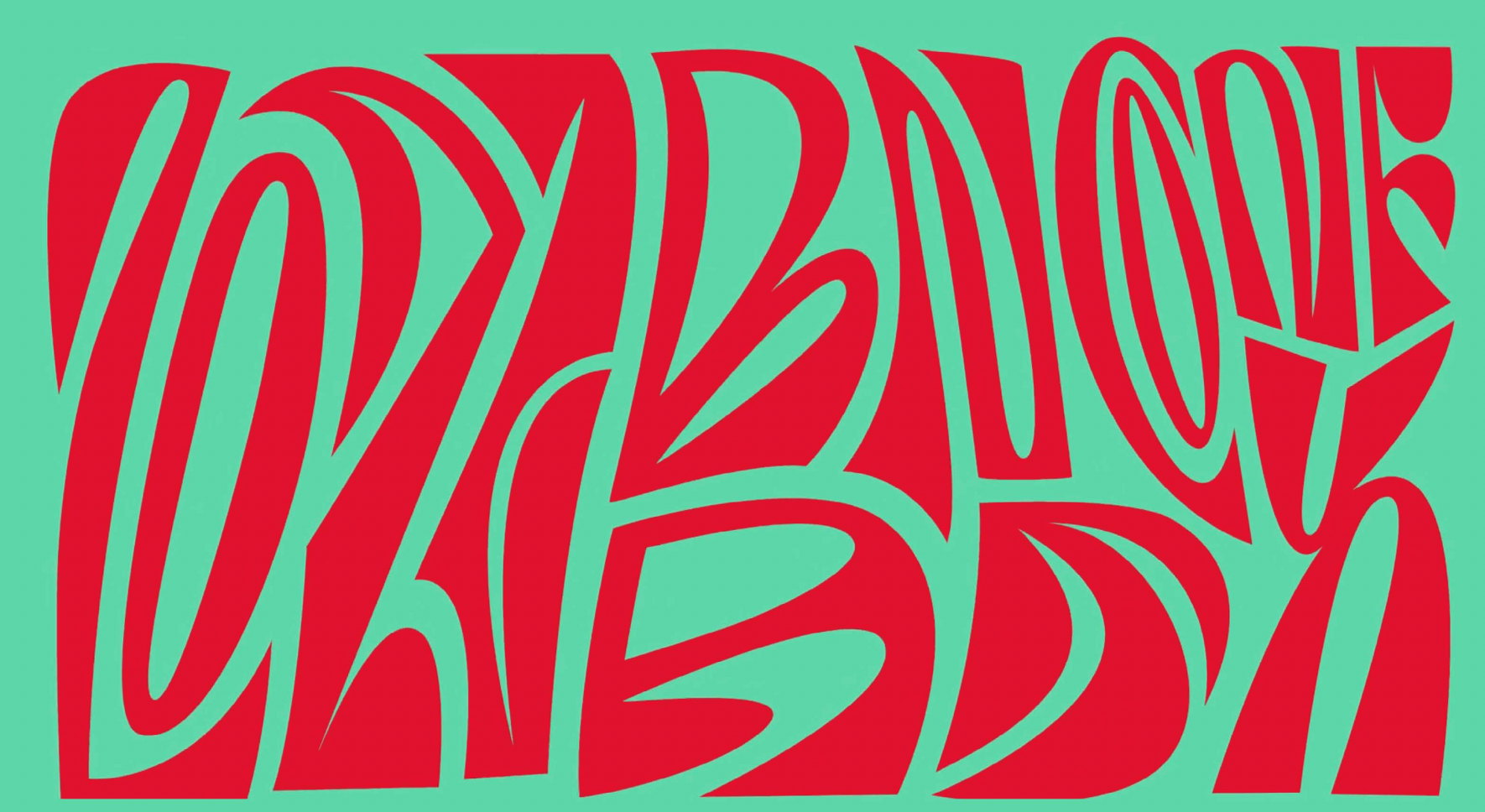
1. Match Maker
A complex, vibrant and quite overwhelming design trend, Match maker was spotted last year by Monotype and is expected to stay with us throughout 2023. The type foundry has pinpointed three versions of match maker.
Mix-up is characterised by its variety and diversity of typefaces, it is the visual representation of young designer’s commitment to diversity, equity and inclusion.
Loopy utilises organic movement and is best paired with a static type for maximum impact.
Finally, the milder Subtle gives off a more “private and conversational” feel, according to Monotype, by pairing just two styles.
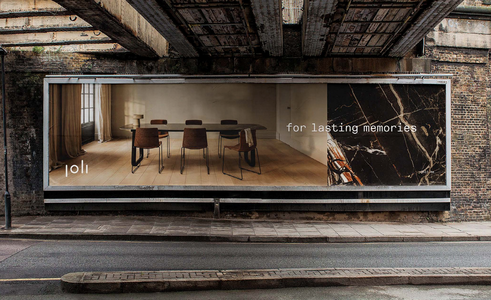
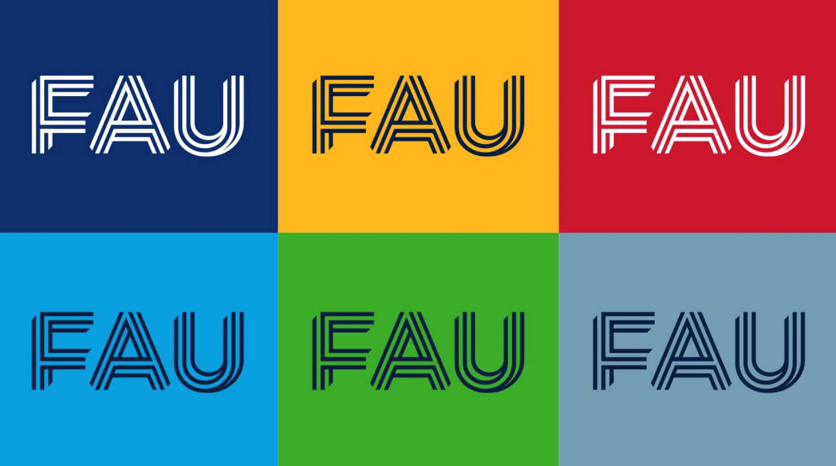
2. Smart Grid
As demonstrated by GSK last year, using a Smart grid design style can result in the successful blending of art and science. Unique to other similar designs, Smart grid is deliberately softened and cut to engineer greater standout. Wolff Olins’ design for GSK proves just how successful this can be.

3. Superhero
Mimicking comic books with its playful and explosive aesthetics, Superhero is a wholly new trend to Monotype. Characterised by outlines and shadows, the typography design evokes purpose and is one of the most powerful trends this year.

4. Super sober
One of the more muted designs in Monotype’s report, Super sober’s very existence may be down to its stark contrast to more bombastic designs like Superhero. Simple and uncomplicated, it can be nicely paired with black and white for maximal (minimal?) impact.
5. Making the cut
Leading to an exaggerated feeling of sharpness, Making the cut can be used as a means of sprucing up a regular sans serif font in two distinct formats.
Ink traps cleverly optimises negative space with interesting shapes and curves, while Hypertension balances technicality and spontaneity.

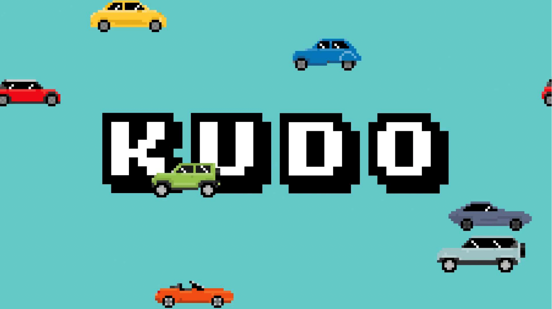
6. Pixel play
Simple and does what it says on the tin. Pixel play utilises nostalgia and shines through as a video game motif. While it could only really be explored in specific circumstances, Pixel play is certainly one type trend to watch out for this year.
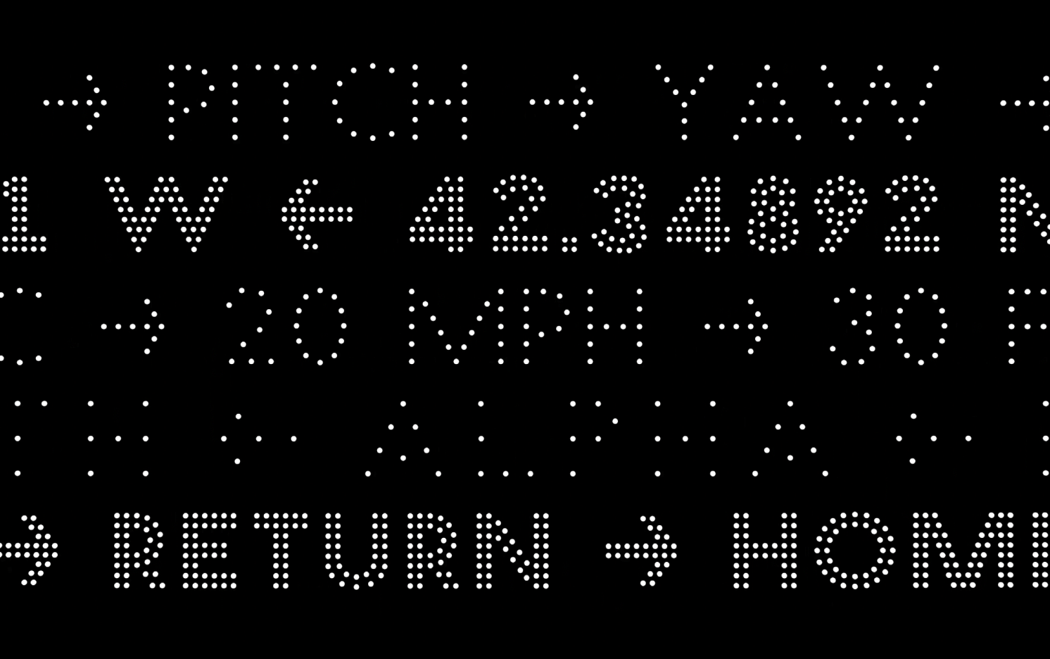
7. Flux
As technology improves and brands become more invested in digital-only design, it is easier to justify the creation of moving fonts. Flux taps into this trend and is exemplified by drones being organised to form letters. Flux can similarly be achieved with a static typeface that gives the impression of movement.
8. Volume up
One of the wilder trends in Monotype’s report, Volume up is where 3D modelling meets typography. Split into three categories, this example once again speaks to technological advancements in design. By implying a 3D object or animated 2D shapes, Illusion offers what Monotype describes as “exuberant expressions of dynamic design.”
Elsewhere, the flexible, free and uninhibited Twisted holds rippled shapes that evoke constant movement. Meanwhile, the graffiti-esque Inflated reflects the urban landscape, giving off a highly textured and provocative feel.


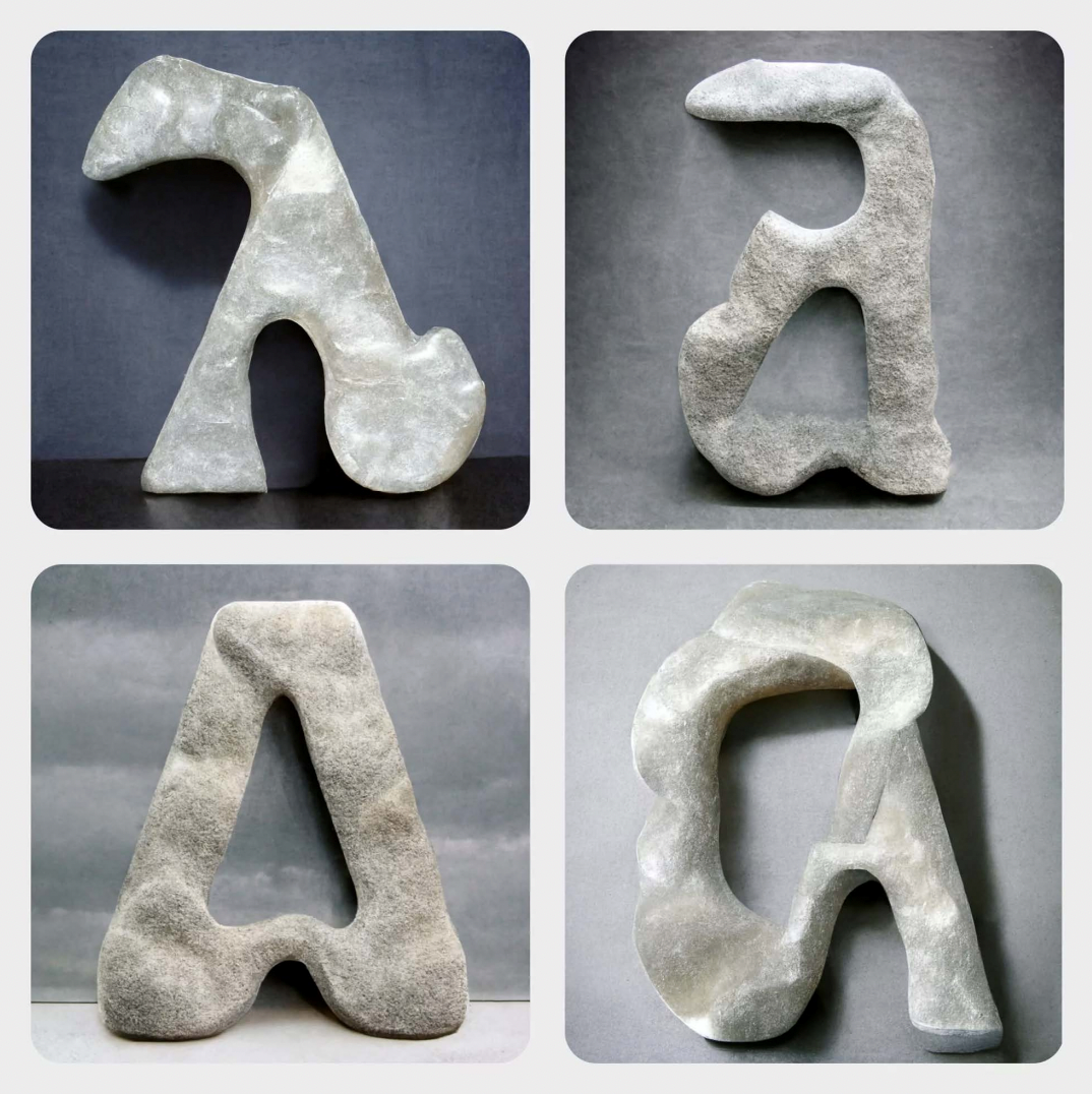
9. Liquify
Use with caution. Pushing the boundaries of legibility, and indeed its importance, Liquify is categorised in two formats by Monotype. Psychedelic, as expected, swirls freely and is easily recognised by the round and soft forms it takes. Organic and wild, it can offer more emotion than most fonts, but can be a tough read. Much like Liquify, Hand-finished’s appeal and drawbacks are its imperfections. This is where digital designs are, you guessed it, ‘hand-finished’ with paint and markers.

10. AI painting
Of all the designs in Monotype report, AI painting might be the one watched with most intrigue. With AI evolving at a remarkable pace, technologies like Midjourney could end up being a game changer in the world of typographic design. AI-painted letterforms may be characterised by their collaged look.
It will no doubt be fascinating to see just how many of these trends are here to stay. Which ones are popularised, evolve to become something better, or are forgotten in a year’s time will ultimately depend on the end user’s tastes.


