GSK rebranded by Wolff Olins ahead of healthcare firm’s proposed demerger

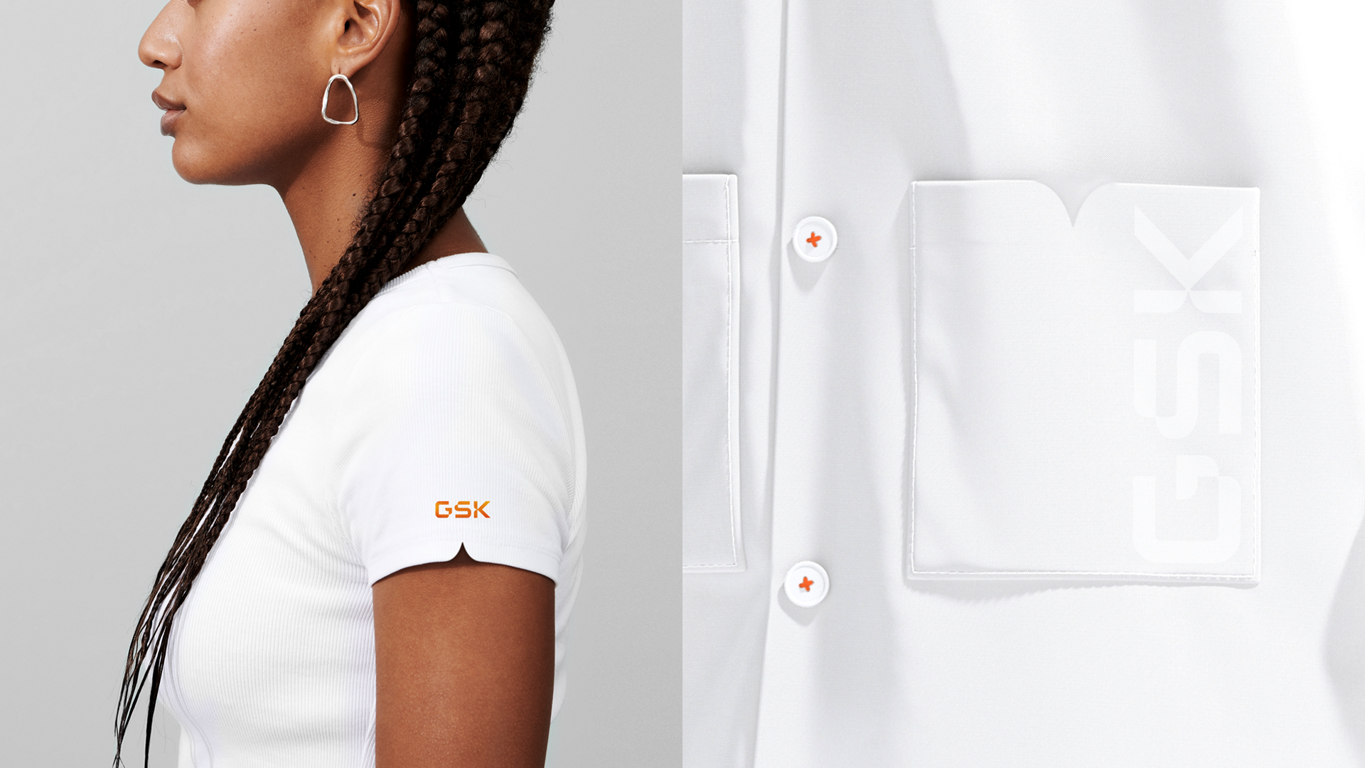
In its most significant corporate change for 20 years, the update to GSK’s brand identity by global consultancy Wolff Olins was designed to reflect a change to its purpose, ambition, strategy, and culture. GSK retains its name and famous orange logo, but sees aspects of its identity, including the typography, evolved.
The proposal of GSK’s demerger saw the creation of Haleon – a new company wholly devoted to consumer health – introduced to the media and investors earlier this year in February. The new firm will boast a portfolio of category-leading brands including Sensodyne, Panadol and Advil.
GSK’s rebranding therefore aims to better represent the firm’s ambition of becoming wholly focused on biopharma innovation. Wolff Olins’ development of the British pharmaceutical company’s identity aims to highlight its new ‘Ahead Together’ purpose and growth ambitions.
David Stevens, executive strategy director at Wolff Olins, says, “From the first moment we spoke to GSK, we understood they wanted to make a real statement – to their people and partners as much as to investors and the media. It was time to bring to life GSK’s purpose and strategy and accelerate their culture.”
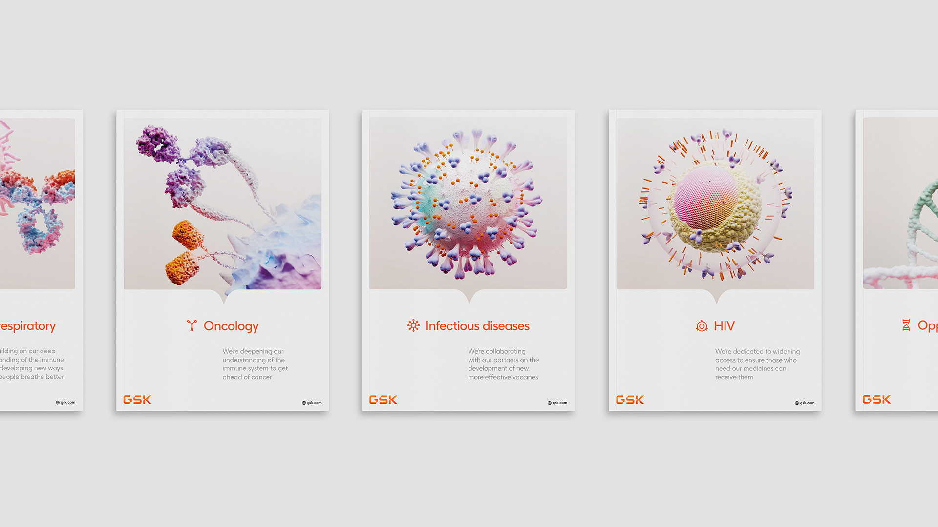
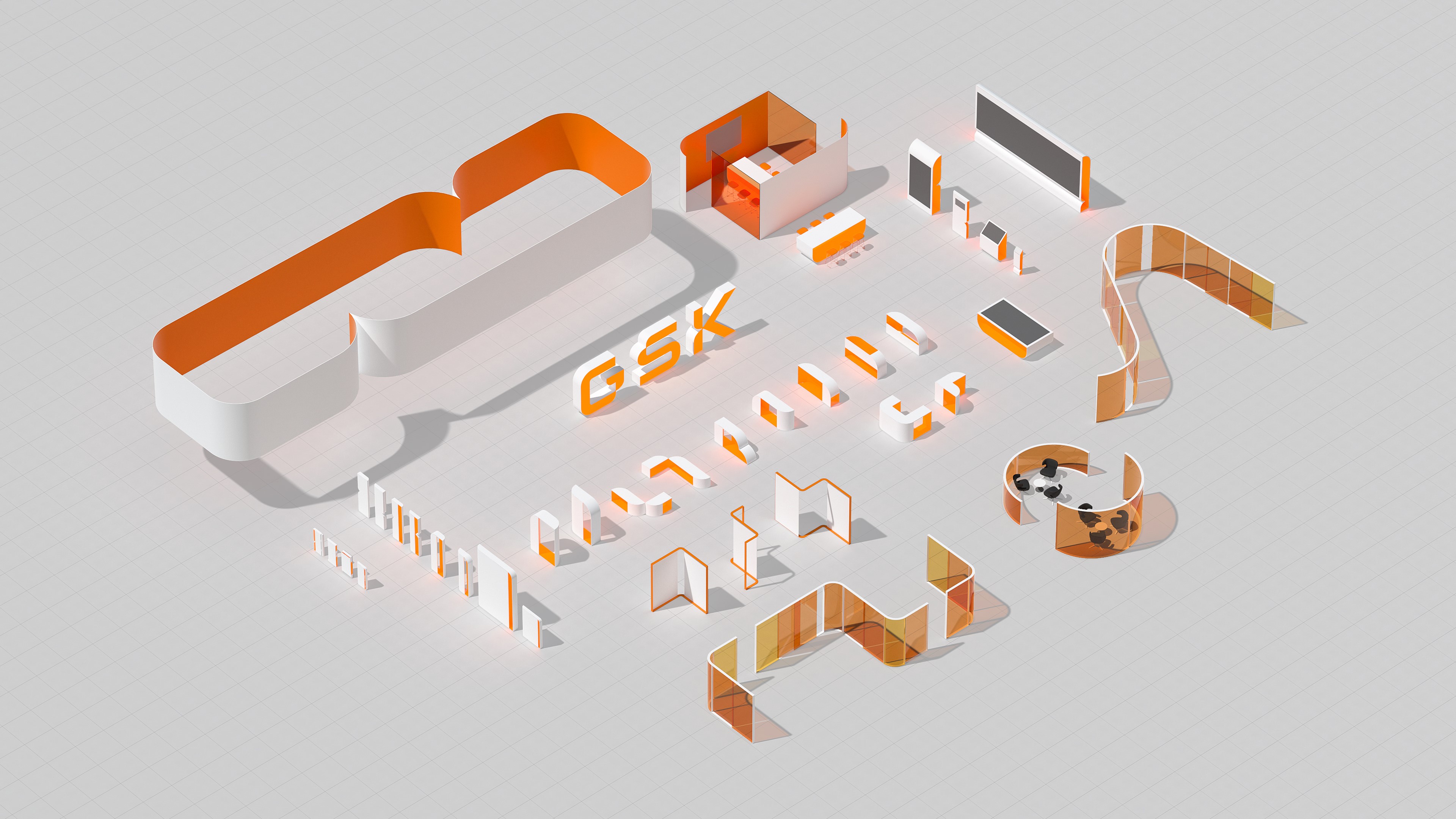
The agency sought to signal GSK’s new R&D focus on the science of the immune system, human genetics and advanced technologies. After finding inspiration from the striking imagery of bioscience, the new identity features numerous curves which aim to evoke the highly adaptable nature of the human immune system.
GSK’s name is retained, while its famous orange logo has been housed in a redesigned shape known as the ‘signal’. The new, dynamic identity system is capable of engaging audiences across digital, social and physical environments through its ability to flex, adapt and move.
Emma Barratt, global executive creative director at Wolff Olins, says, “Our ambition was to create a brand identity that signalled extraordinary adaptability – of the human immune system, of tech, of GSK’s people – so that the brand identity could work everywhere and retain a feeling of constant innovation. But we had to balance this out with a need for warmth.”
Wolff Olins worked closely with the team at GSK to ensure a branding system was developed which worked for everyone in the business. This meant showcasing the diversity of the firm’s people and partners, from its employees to suppliers.
The agency was also keen to ensure every asset and application, both on-screen and in print, was clear and accessible. This was made possible by the commissioning of a custom typeface by Face37 which utilised ink traps for legibility.
Jessica Bigio, executive engagement director at Wolff Olins, adds, “In the spirit of getting ‘Ahead Together’, our collaboration with GSK has been about building one truly blended team, working across a huge array of global channels and assets with numerous agency and production partners. GSK has huge ambition and isn’t scared to try something new together, which makes this incredibly refreshing to be a part of.”
Launching today, GSK’s updated identity is set to be rolled out across the whole business in the coming months.