Blue State redefines Oxfam’s brand positioning and identity to focus on equality
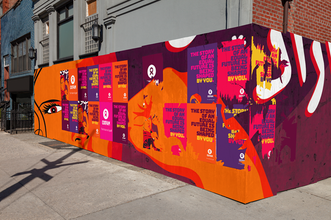
With the globally recognised charity deciding to update its ‘confused’ identity for the first time in its 80-year history, New York-based Blue State was brought onboard to simplify the brand’s identity and connect authentically with audiences. Moving away from an identity that focuses on alleviating poverty, the new Oxfam brand revolves around fighting inequality.
The brand’s new tagline – ‘Equal rights, equal opportunities’ – was founded on the back of worldwide audience research and speaks directly to Oxfam’s new focus on equality. The unifying new position aims to differentiate the charity by taking on a broader vision for the future.
New brand messaging was described in testing as ‘hopeful’, ‘motivated’ and ‘inspired’, while the agency also designed an emotive brand book which could show ‘Oxfamers’ how the revised brand comes to life in the real world. Mantras were designed with 60-year-old donors in mind as well as teenagers.
With inclusivity at the heart of Blue State’s graphic and copy design for Oxfam, the agency also ditched an inaccessible lighter green colour palette for a new green that keeps disabled users in mind. It was also important that the new identity could work across different contexts, cultures and languages.


